Picnic, the Dutch grocery delivery brand, has disrupted the traditional grocery shopping experience by offering an app-only service with a range of 2,000 products. Their new packaging design is disrupting the traditional grocery shopping experience by prioritizing joy and delight over standing out on a crowded shelf.
Partnering with UK strategic design consultancy big fish, Picnic has crafted a range of over 2,000 products with whimsical illustrations and attention to detail. Let’s explore how Picnic’s unique design philosophy and creative packaging have transformed the traditional grocery shopping paradigm into a fun and visually appealing online experience.
Designing for the Home, Not the Shelf
Unlike traditional retail brands that vie for attention on crowded supermarket shelves, Picnic’s app-only business model allowed big fish to break free from conventional design norms. The design philosophy shifted from attracting consumers in-store to enhancing the home experience. The packaging design prioritizes care, detail, and beauty that resonate within the home, without the need for excessive visual shouting. Victoria Sawdon, chief creative at big fish, explains how this approach provided unprecedented freedom and creativity.
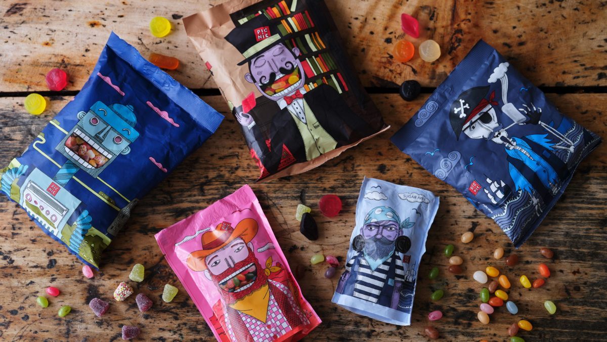
Blending Whimsy and Aesthetics
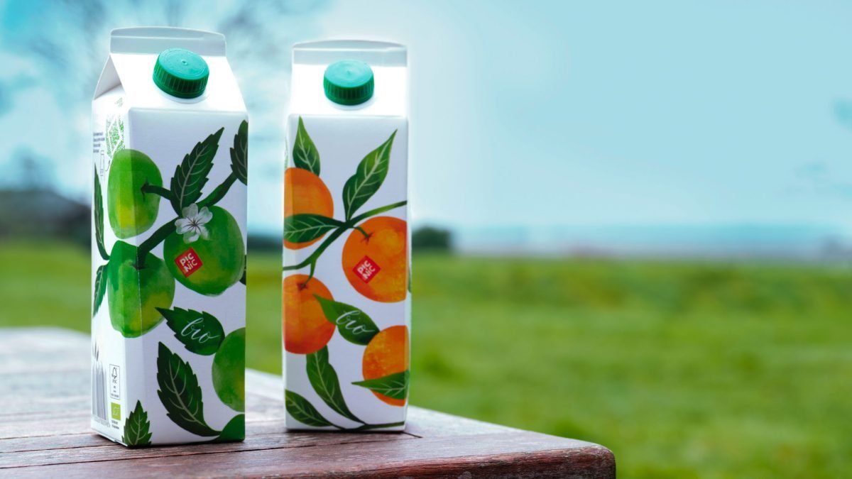
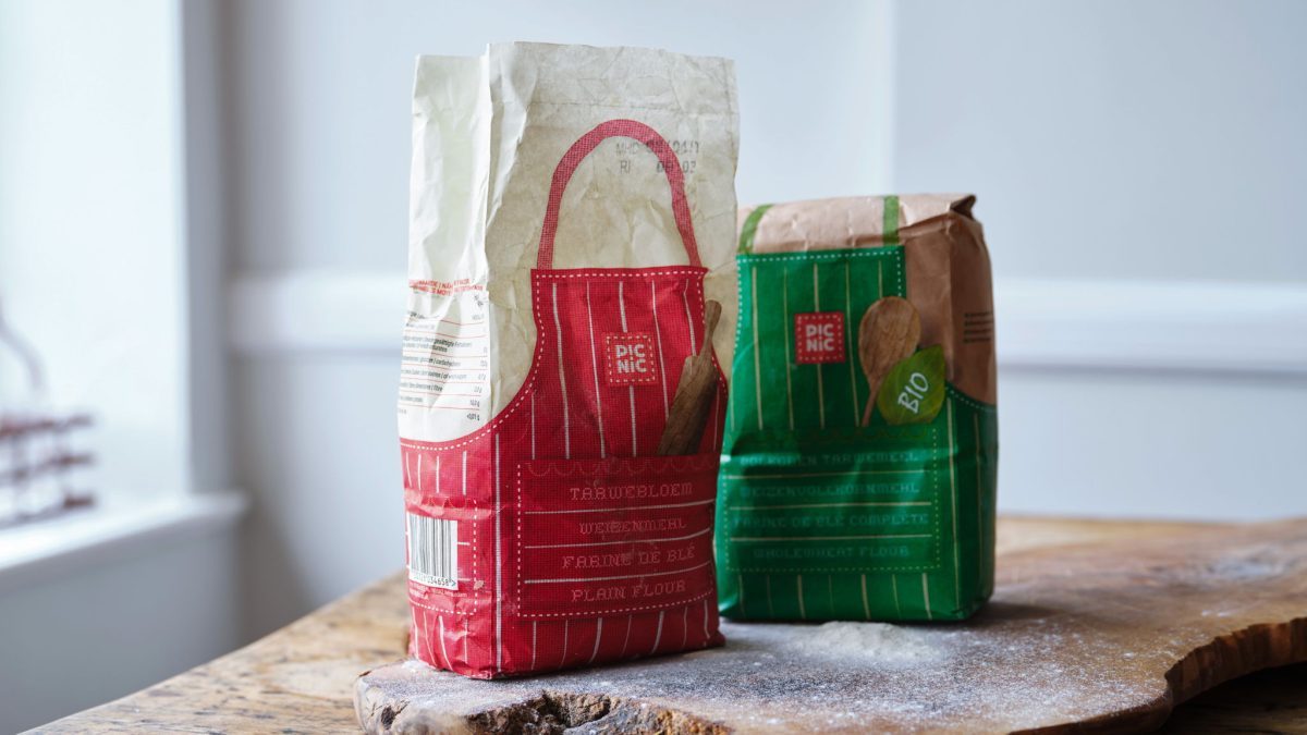
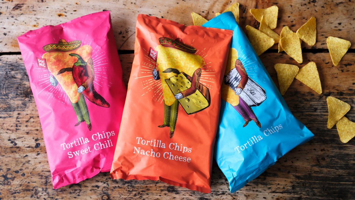
From everyday essentials like milk and canned vegetables to pet food and snacks, each Picnic product features a whimsical illustration style with painterly textures and intricate details. The designs not only highlight the health-conscious nature of the budget-friendly foods but also seamlessly blend into the aesthetics of consumers’ homes. Sawdon emphasizes the importance of visually appealing household goods, paralleling the selection of cushion covers and plates. The packaging aims to be visually enticing, with the ultimate compliment being someone wanting to display it rather than hiding it away in a cupboard.
Consistency in Inconsistency
Designing packaging for over 2,000 products posed a considerable challenge for big fish. However, they successfully created individual experiences while maintaining a cohesive brand identity. Sawdon explains that each pack embraces art and illustration, resulting in a myriad of styles. However, they all share a level of care and attention to detail that unites them as a family. Even the logo, which typically adheres to strict guidelines, varies across different ranges. This approach reflects Picnic’s anti-corporate ethos and adds a unique touch to every packaging design.
Final Thoughts
Picnic’s creative packaging breaks away from traditional design rules, providing an inspired online shopping experience. By shifting consumer mindsets from urgency-driven purchases to selecting products that enhance their lives and homes, grocery shopping becomes an enjoyable task rather than a daunting chore. The thoughtful design philosophy, whimsical illustrations, and attention to detail transform the mundane act of grocery delivery into a visually appealing and delightful experience.