New York City’s rebranding campaign “We Love NYC” is pulling notes from the old “I ♥ NY” campaign to reimagine and reinvigorate the city in the post-pandemic world.
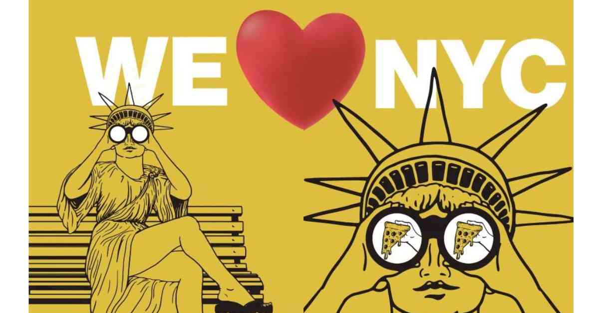
The new campaign has tweaked the 1977 “I love NY” campaign which was created by Milton Glaser. It seeks to counter pessimism about the city’s future and encourage civic engagement and pride among residents.
Governor Kathy Hochul said this “We Love NYC” campaign will help to capture that energy and preserve the city’s spirit by encouraging New Yorkers of every background to come together, get involved and make a positive change in their community. “Listen you guys, in the 1970s things were awful here and crime was at record levels. But a simple PR campaign worked wonders. So why not use a version of it again? New York is not coming back, New York is back.”
Mayor Eric Adams urged New Yorkers to come together. “Let’s all come together no matter if it’s volunteering to clean up parks, or volunteering at a homeless shelter. It’s all contributing together because this is the city we love.
The Original Campaign
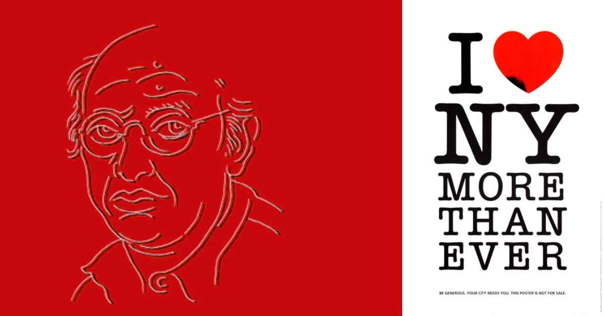
Milton Glaser created the “I ♥ NY” campaign in the 1970s, wherein the heart symbol is a classic. Various reports say that Glaser sketched the logo with a logo in the back of a taxi cab. His logo remains the ubiquitous symbol of the city. As such, enthusiasts of the original campaign are not too pleased with the rebrand.
Ben Stephens, a freelance copywriter, tweeted that the iconic power of Glaser’s design comes from its simplicity, its boldness, the foursquare arrangements of its elements. He believes the original looks like the voice of the city. “The new one looks like the voice of an investment bank or possibly a healthcare provider.” Another said “Don’t mess with perfection”.
Modern Twist
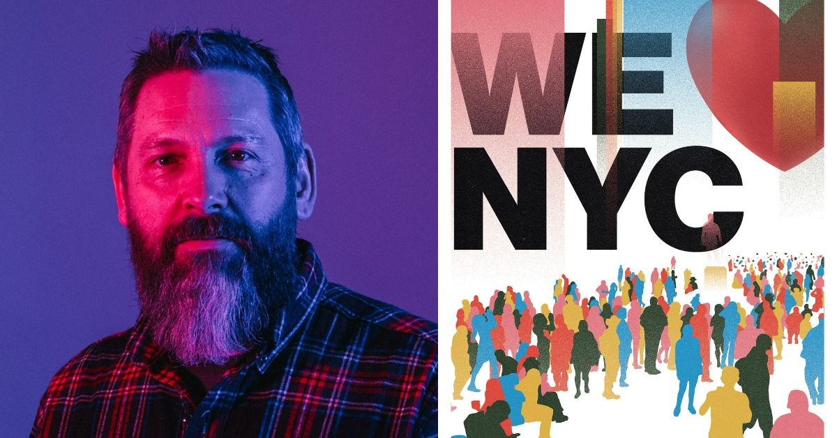
But Graham Clifford, the designer and art director behind the new logo, highlighted that the idea was to give it more of a “modern twist”. The rebranding campaign team, led by Maryam Banikarim, Andrew Lerner, working with the ad agency Founders, Grain Group, and Graham Clifford, said technology revolution has widened the skill gap, enabled remote work, and disrupted basic patterns of urban life.
“Public safety has re-emerged as the top concern of New Yorkers, but with overlays of mental health, homelessness, and racial justice issues that make solutions difficult. Whereas the city was a bargain in the 80’s, today it is unaffordable for many current and would-be New Yorkers. Together, “We” can tackle these challenges and demonstrate, once again, that this is the greatest city in the world,” the team explained.
Hochul believes New York City, with its iconic views and vibrant arts and culture, to its thriving businesses and world-class cuisine, represents some of the best that the state has to offer.