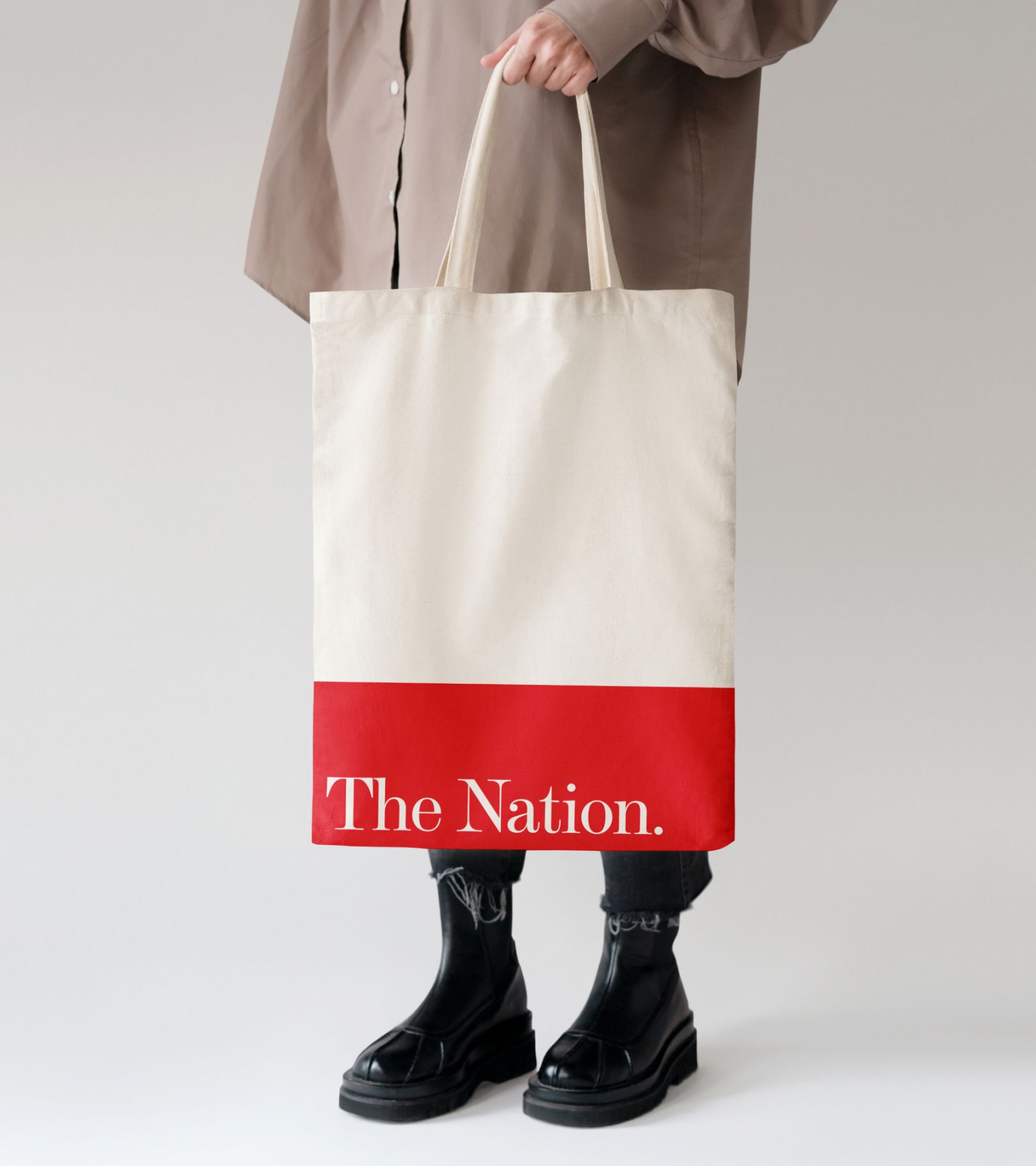
The Nation, a stalwart progressive publication founded in 1865, has revamped its digital presence for a new era. With the goal of better engaging modern audiences, while upholding The Nation’s legacy, the new look set out to amplify the publication’s voice.
According to Katrina Vanden Heuvel, editorial director of The Nation:
“As our country and the world undergo extraordinary and tectonic shifts, these times demand that The Nation be ever bolder, willing to unleash our imaginations and ready to think anew.“
Let’s explore how Athletics revitalized The Nation’s website, preserving its heritage while embracing modernity to reinforce its position in progressive political and cultural discourse.
Bringing The Nation into the 21st Century
Prompted by the need to stay relevant in 2023, The Nation approached Brooklyn-based design studio Athletics, the creative minds behind The Nation’s remarkable transformation. The goal was to not only connect deeply with both new and existing users but also celebrate the publication’s modernity. Athletics rose to the challenge, re-envisioning brand behaviors for the digital realm and enhancing user journeys, taxonomies, and subscriptions. They focused on streamlining user journeys, simplifying article formats, improving subscriptions and conversions, and above all creating a flexible platform optimized for The Nation’s political and cultural commentary.
Visual Heritage Meets Digital Clarity
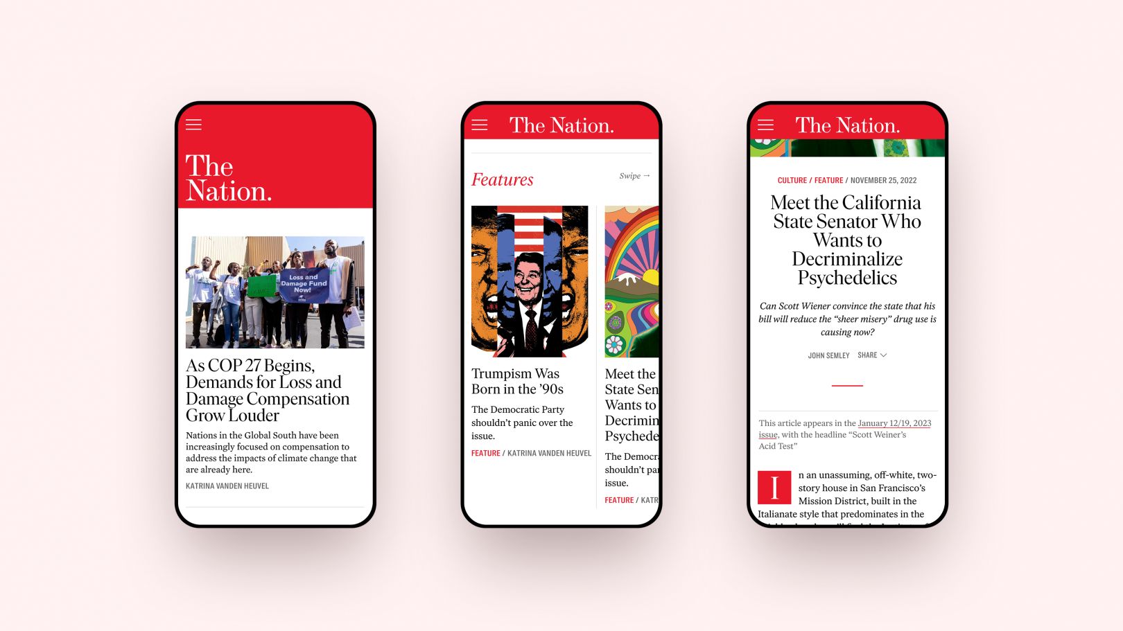
The redesign retains visual ties to The Nation’s heritage while ensuring its new digital home is contemporary and dynamic. The iconic red masthead is boldly scaled, with rules and delineations in red to aid navigation. An expanded secondary color palette introduces versatility without distracting from the brand’s core red.

A Symphony of Versatility Through Design
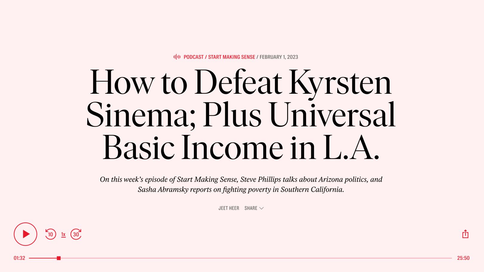
The wordmark, a critical aspect of any brand, received special attention from Athletics and custom typefaces by Tré Seals offer legibility across devices while referencing the original print aesthetic. Furthermore, a flexible approach to the wordmark was developed, ensuring it adapts seamlessly across various digital platforms and scales.
Beyond aesthetics, the website’s architecture emphasizes content versatility. Athletics masterfully crafted a flexible homepage designed to respond to breaking news, significant announcements, and thematic article suites. As a result, The Nation can effortlessly organize its political and cultural news, opinion, and analysis without compromising advertisement modules.
Final Thoughts
By honoring tradition while embracing innovation, Athletics’ rebrand for The Nation is for a new generation of progressive readers. As America’s longest continuously published weekly magazine, The Nation now has a digital platform ready to speak truth to power for years to come. The dynamic and user-centric editorial platform sets the stage for an even bolder and influential future, ensuring that The Nation remains a vital force in shaping progressive discourse worldwide.
