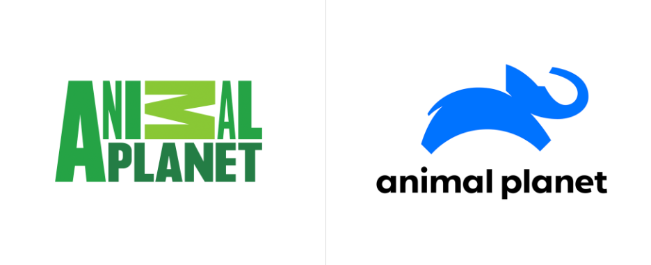
Leap of Faith, they call it! And it’s a blue elephant. But, seriously?? A blue Elephant! It’s a strange colour choice. Blue is not an animal colour. Yes, I am talking about the new rebranding Animal Planet did a couple of days ago. Animal Planet is at the beginning of its 20s, basically the age for a human to decide worst things and somewhat right things. So now the question is, is this a right decision or a bad one?

The first Animal Planet logo was with an elephant, a globe and some greenery. Now, there you had a perfect elephant in white with horns and legs. But now the elephant is like, kind of funky I must say. When Animal Planet created there the first logo, it was ideally suited to the brand. It felt royal, majestic and intelligent with the Elephant and Elemental, Naturistic, and exotic with the globe. And the typo was so in a match that we had that warm feeling of nature. One can immediately say “Oh this logo belongs to some nature loving Wildlife channel thingy,” but right now, it’s a bit confusing. One may recall this new logo as something that belongs to a cartoon channel, with the leaping elephant! Though it is necessary to say that the logo does make a feeling of joy, and it feels like an active and happy elephant (even if it is blue). The wordmark under the logo is the size of the leap. We can say Animal Planet is the size of a jump of a blue elephant.

It was a decade ago when Animal Planet rebranded themselves for the first time. And they gave the tagline “Surprisingly Human” to it. Indeed, it was astounding that the logo was just typography with M in animal lying down. But it had a vibrancy of its own. That was surprisingly human, and this new rebrand is surprisingly elephant. Now if you check the new mission of Animal Planet, you can find what they intended with the new logo. It says that the new mission is “is squarely centered around keeping the childhood joy and wonder of animals alive by bringing people up close in every way.” Voila, now the reason behind the blue elephant is revealed. The channel is representing the animal as a childhood wonder where we can find the nostalgia about animals. Though, Elephants don’t leap, right?
Susanna Dinnage, the channel’s Global President, quoted that
“Animal Planet has been a much-loved brand around the world for more than 20 years, and the time has never been more right to engage with mass audiences across every platform who are as passionate about animals as we are. We are able to reach all generations through our content and storytelling – we are here to entertain and delight by bringing people up close to animals and nature.”
Another mediocre fact about the logo is that it feels almost the same as that of Peta’s logo. Now for Peta, the leaping animal was a rabbit (thank god, at least rabbits do really jump). Now the colour is pretty same; their rabbit is also blue in colour.

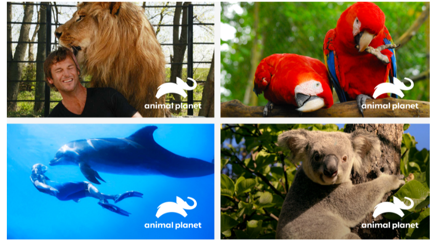
Animal Planet Logo Execution
Moving to the execution part, this is the most awful one I guess. The logo doesn’t project out on a screen. For a channel like Animal Planet, the shots are more often related to wildlife animals. The long shots and close up ones are so not matching with the elephant on the screen. The wordmark seems dull, and it feels like a kid’s channel. Now some people comment that the leap is designed in such a way that it represents the globe from underneath. Pretty neat, like the elephant is chilling on the globe instead of leaping!


Let us know what you think about the logo in the comment section below!


