Consistency had made its way out, and now, everybody seeks Dynamism. Dynamic developments are indeed, crowd-pleasing as it focuses on future trends and customer interactions. Such changes are happening everywhere. And for the year 2018, it was massive. Instagram started IGTV, Justin Bieber got Hitched, Trump stepped up his anti-media attacks, Apple upgraded to dual sim slots(at last…!!), T’Challa (Black Panther), Spiderman, and Doctor Strange turned to dust and much more. Indeed the year was like a roller coaster, subtle than the usual with all sorts of dramas, corruptions, victories, defeats and ties! The one thing, the only one thing that remained constant was “change”! And this change implies to dynamism.
In branding, dynamism is something like the cream above your latte. It needs to be fresh; otherwise, people may find it sour. In order to keep it fresh, what these big companies do, is to redevelop everything. Whether it is a logo, a design pattern, an advertisement, or the brand itself, they call for a “re”! Rebranding, redesigning, reinventing everything adds a new set of polish to the old outlook. And if it is up to the trend marks, yes, they are on the right track. Now, with this article, let us check such incredible slash weird slash worse redesigns of the year 2018 associating with rebranding or redesigning of logos. To make it simpler, let us deal with the logos instead of the whole brand. Seems fair, right?
Rotten Tomatoes
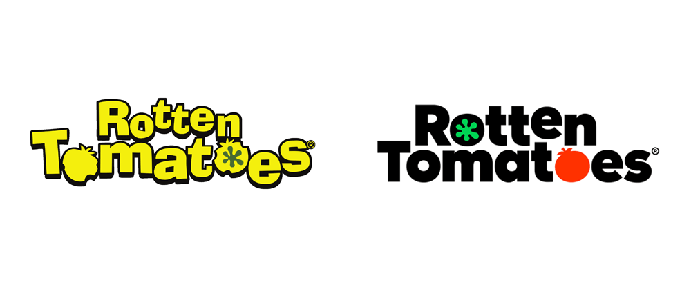
Rotten Tomatoes was in its teenage when it first got rebranded. Yes, on 2018 March, Rotten tomatoes made its first rebrand. Pentagram designed this new logo for Rotten Tomatoes after 17 years of existence. This time, the logo is more playful one, with splashy colours and fresh feeling (though it doesn’t feel “rotten”). The wordmark seems much, and hence it is easier to reproduce. But again, there was no detailing or massive illustrations. The update introduced a modern look portraying the brand’s joyful, wacky attitude in a streamlined design that works well across online and mobile platforms. The brand has used a sharper font for a cleaner presentation and has included a monogram that can be used as a social media icon.
MailChimp
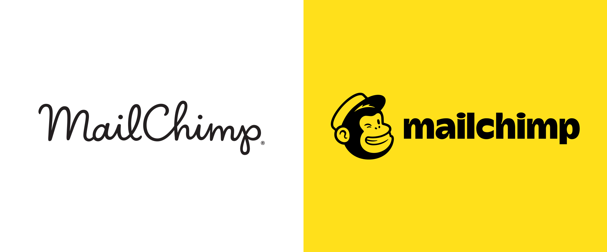
MailChimp revealed its new logo on September 2018. A redefined icon and a bold wordmark is the highlight here with the splash of a kinky, vibrant colour. And happily, Freddie doesn’t have any hierarchical issues this time! Freddie the chimp got a permanent spot alongside the bolder wordmark. The letters “M” and “C” were uppercase in the old logo, but in the new one, the wordmark is entirely lowercase. The usage of Cavendish yellow colour all over the design made the logo look a bit cartoonish, but still, with this colour upgrade, the logo regained its energetic, vibrant look. The combination of this yellow colour with the bold typeface in black seems pretty clean, and Freddy alongside makes it more lively. The chosen font is Cooper light, and it balances out the overall look. The logo made a flexible appearance, and it gives a structure to creativity through its playful and expressive presence.
Ogilvy
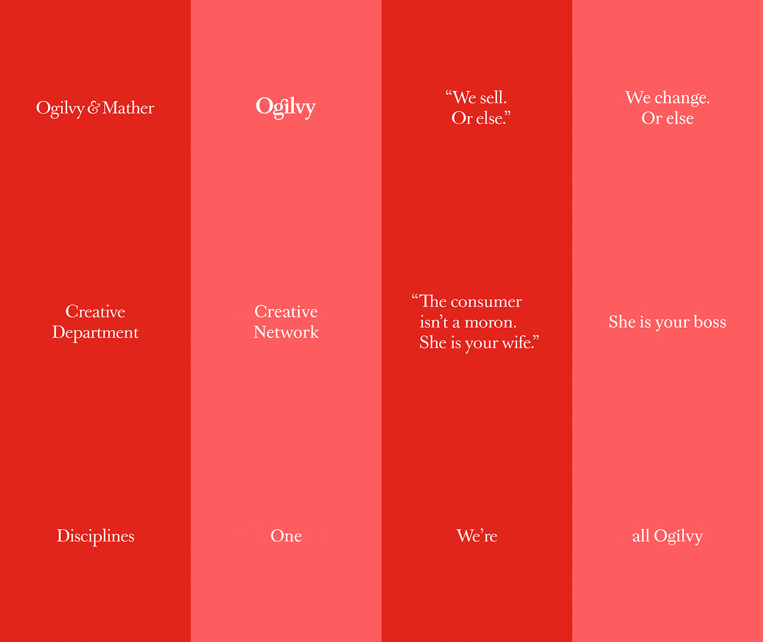
Ogilvy holds one of the top rebranding stories last year. The team says that it is one of their most significant transformations. It was more of a re-founding than that of a rebranding the company made changes from its roots to tip. Coming to the logo, what happened here is much similar to that of Mailchimp. The old logo was just a wordmark, but it was a classic one as it was a handwritten piece. That piece of work was primarily made out of a signature, but not just a signature. The founder of Ogilvy, David Ogilvy was the owner of that signature. Pointing to the latest look, the agency transitioned the signature logo into something different. Baskerville, an existing corporate typeface got induced as it enhances readability in both analogue and digital environments. They also introduced a dynamic colour palette with this rebranding to raise the vitality of the materials.
Want to know more about the rebrand, Click the link:
https://brandthechange.com/featured/ogilvy-rebranding/
Dunkin’
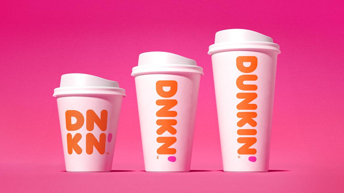
Chopping off a brand name is something that happens rarely, but Dunkin’ Donuts has done that by cutting the Donuts part from the brand name. However, they retained both the primary colours with the logo. The coffee cup is long gone, and the pink colour got narrowed to an apostrophe. And to spread the rebrand, they initiated a campaign “Just Call Us Dunkin”. Though they have chopped the donuts part from the brand name, they are not ready to give up doughnuts from their menu. The change is said to be official in January 2019, but the campaigns, patterns, beverages are all out with the new logo from September 2018. Removing the word along with the cup image had given more space to the brand being Dunkin’ and representing it with bold typeface with a splashy colour is indeed genius.
Animal Planet
A jumping blue elephant is what we got from Animal Planet last year. The rebrand is named as “Leap of Faith”. The original logo of Animal Planet was somewhat majestic and exotic as it represented the entire animal kingdom through a single logo. The new logo is pretty far from that concept as it doesn’t reveal that much. The wordmark is relatively plain, lower case alphabets with single line depiction and a tinted blue elephant. But Animal Planet had their explanation to their new rebrand. They were focusing on childhood joy, and wonder of animals while designing this logo and hence they made creative one. And this explains a lot. If we stop comparing it to the older ones, it may look appealing, at least as a representation of childhood joy!
Want to know more about this rebrand? Click the link: https://brandthechange.com/featured/animal-planet-rebranding/
Uber
![]()
After its 2016 rebrand, Uber rebranded again in the year 2018. It looks like Uber is focusing more on a minimalistic look. Uber ditched every single element from its old logo and created a new wordmark as the logo. People may have wondered as it is so plain. But, it is the typeface that is what makes the logo a relevant one. This typeface is not a regular one as it is a customised one. Uber created this typeface for their purposes and made it as a signature element. Uber chose black and white as their primary colours to enhance readability. This is actually a smart move as the colour palette goes with almost all other colours. The illustrations, Tone of voice, Photography, everything got changed with this new look.
Wanna know more about Uber rebranding? Check the blog: https://brandthechange.com/featured/taking-a-u-turn-uber-rebrands-again/
Comedy Central
Channel rebrands are far too appealing, and Comedy Central is one of the best comedy sitcoms channel had its rebrand by the end of 2018. And they call it a Brand Refresh! From logo to the thumbnail image, they claim that they are doing it all over again to amplify the user experience. Coming to the logo, the “CENTRAL” in Comedy Central was inverted before, and now they reverted it. A significant part, or to be precise, a fun element is also there. The font used is a customised one, and the brand named it as Comedy Sans! Interesting right? They haven’t done much to the C-mark as it is already perfect in portraying the brand. The wordmark is perfect this time, stable from every angle and everything seems balanced out. Say, its a 10/10 rebrand! They’ve introduced a signature colour also named as Summer Ale, a shade of chrome yellow and it works perfectly on their black canvas. Even then, it is worth saying that the new logo loses its quirky nature as the previous one had an upside down Central. That was kind of a cool interlocking since the C-mark was in between the two words. So even if it a stable rebrand, Comedy Central, people all around the word made it clear that it was not appealing as the last one.

Google Ads

Google Adwords got transformed to Google ads and through this rebranding, Google made some massive changes. The payment application Google Tez got rebranded into Google pay along with it. The new logo of google ads is pretty much similar to that of the old one but with some more vibrant colours and curved edges. The name “Google Adwords” got converted to “Google Ads” as it could offer a whole new range of advertising through it. Both the verbal identity and the visual identity had its new twist with this rebrand. These changes were done as a part of Google’s 20th birthday. This made changes in other services provided, such as Google Ad manager and Google Marketing Platform.
Read more about Google rebrands in https://brandthechange.com/case-study/google-ads/
Britannia
Britannia rebrand is another golden feather to the agency Interbrand. Not many agencies get a centenary year rebrand, but Britannia chose Interbrand in making one. The first visible change they made is to remove the red border from the logo. This is ultimately done to create better coverage for the logo. The primary colours were red, white and green earlier and with this rebrand, there is an addition of yellow colour. The brand identity is pretty much similar to that of the old one as they haven’t changed the core values. However, they made a change in tagline making it “Exiting goodness” from “Eat healthy, Think Better”. Inheriting splashy, vibrant colour tones is a sign of response, as the brand is welcoming new changes and dynamism in its veins. This concept is indeed refreshing, and at the same time, the brand preserved its identity as a heritage brand throughout.
Read more about Britannia’s centenary rebrand: https://brandthechange.com/featured/britannia-the-centenary-rebranding/
