Eucalyptus, a leading Australian digital healthcare company has developed a captivating brand for their latest offering, Compound. Specifically designed with men’s health in mind, Compound is a data-driven program that promises enhanced vitality, longevity, and performance. Let’s explore their brand development process and the distinctive elements that make Compound stand out.
Naming the Next Evolution in Men’s Vitality
Eucalyptus tapped design agency DesignStudio to craft the brand identity for their innovative men’s health platform Compound. The first step for the DesignStudio team was to devise a compelling name for the new program. In a deliberate departure from conventional norms, they chose to rebel against category codes and landed on the name ‘Compound’. This name symbolizes the long-term impact of consistent positive actions, highlighting the significance of incremental improvements that create lasting positive outcomes.
DesignStudio’s APAC principal, James Duru, expressed his excitement about working with the Compound team, emphasizing their shared vision to create something extraordinary. From the very beginning, it was evident that the team was determined to develop a product, brand, and experience with a unique perspective, setting the tone for the collaboration.
Blending Ancient Symbology and Futuristic Visions
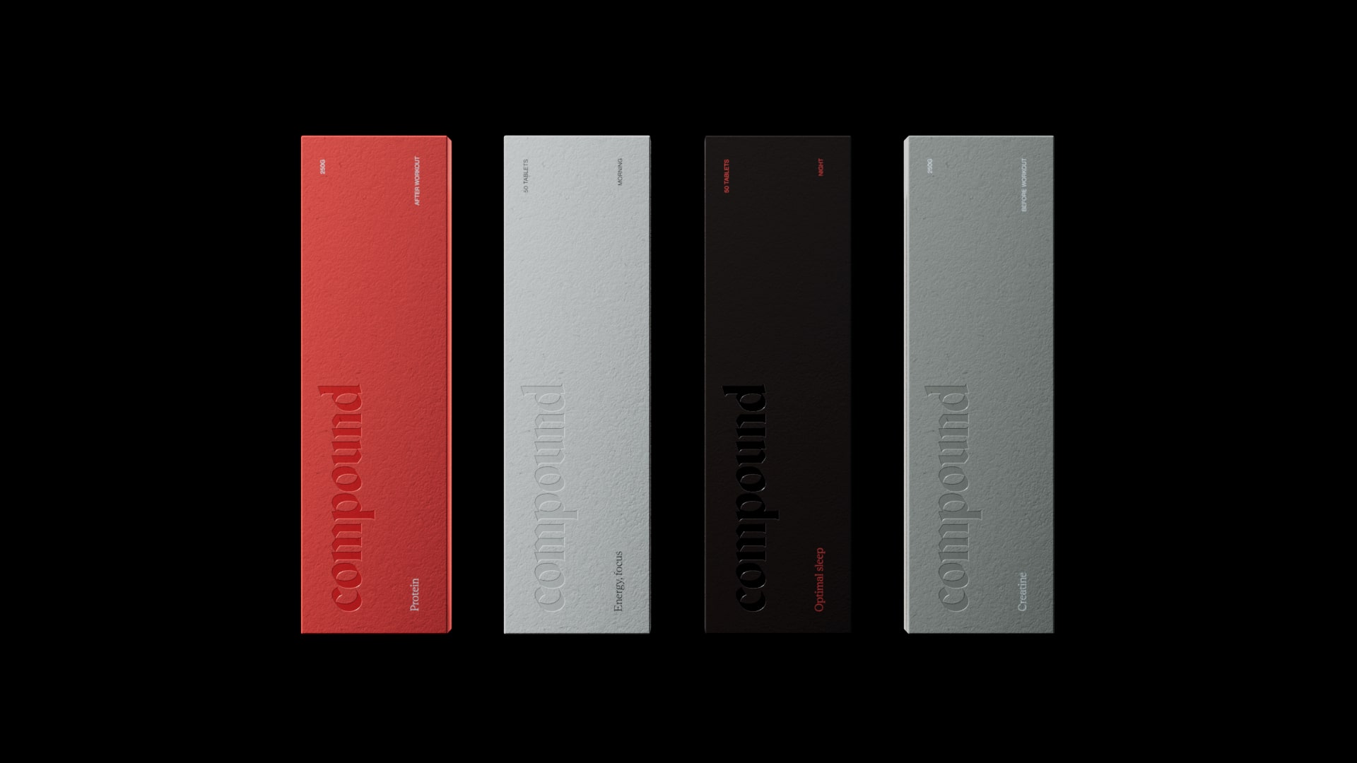
To visually represent the values of the Compound brand, DesignStudio created a wordmark and icon that strike a balance between tradition and innovation. Drawing inspiration from gothic history and ancient codes of strength and performance, the brand logo strike a careful balance – fusing gothic history’s codes of strength with futuristic visions of optimal health. This juxtaposition is echoed in the contrasting typography, merging the classical Rhetorik by AllCaps with the modern Neue Haas Grotesk.
Where Clinical Diagnostics Meet Organic Textures
Compound’s branding takes cues from the clinical processes in the program, like the fluorescent gradients reminiscent of Dexa body scans. But to keep it grounded, DesignStudio incorporated earthy tones and textures inspired by the natural world.
Personalized User Journeys in a Data-Driven Age
In the digital era of data and algorithms, DesignStudio insisted on humanizing touches throughout Compound’s user experience. Realistic 3D headshots built with PolyCam scanners and user-created, hand-drawn versions of the logo ensure each person’s path feels unique.
“A Little Weird” in All the Right Ways
According to Eucalyptus founder Charlie Gearside, DesignStudio was tasked with pushing Compound’s branding ‘somewhere new and a little weird’ to challenge conventional healthcare marketing. The final coherent-yet-unconventional identity for this pioneering men’s vitality platform achieves just that. Apart from this, user-created versions of the brand name, hand-drawn and integrated throughout the user journey, emphasize the individual nature of each user’s experience.
Final Thoughts
From its subversive name to its seamless blending of ancient and ultra-modern aesthetics, Compound’s brand identity crafted by DesignStudio embodies the forward-thinking, data-driven approach of the program itself. Yet it remains firmly rooted in humanizing elements that celebrate the highly personal journeys of its users. Compound’s data-driven program, paired with its captivating brand identity, positions it as a unique offering in the realm of men’s health. With these careful design considerations for their products, Compound is set to make a significant impact on the lives of its users.
