The Wombles have been beloved for their innovative environmental efforts, transforming waste into valuable resources long before it was trendy. Originally appearing in children’s books and later as stars on television, these characters have become a symbol of sustainability. Let’s explore how The Wombles evolved into environmental icons and how they’re embracing a refreshed identity to ensure their message stays meaningful for today’s audience.
Pioneers of Green Living
Created by Elisabeth Beresford in 1968, The Wombles are well-loved for their unwavering commitment to protecting the environment. Inspired by Beresford’s strolls through Wimbledon Common, these imaginative creatures gained fame for their knack for repurposing discarded items into something useful. Their philosophy of waste not, want not, struck a chord with the growing environmental awareness of the era, positioning them as early champions of sustainable living.
From Storybook Favorites to National Treasures
What began as a series of children’s books soon captured the public’s imagination. In the mid-1970s, The Wombles leapt from the pages onto the screen when the BBC adapted them into a charming stop-motion TV show. Their lovable characters and earth-friendly message quickly won over viewers, cementing their status as cultural icons across the UK and beyond.
A Fresh Look for a Timeless Message
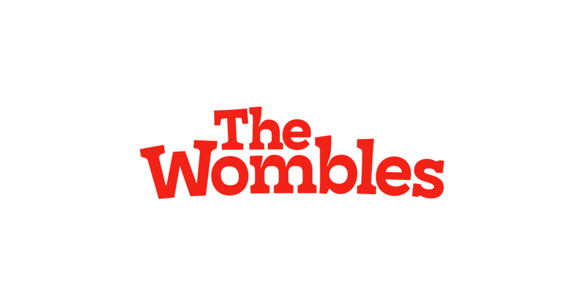
The Wombles’ new identity, created in collaboration with the design studio How&How, aims to preserve their classic charm while appealing to modern audiences. To maintain the Wombles’ classic charm while giving the brand a much-needed refresh, How&How spent significant time defining the essence of what a Womble truly represents.
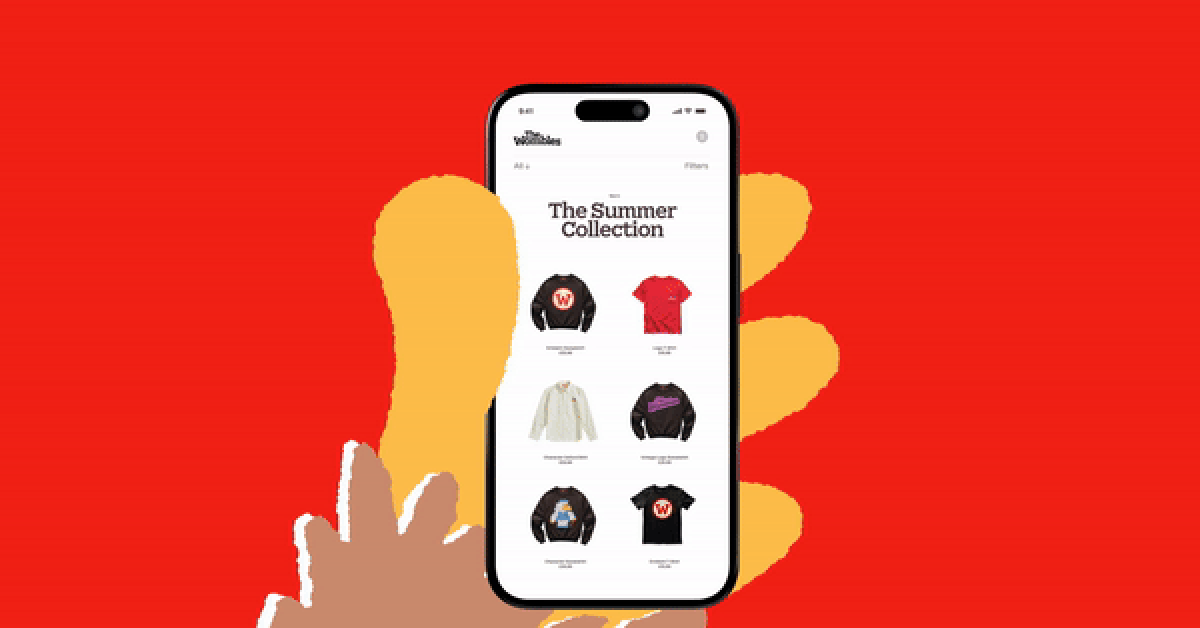
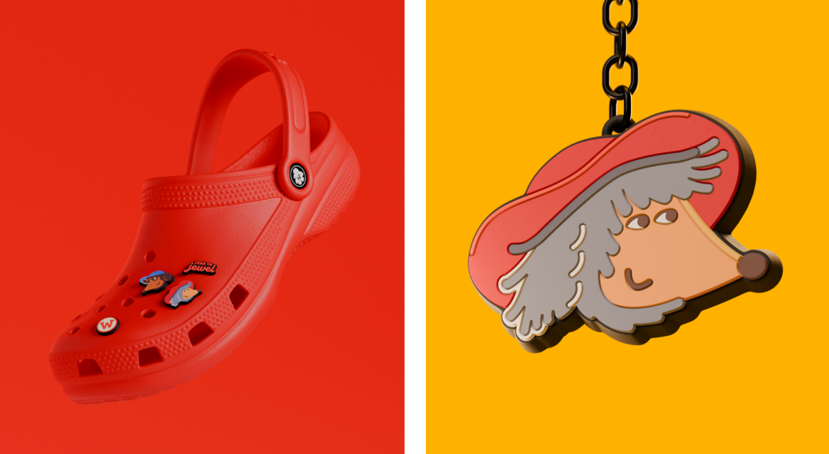
When designing the wordmark, How&How chose a typeface that echoed the “chunky slab” of the original. They selected Monokrom Foundry’s Nordvest, which features a playful twist in its stroke weights, creating a unique tone that reflects The Wombles’ eclectic nature. Alongside illustrator Remi Sorbet, the team developed a Wombles icon in various sizes, ensuring versatility for merchandise and branding.
A Celebration of Sustainability and Nostalgia
The rebrand of The Wombles is a celebration of sustainable living and environmental responsibility that resonates with modern audiences while maintaining its core values of sustainability and resourcefulness. By embracing their retro charm and integrating contemporary design elements, How&How has successfully positioned The Wombles as both a nostalgic icon and a relevant figure in the current sustainability conversation. This updated look, which blends nostalgia with modern design, ensures The Wombles’ enduring commitment to environmental stewardship remains relevant today, resonating with long-time fans and new generations alike. The result is a cohesive brand identity that brings the characters to life in a way that’s both nostalgic and fresh, making it a joyous experience to witness.
Bottomline
In a world where sustainability is increasingly important, How&How’s rebranding of The Wombles showcases the power of creativity and collaboration. By blending nostalgia with modern design, The Wombles’ new identity not only updates their visual appeal but also reaffirms their pioneering role in sustainability. This refreshed approach inspires and educates about environmental responsibility, ensuring their message remains impactful and relevant for a new generation. As a result, The Wombles solidify their status as enduring icons of environmental advocacy, proving that even beloved childhood characters can adapt and thrive in the digital age.