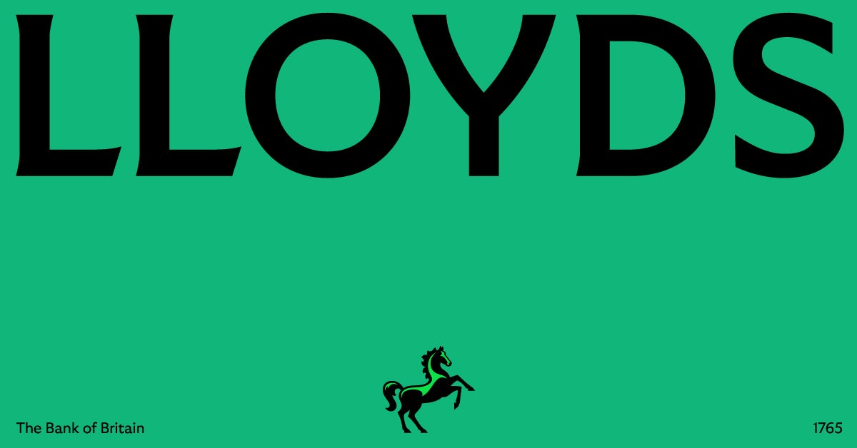
Lloyds Bank has modernized its looks with a brand new identity and updated its app to keep up with the demand. The redesign includes new colors, different language, and tone.
The British bank has updated its logo and now uses the name ‘Lloyds’ instead of ‘Lloyds Bank’ and introduced a fresh take on its iconic black horse. Moreover, the new design by Wolff Olins is made up of a complementary color palette that builds on the brand’s classic green color.
Tom Carey, Wolff Olins’ Senior Creative Director, said the sense of Britishness has been brought to the fore with a touch of humor. “It’s still the Lloyds we know and love, but redesigned for the future – bolder, wilder, and with a charming British twist. We worked together with the Lloyds design teams to make the brand more flexible, expressive and effective.”

Suresh Balaji, CMO at Lloyds Banking Group, said modern brand building is more than advertising. “A brand is the total of all experiences and using design principles across the customer ecosystem is non-negotiable for us,” he said. “We know most people call us Lloyds and this isn’t the first time in our history we’ve updated our name, but we’re keeping the color green and our black horse.”
As part of the redesign, the horse’s head now faces in the same direction as its body. This reflects Lloyds’ new positioning – Lloyds Moves Everyone Forward. The horse is powered by motion. It moves on based on canters, flicks, and gallops.
The bank stated that the Lloyds app will look different in the coming months. “Our refreshed app will include our new brand identity, as well as new features to help customers manage their finances from their mobile 24/7 all year around.”
Also Read: Serviceplan Group Records Growth Across All Agency Areas


