In recent years, we have seen a shift towards minimalist logo design, with many brands opting for simpler and flatter designs. While this approach may make sense in the age of digital marketing, a recent study by Distinctive BAT has found that it may have negative effects on brand recognition and attribution.
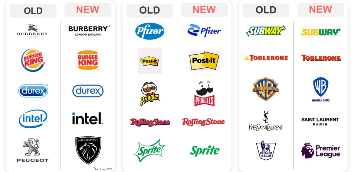
The study surveyed 750 UK consumers on a variety of old and new logos with the brand names removed. Results showed that brands that had removed major elements of their branding, such as Peugeot, Warner Brothers, and Intel, suffered from decreased brand recognition and attribution.
On the other hand, new logos for Toyota, Burger King, and Post It resulted in improved brand attribution. Distinctive BAT suggests that this is because these brands had simplified their logos while enhancing the elements that made them distinctive in the first place.
The Negative Effects of ‘Debranding’
This study highlights the dangers of ‘debranding’ i.e., stripping away elements that made a brand unique and recognizable. While the minimalist approach may be aesthetically appealing, it may lead to a loss of important equity and missed opportunities to embed additional branding assets.
To avoid these negative effects, Distinctive BAT recommends treating a logo as an embedding vehicle for additional branding devices that can be used in other ways. They also stress the importance of understanding what makes a logo distinctive and amplifying that feature. Small adjustments can answer the brief without having a major impact on consumer memory structures.
The Importance of Maintaining Distinctiveness
While it’s important to keep up with design trends, it’s crucial for brands to maintain their distinctiveness and avoid copying other brands. By taking a strategic approach to logo design and focusing on what makes a brand unique, businesses can create logos that are both memorable and effective.
Logo design is a vital aspect of creating a brand’s identity, and its importance should not be underestimated. Your logo is a visual representation of your brand, and it needs to be instantly recognizable and memorable.
Golden Rules of How to Design a Logo
![]() Creating a logo is an exciting and challenging process that requires careful consideration and planning. These golden rules can help you create a logo that is memorable, appropriate, and effective.
Creating a logo is an exciting and challenging process that requires careful consideration and planning. These golden rules can help you create a logo that is memorable, appropriate, and effective.
- Do the groundwork: The first and foremost rule of designing a logo is to do your groundwork. Get to know your client and their product. This will help you choose the strongest design direction and make it easier to get a consensus on your logo design further down the line.
- Start with a sketchpad: Using a sketchpad gives you a chance to rest your eyes from the glare of brightly lit pixels and record design ideas much more quickly and freely. Sketching makes it easier to put shapes exactly where you want them. It can also be useful to share some sketches when you’re describing design ideas to clients prior to digitizing a mark.
- Begin in black and white: Leaving color until later on in the process can allow you to focus on the idea of your logo design itself rather than on an element that’s usually much easier to change. A good idea will still be good irrespective of color. It’s the lines, shapes, and the idea itself that is most important.
- Make sure your design is relevant: A logo design needs to be relevant to the ideas, values, and activities it represents. The more appropriate your rationale behind a particular design, the easier it will be to sell the idea to a client. Remember, designers don’t just design. They sell, too.
- Create a design that’s easy to remember: A good logo design is memorable, allowing a brand to stay in a potential customer’s mind despite other brands competing for their attention. Simplicity should be your watchword here. A really simple logo can often be recalled after as little as a brief glance.
- Strive to be different: Doing something different can really help your logo design stand out. It often takes a brave client to buck a trend that they see all around them. However, showing imagination in your design portfolio is one good way to attract the kind of client you want.
- Consider the wider brand identity: Always consider how the identity works when the logo isn’t there too. One way to achieve cohesive visuals is to craft a bespoke typeface for your logo. That typeface can then also be used in marketing headlines.
- Don’t be too literal: A logo doesn’t have to show what a company does; in fact, it’s often better if it doesn’t. More abstract marks are often more memorable.
- A symbol isn’t necessary: Logos don’t always have to be symbols. It can often be a good idea to create your own wordmark, especially when the company name is unique – for example, Google, Mobil, or Pirelli. Putting an emphasis on the letters shouldn’t lead you to overdo the design flair. Wordmarks must be legible in all sizes, and your presentation should demonstrate this.
- Give people a smile: A little wit can also help your client be more successful by adding a little fun to your logo design. Adding humor to a brand’s identity won’t work for every brand or industry (it certainly won’t work for weapons manufacturers or tobacco companies), but it can make the brand stand out from others.
Final Thoughts
While it’s important to keep up with design trends, it’s crucial for brands to maintain their distinctiveness and avoid copying other brands. By taking a strategic approach to logo design and focusing on what makes a brand unique, businesses can create logos that are both memorable and effective.