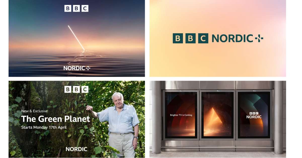
BBC Brit and BBC Earth are now merged into the new BBC Nordic, a dedicated linear channel and on-demand service that caters to audiences in Norway, Sweden, Denmark, Finland, and Iceland. To create a tailored line-up of programming, the broadcaster researched the viewing habits of its audience.
Source: weareseventeen.com
The Meditative Brand Identity of BBC Nordic
London moving image specialists Weareseventeen designed the brand identity for the new channel with meditative elements, featuring CG idents and a marque that harnesses negative space. Weareseventeen designed a motion-first identity for BBC Nordic with a recurring symbol of a light beam called a ‘prism edge.’ This symbol appears at a diagonal angle and informs a new plus-shaped marque developed for Nordic+ (the channel’s VOD offering).
The brand identity is largely meditative, aligning with the channel’s positioning as an ‘appointment to unwind.’ The prism symbol nods to the concept of ‘enlightening programming,’ while the contrast between light and dark suggests the range of programs available and the ‘seasonal extremes of the region.’ The color palette flexes between warmer and cooler tones to create a balance between upbeat and subdued tones.

Five Distinct CG Idents and Motion Behaviors
BBC Nordic launches with a total of five CG idents, each showcasing a unique motion behavior that represents a different side of the channel. Weareseventeen distilled the brand’s pillars into unique motion behaviors and inhabited them with the prism edge. For example, one ident set in a forest shows the prism moving at speed, constructed of fireflies, while the next shows a more abstract iteration. The result is a visually stunning brand identity that captures the essence of the channel and its programming.
Long story short, BBC Nordic’s rebranding by Weareseventeen is a motion-first identity with a recurring symbol of a light beam, called a ‘prism edge,’ that appears at a diagonal angle. The brand is largely meditative, allowing viewers to unwind, but it can also be adapted to suit more upbeat programming. The contrast between light and dark suggests the range of programs available, and the color palette flexes between warmer and cooler tones. The result is a cohesive brand identity that effectively represents the channel’s programming and mission.


