WeWork, the popular coworking space company, recently launched a refreshed visual brand identity. The new brand refresh is aimed at maintaining the essence of the brand while allowing the old and new assets to coexist harmoniously. Let’s explore the motivations behind their minimalistic approach to rebranding and delve into the key elements of their new visual identity.

Embracing Change while Preserving the Soul
WeWork’s decision to opt for a brand update instead of a complete overhaul reflects their commitment to preserving the core values and identity that have made them a household name in the co-working industry. By making intentionally minimal changes, WeWork ensures that their new designs can seamlessly coexist with their previous brand expression, creating a cohesive visual experience for their members and stakeholders.

The Evolution of WeWork’s Visual Identity
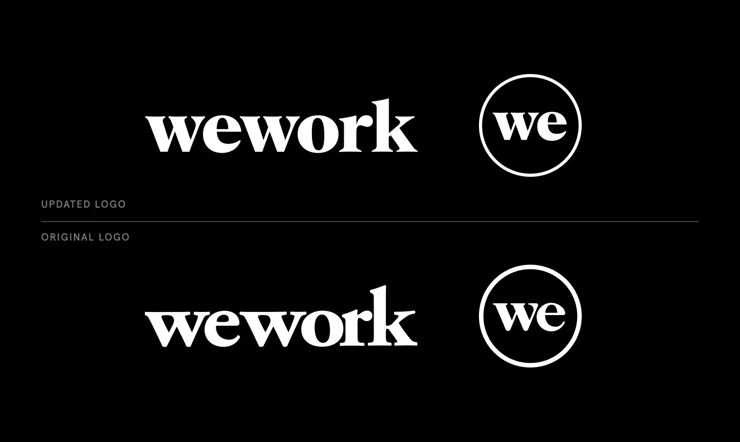
The first notable change in WeWork’s brand refresh can be observed in its new logo. The company’s previous logo had prominent serifs, which have been shortened in the new update to enhance its impact and form. This custom logo, along with a corresponding typeface, will be gradually rolled out, allowing elements of the previous brand expression to coexist with latest update in the coming months.

Exploring the Colors of WeWork’s Personality
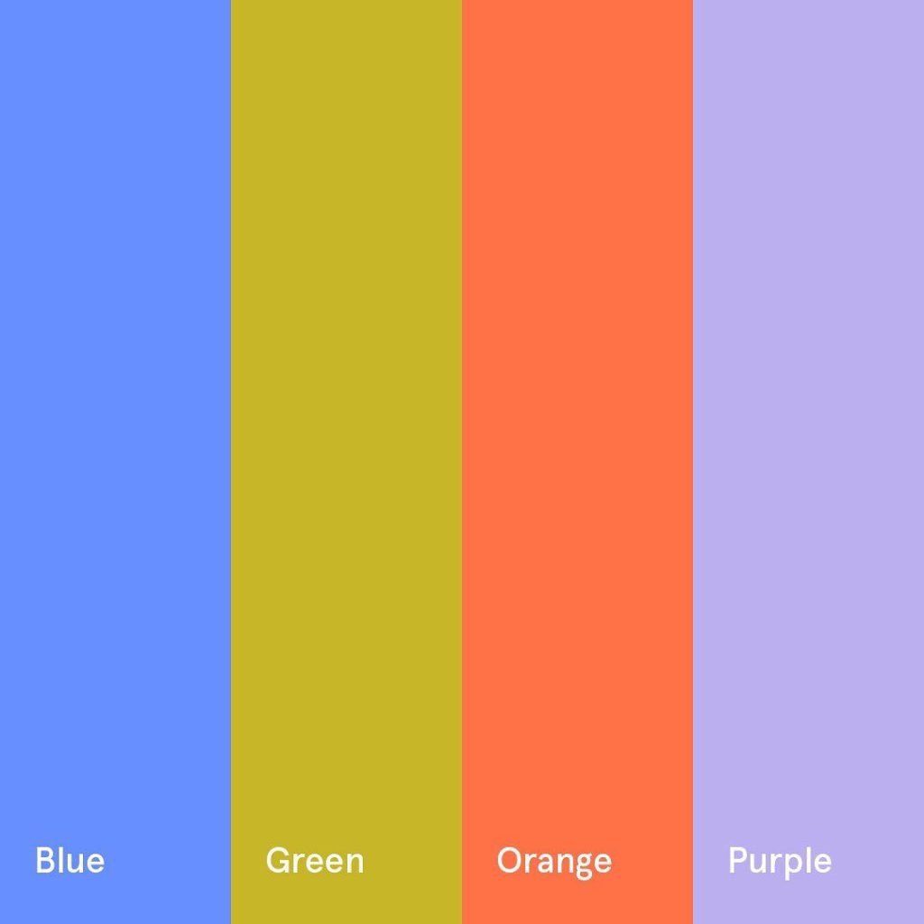
To complement WeWork’s iconic black and white logo, Franklyn, the creative agency behind the rebrand, has developed a new set of secondary colors that complement WeWork’s iconic black and white logo. These colors represent the multifaceted nature of WeWork’s personality, capturing the essence of their vibrant and dynamic community. According to Franklyn co-founder Patrick Richardson, “WeWork blurs the line between art and science, emotion and intellect; and this duality inspired the company’s new visual identity.”

Bottomline
WeWork’s subtle brand refresh, guided by the creative expertise of Franklyn, showcases their dedication to preserving the soul of the brand while embracing the need for evolution. By strategically modifying their logo and introducing a new color palette, WeWork strikes a balance between tradition and innovation. This refreshed visual identity reflects the brand’s vision for fostering an energizing and collaborative workspace, where members can experience the magic of WeWork firsthand. Stay tuned as WeWork’s new brand expression gradually unfolds in the upcoming months, blending seamlessly with their existing brand legacy.


