Pepsi has refreshed its look, paying tribute to the pop in the brand’s classic labeling, ahead of its 125th anniversary. The new logo replaces the one that has been used since 2008. “Pepsi” is featured on the white stripe, in bold, in the center of the globe – giving it a more “modern and polished” look.
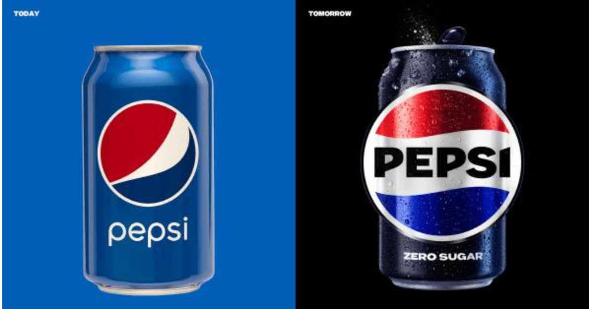
The new look will be unveiled in North America this fall in time for the brand’ 125th anniversary, and globally in 2024 to mark the brand’s next era with an eye toward the future. The new design evolves the Pepsi brand to represent its most unapologetic and enjoyable qualities. It will span across all physical and digital touchpoints, including packaging, fountain and cooler equipment, fleet, fashion, and dining.
Maintained a Bolder Mindset
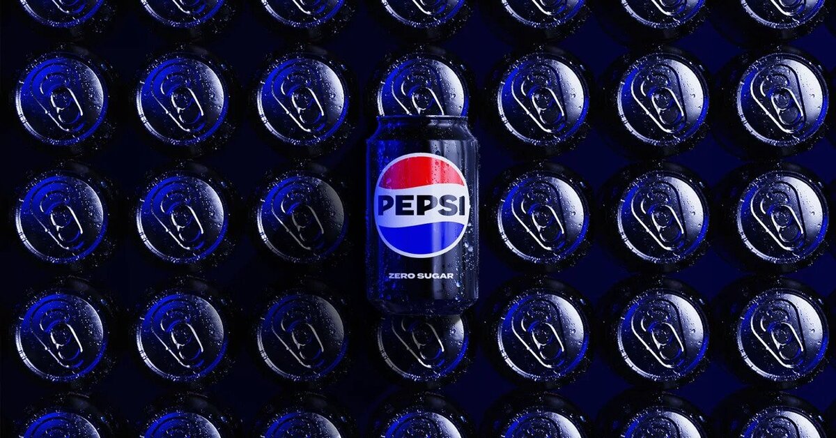
Throughout its colorful history, Pepsi has maintained a bold challenger mindset and a strong link to pop culture. Pepsi has always pushed culture forward, from reimagining the Super Bowl Halftime Show, to creating some of the most iconic ads of all time with the world’s most renowned musicians and actors, to delivering one-of-a-kind fan experiences in a timely way. But it has simultaneously remained iconic and timeless.
The brand has reinvented itself with brave marketing and product innovation, from creating its own television shows, exploring Web3 and introducing compelling new varieties over the years, including the recent Nitro Pepsi, Pepsi x Peeps, Pepsi for SodaStream, and an improved Pepsi Zero Sugar taste.
Pepsi wants to help fans choose more moments of unapologetic enjoyment. Its revitalized and distinct design in an increasingly digital world introduces movement and animation into the visual system. It unlocks more flexibility for Pepsi to move between physical and digital spaces, from retail shelves to the metaverse. The new look also allows for seamless and creative collaboration with partners and retailers, and more versatility to engage fans in the places they shop, dine and play.
Compelling and Holistic Story
Mauro Porcini, PepsiCo chief design officer, said the goal in reimagining the logo was to infuse great energy and confidence and boldness. “At PepsiCo, we design our brands to tell a compelling and holistic story. Pepsi is a shining example of a brand that has consistently reinvented itself over 125 years to remain a part of pop culture and a part of people’s lives. We designed the new brand identity to connect future generations with our brand’s heritage, marrying distinction from our history with contemporary elements to signal our bold vision for what’s to come.”
Todd Kaplan, chief marketing officer, Pepsi, said Pepsi is an iconic brand that is constantly evolving with the times. “We couldn’t be more excited to begin a new era for Pepsi, as this exciting new and modern look will drive brand distinction to show up bigger and bolder, and help people find new ways to unapologetically enjoy the things they love.”
Pepsi’s new visual system brings out the best of the brand’s rich heritage, while taking a giant leap forward to set it up for success in an increasingly digital world.
