Studio Theatre, a renowned cultural hub in Washington, D.C., has recently gone through a significant rebranding process. This rebranding aims to not only emphasize the theatre’s ambitious programming but also create a more welcoming and accessible space for the local community. Let’s explore the exciting changes that Studio Theatre has embraced, highlighting its imaginative identity, typography choices, color palette, and captivating visual elements.
The Groundbreaking Identity
Studio Theatre, a hub for socially relevant and artistically daring productions, recognized the importance of aligning its appearance with its ambitious programming. To create a more welcoming and accessible space for the local community, they collaborated with Abbott Miller of the renowned design firm Pentagram. This esteemed theatre, founded in 1978, has long been a haven for socially conscious and artistically daring productions, attracting ‘today’s edgiest playwrights’, according to Variety magazine. However, the theatre’s team felt the need for a fresh look and feel to better reflect its ambitious programming and connect with the local community.
With the guidance of Abbott Miller and Pentagram, the theatre’s new identity celebrates both the groundbreaking talent found within its walls and the industrial past of the Studio complex, once a factory. This rebranding honors Studio’s history while positioning it as a contemporary and forward-facing institution.
Typography at the Forefront
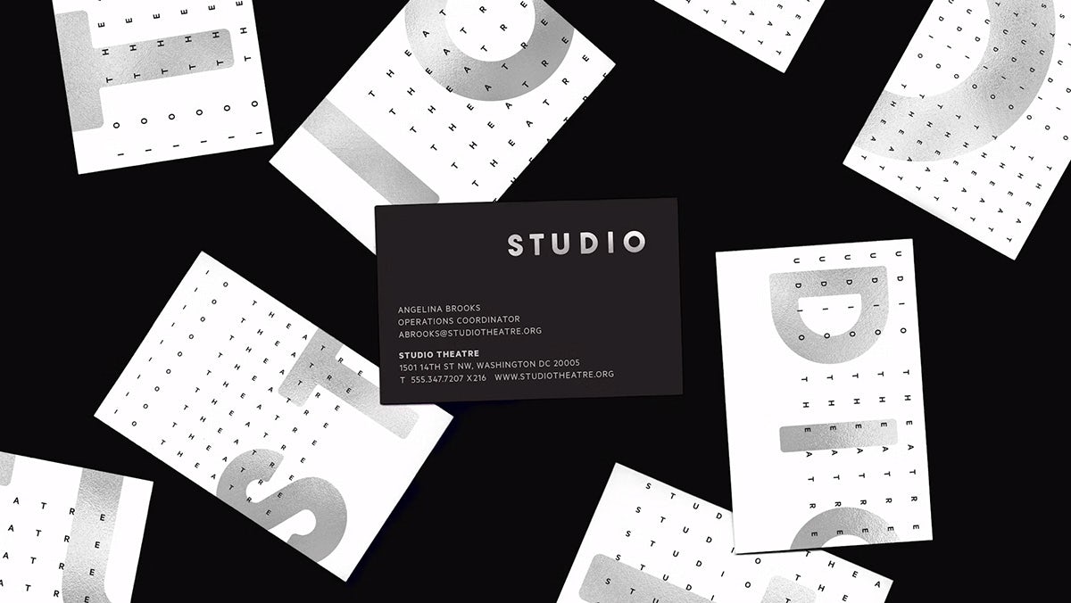
The typography chosen for Studio Theatre’s rebranding plays a crucial role in capturing the essence of the institution. The non-stencil version of the utilitarian heavyweight font AType, designed by Pentagram partner Matt Willey, takes center stage across Studio’s primary communications and its wordmark logo. This choice reflects the theatre’s bold and edgy character. Complemented by the geometric sans Metric from Klim Type Foundry and the serif Publico from Commercial Type, Studio Theatre creates a cohesive visual language that resonates with its audience.
The Palette of Personality
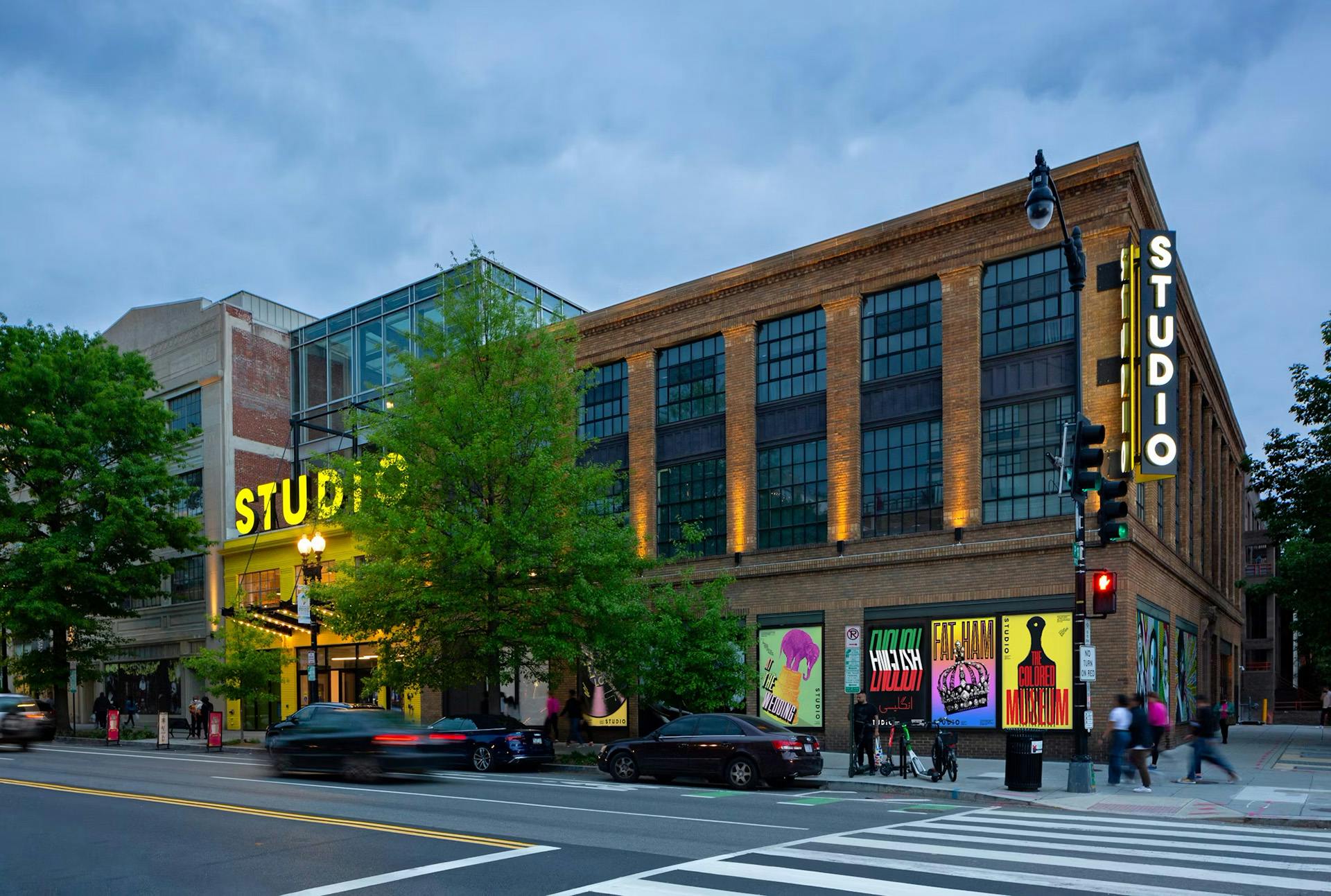
The color palette selected for Studio Theatre’s rebranding consists of vibrant yellow, classic black, and crisp white. The deliberate incorporation of yellow serves multiple purposes. Firstly, it effectively captures the eye and highlights the theater’s prominent position along the 14th Street corridor. Secondly, the strategic use of yellow fosters an atmosphere that is visually appealing but also welcoming and dynamic, setting the stage for an engaging and memorable experience for theatergoers.
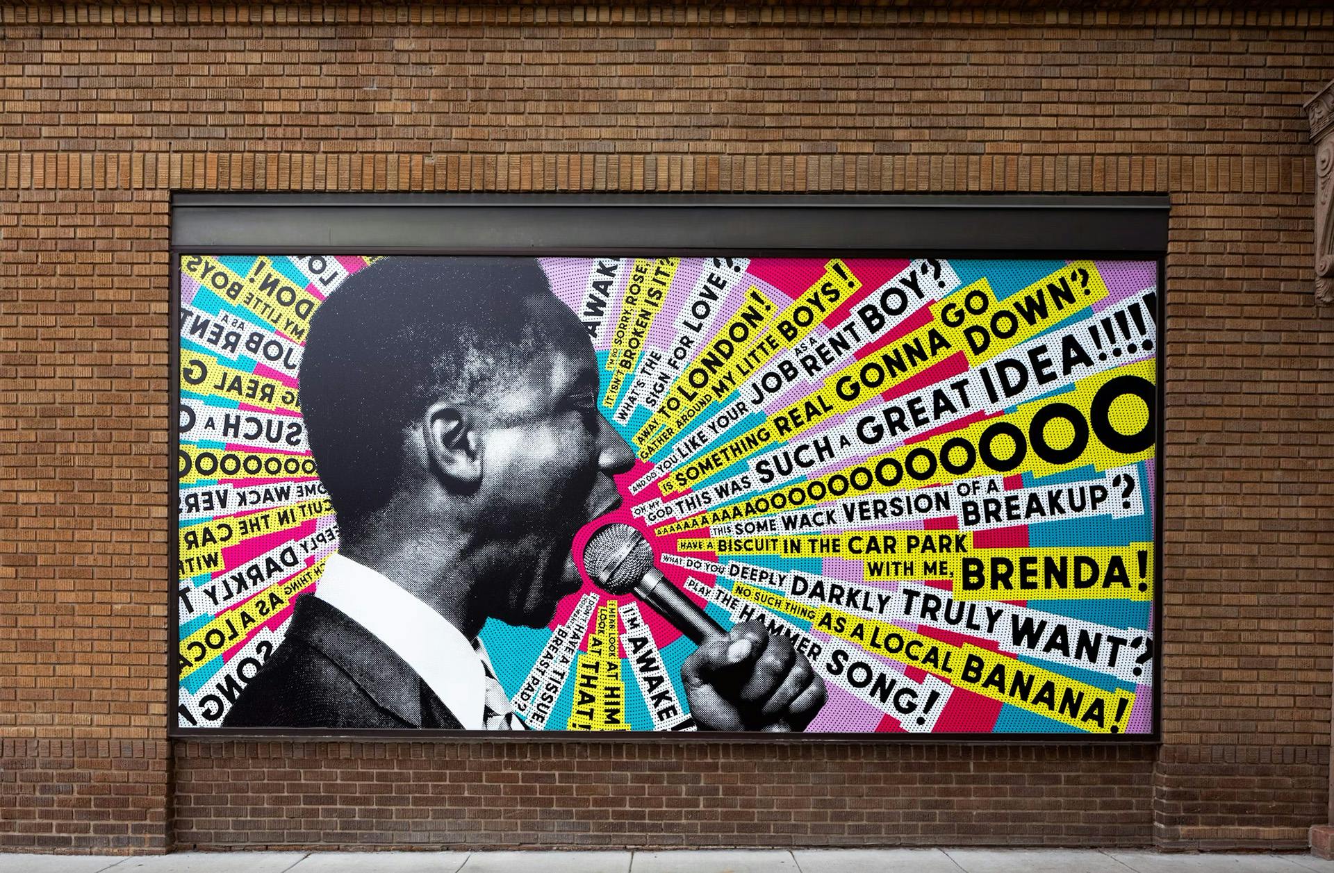
A Celebration of Local Legacy
According to Pentagram, the redesigned facade of Studio Theatre announces it as a vibrant personality within its neighborhood. This vibrancy extends to the interior as well, with two large-scale murals composed of materials from the Studio archive, showcasing the institution’s rich history.
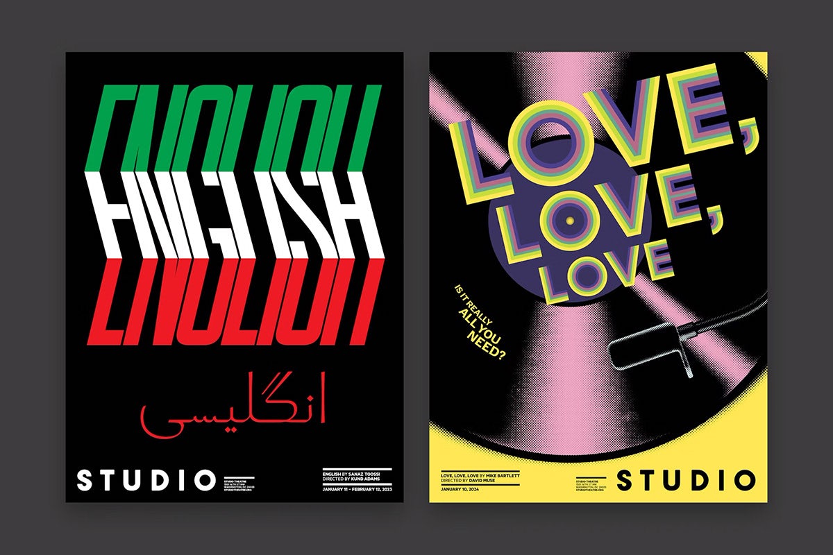
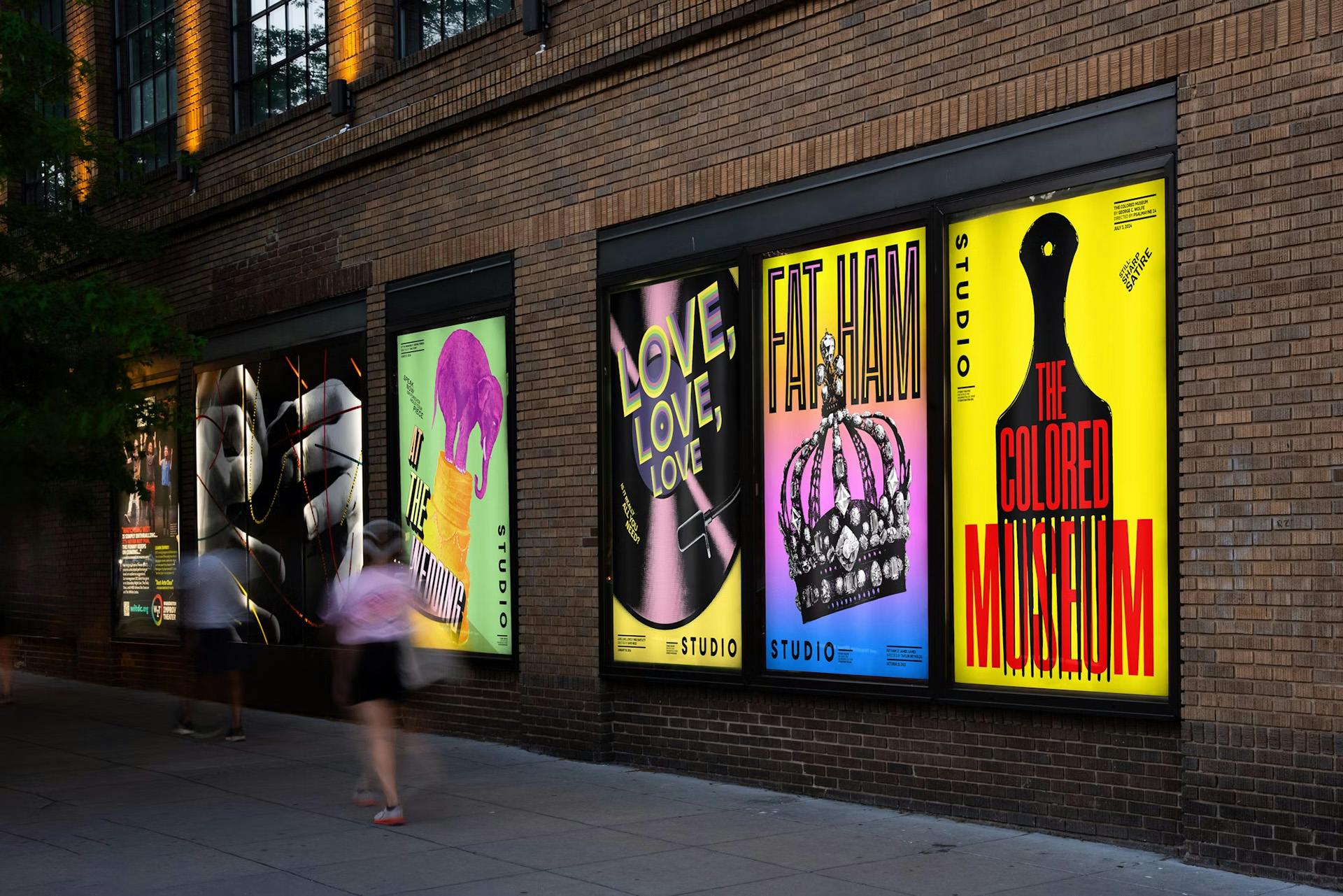
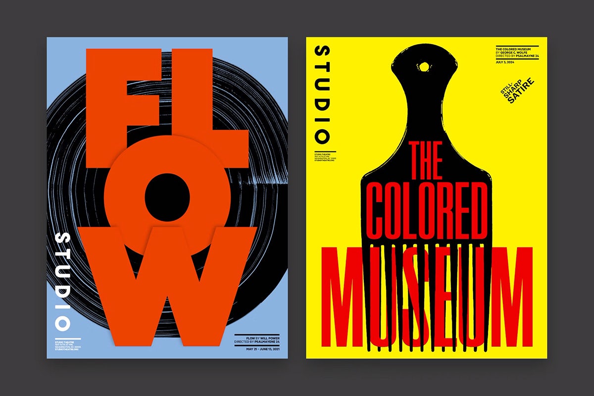
At the same time, the exterior features a series of bold poster designs featuring original Studio productions like Fat Ham, English, The Hot Wing King, and White Noise. These visually striking posters, blending collage and layering techniques, contrast beautifully with the bare brick walls and the iconic yellow entrance, capturing the attention of passers-by and establishing Studio Theatre as a standout presence in its community.
The Big Picture
With its new identity, Studio Theatre stands ready to captivate audiences, proving that innovation and imagination in design are at the heart of every performance. The rebranding reflects the institution’s dedication to pushing boundaries in design and providing a welcoming space for both artists and audiences alike.
Also Read: Discover The Evolution of a Childhood Classic In New Brand Identity of American Girl


