The ‘State of the Times’ is an annual employee conference held by The New York Times that showcases their journalistic excellence and innovation. This year, they have rebranded with a new identity and motion system that represents the essence of their media landscape. Let’s learn more about their latest identity.

Crafting a Visual Symphony
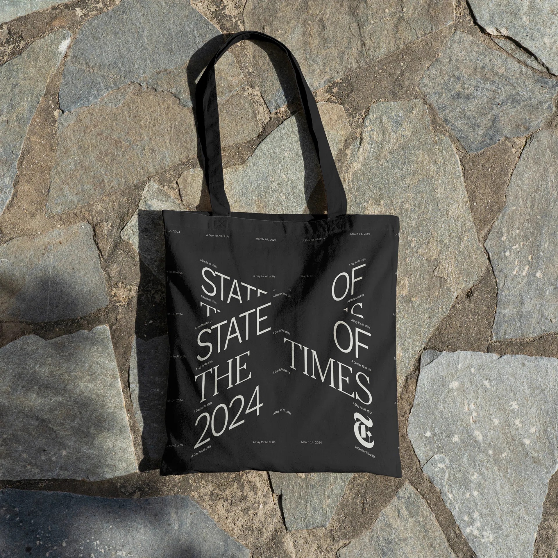
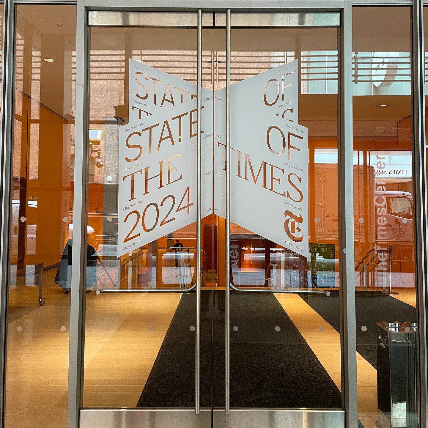
CC Studio, in a noteworthy collaboration, has crafted this eye-catching identity and motion system, for the NYT. Led by the creative vision of Jessi Brattengeier and the typographic expertise of Matthew Carter, embarked on a journey to create a visual narrative that speaks volumes. The team handled the typography with a keen understanding of the newspaper’s established visual language. They used NYT Franklin and NYT Cheltenham in equal size and weight to give the identity a contemporary edge while maintaining recognizability. The ‘bundle’ concept became the cornerstone of the design, representing the vast array of content and media streams that the NYT operates within. The static visuals set the stage, building anticipation through promotional materials and signposting, while the animated visuals brought a rhythmic cohesion to the event, playing a pivotal role in the conference’s storytelling.

A Nod to History with a Modern Twist
The standout ‘X’ isometric graphic is a tribute to the NYT’s storied past and its digital evolution, reminiscent of the tactile experience of flipping through pages. This graphic, alongside a vibrant color palette inspired by Wong Kar Wei’s cinematic flair, offers a stark contrast to the traditional black-and-white culture of the newspaper. The motion graphics further reinforce the ‘bundle’ theme, with their perpetual motion and three-dimensional perspectives, symbolizing the endless stream of stories and ideas that flow through the NYT. On the other hand, the key titles were refined to balance communication and legibility.

Final Thoughts
CC Studio’s fresh design for The New York Times’ annual conference perfectly encapsulates the spirit of the event. The vibrant identity and motion system, with their thoughtful interplay of color, motion, and typography, create a visually captivating experience that echoes the newspaper’s rich content diversity and expansive reach. It’s a harmonious blend of tradition and forward-thinking, a visual symphony that resonates with the employees and the ethos of the NYT. With this rebranding, the conference not only celebrates the present but also sets the stage for the future of media and journalism.