Fluz, the collaborative earning app based in New York, is here to make your wallet feel less. They have undergone a colorful rebrand that’ll make your eyes pop and your bank account sing. Leveraging the brand essence of ‘Life on Max’ and the concept of maximizing cashback, Fluz aims to attract a younger demographic. This strategic shift combines financial transactions with community engagement to create an inclusive and vibrant identity. Let’s explore the exciting details of Fluz’s brand revamp and how it resonates with the target audience.

Enhancing the Brand Essence through Design
Fluz has centered its new design, created in collaboration with design studio Koto, around the brand essence of ‘Life on Max.’ By leveraging the concept of maximizing cashback, Fluz seeks to appeal to a demographic aged 18 to 32. This strategic collaboration blends financial transactions with community engagement, creating an inclusive and vibrant brand identity that resonates with the target audience.

Bold Design Elements for a Lasting Impact
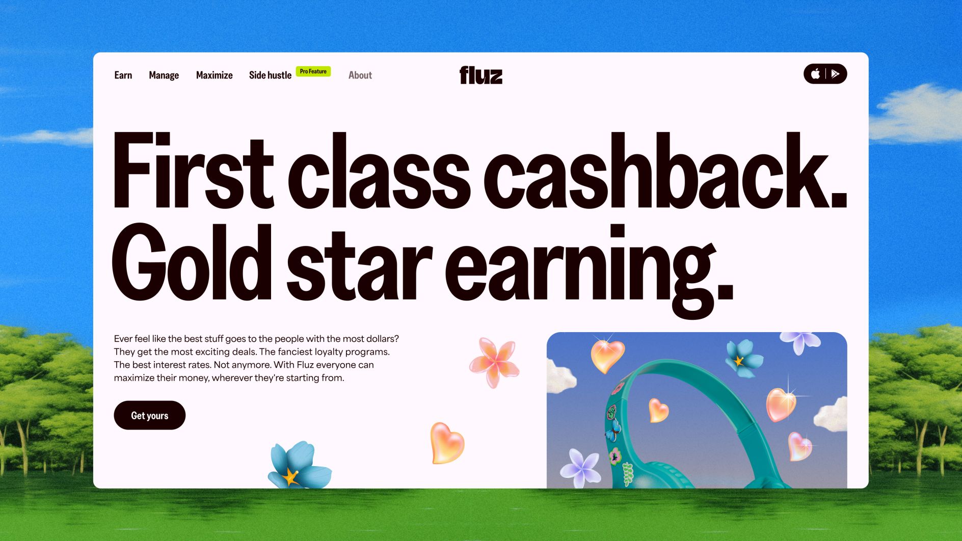
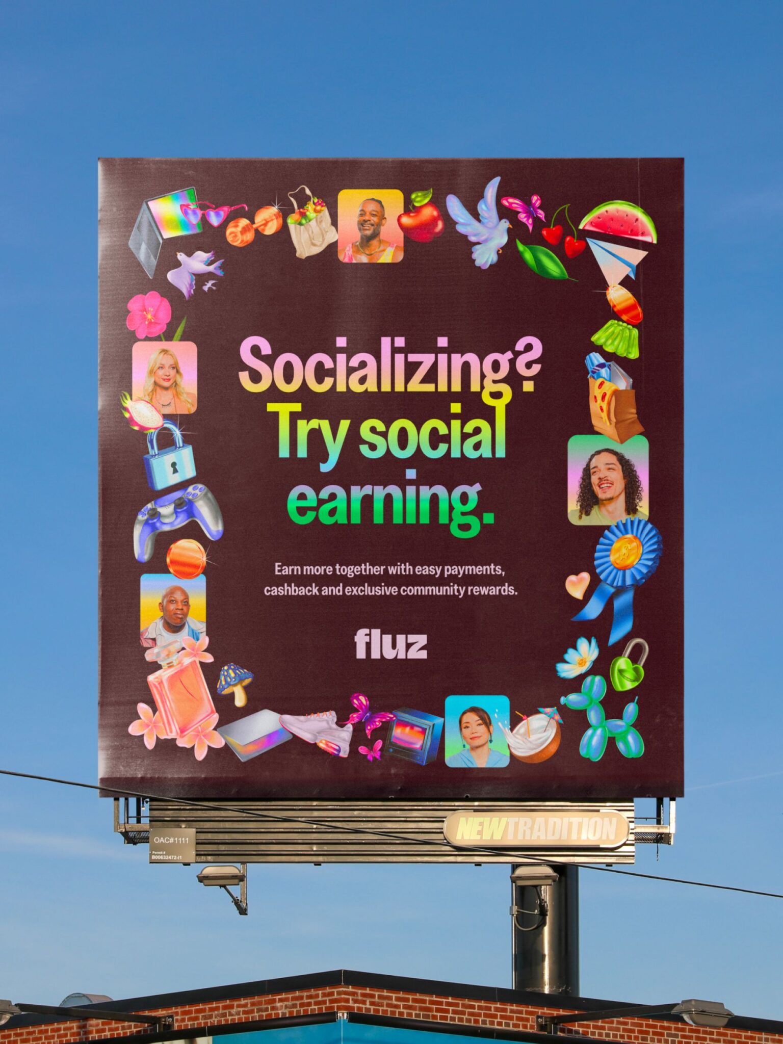
As part of the rebrand, Fluz has unveiled a bold and confident logo as an entry point into the brand world. The updated design aims to make a powerful impression on users. The brand’s colour palette features ethereal tones and dark contrasts, carefully chosen to enhance text legibility and create visual impact. The primary typography, the playful Greed Condensed Semibold, exudes energy and dynamism across various touchpoints. Complementing this, the secondary typeface, Area, adds clarity and cohesion to the overall design language. Combining these design elements creates a visually captivating and inclusive brand identity for Fluz.

The color palette combines a lively range of colors with strong differences in darkness. This thoughtful combination guarantees that the text is easy to read and has a powerful visual presence. There are three types of gradients—Calm, Expressive, and Max—that are used in the new identity which inject bursts of dynamism into Fluz’s communication.

Three-Step Recipe for Brand Domination
Arthur Foilard, the creative director at Koto, emphasizes the importance of three crucial elements that ensure Fluz’s long-term influence:
- Consistency, achieved through the respectful utilization of brand assets across all platforms, thanks to strong collaboration with the founder and the team.
- Flexibility, which involves ensuring that every interaction point conveys a distinct Fluz identity.
- Distinctiveness, which entails staying true to the original vision when making brand and business decisions.
By incorporating these valuable insights, it is evident that Koto’s Fluz’s rebrand isn’t just about aesthetics—it’s about capturing Gen Z’s attention and creating a lasting impression.
Bottomline
Fluz’s partnership with Koto has resulted in a vibrant rebrand that aligns with the brand essence of ‘Life on Max’ and appeals to a younger demographic. The collaboration successfully blends financial transactions with community engagement, creating an inclusive and vibrant brand identity. The bold logo design, carefully chosen colour palette, and playful typography all contribute to a lasting impact. Fluz’s commitment to consistency, flexibility, and distinctiveness ensures that the brand’s vision is brought to life and resonates with its target audience. This rebrand positions Fluz as a dynamic and innovative platform for maximizing financial potential while fostering a sense of community.
Also Read: Potluck’s New Identity: Brightly Colored Branding Celebrates Korean Tradition


