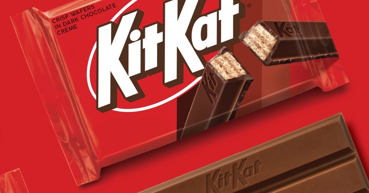
Kit Kat in the United States is sporting a refreshed look thanks to Sterling Brands which has given the beloved chocolate-covered wafer a new packaging design. The logo features a more robust and dynamic appearance.
The new look celebrates Kit Kat’s distinctive crispy, creamy taste and the energetic vibe that is often associated with the brand. It activated the brand with the upbeat, kinetic energy that Kit Kat’s iconic ‘break’ is known for. Kit Kat features a refreshed logo design and a sleeker look.
Don Childs, executive creative director at Sterling Brands, said they worked towards amplifying Kit Kat’s uniquely light, crispy and creamy product, celebrating the ritual of the eating experience, and bring depth and humanity to the brand personality. “Our strategic and creative leads work together from start to finish, to balance the data-driven decision-making with boundary-pushing design.”

Kit Kat’s new typography has sharper straight lines minus the inner shadow. It stands out from the red background with the help of chunky drop shadows. Moreover, the new logo looks thinner and has a white ring around the text. It gives a more symmetrical and sophisticated touch to the overall design overhaul.
Consumers will also notice that the words ‘Kit Kat’ are closer together, giving it a compact look. Kit Kat is still very much italicized, but slants towards the right.
Also Read: Cannes Lions and Effie to Power Drive Creativity in Marketing: Ascential On its New Acquisition


