ESN, which stands for Elite Sports Nutrition is Germany’s leading sports nutrition brand, offering a wide range of products for athletes and fitness enthusiasts. However, over time, the brand had lost its edge and identity and needed a makeover to stand out in physical retail spaces and online. To achieve this, ESN revamped its visual identity and created a more impactful and distinct brand experience. Let’s explore how the new identity transformed ESN into a stronger, bolder, and more dynamic brand.

Evolving the Visual Identity
One of the key aspects of the rebranding process was the redesign of ESN’s logo. The new logo, more legible and impactful, pays homage to the brand’s heritage while incorporating a bold, simple, and energetic design. By softening the corners and adding motion and movement, the logo now feels more progressive and aligned with ESN’s identity. For this Robot Food, the branding agency behind the rebranding of ESN, first analyzed the existing identity of the brand and found that it had a unique selling point of focusing on performance and quality.
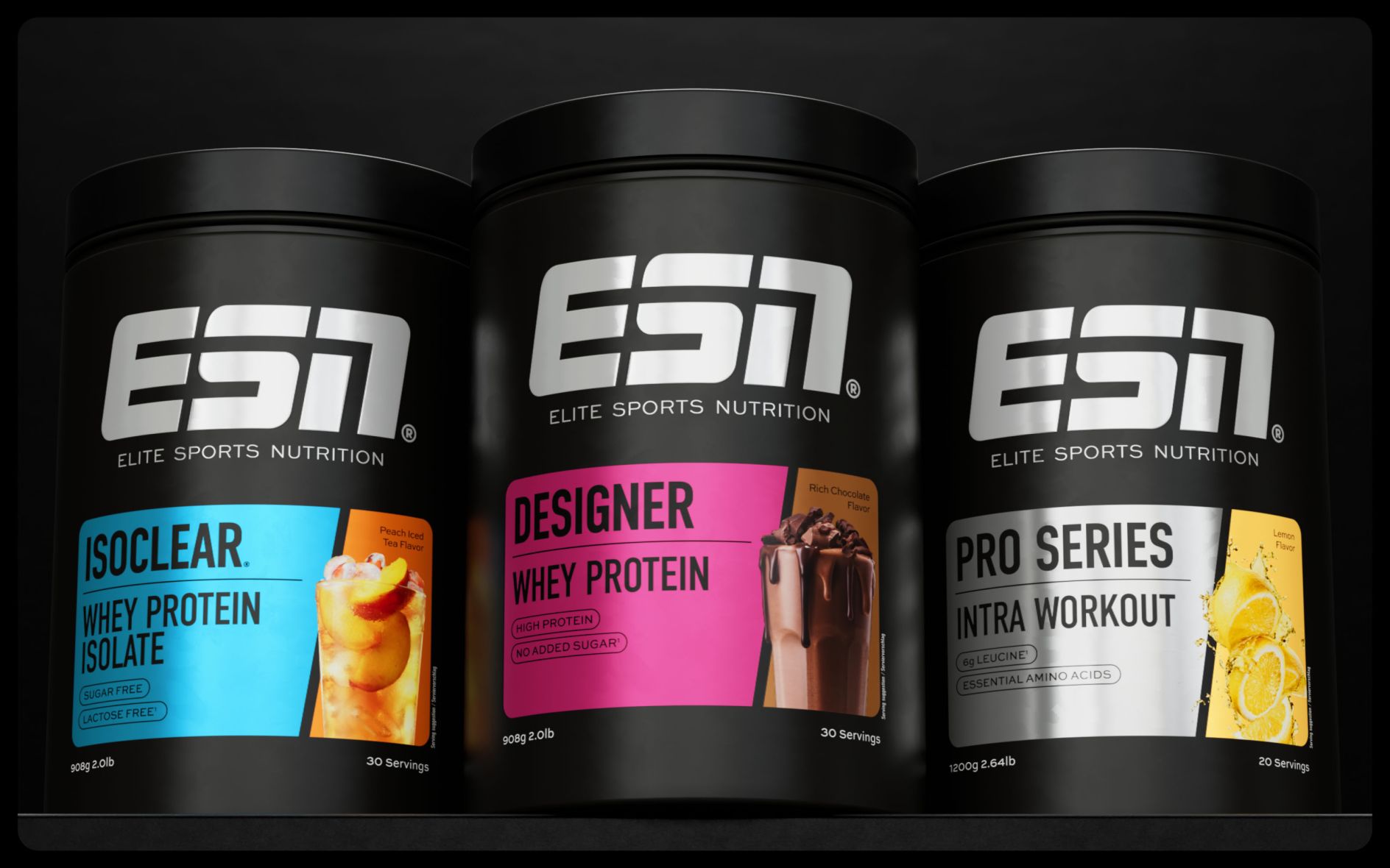
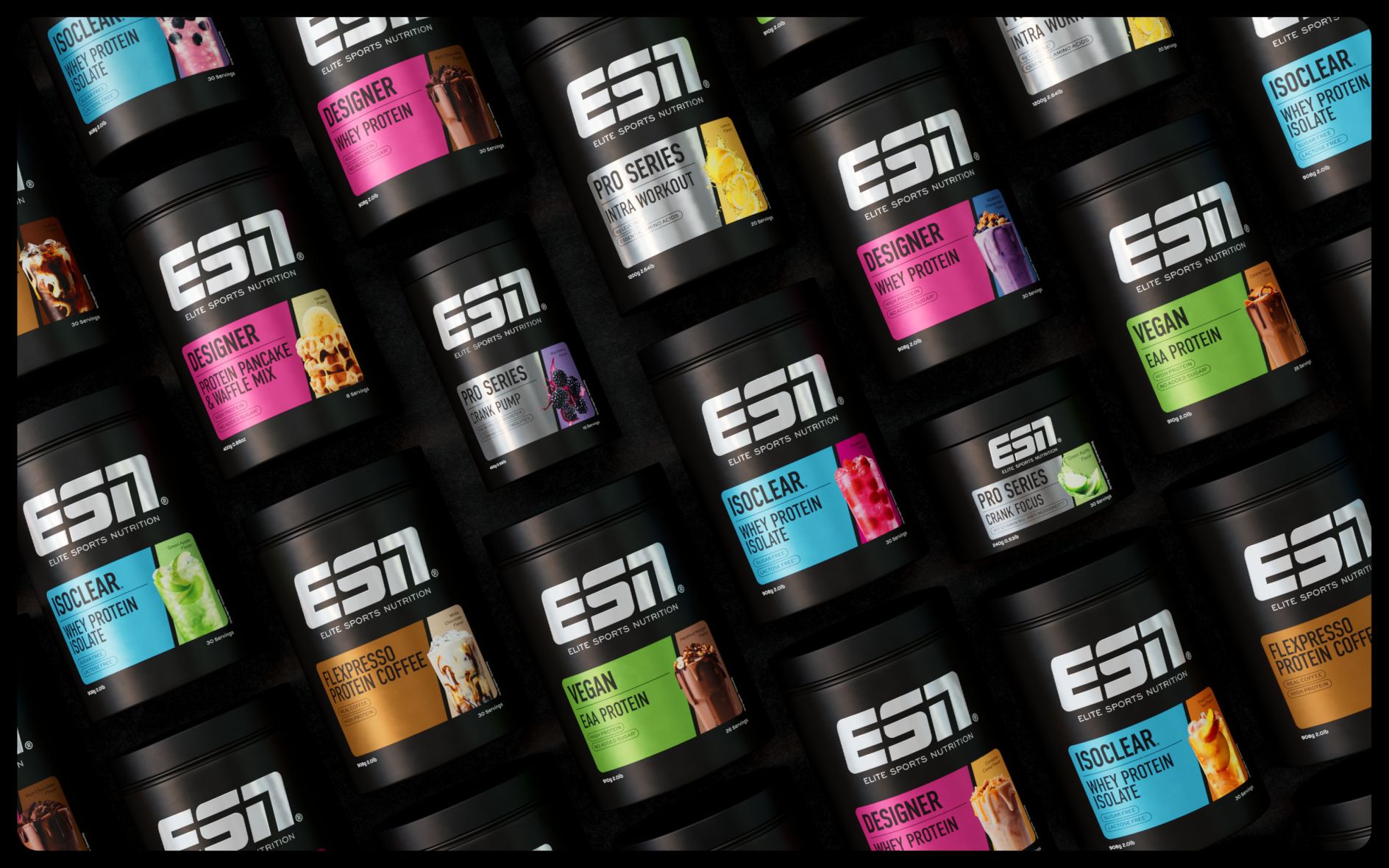
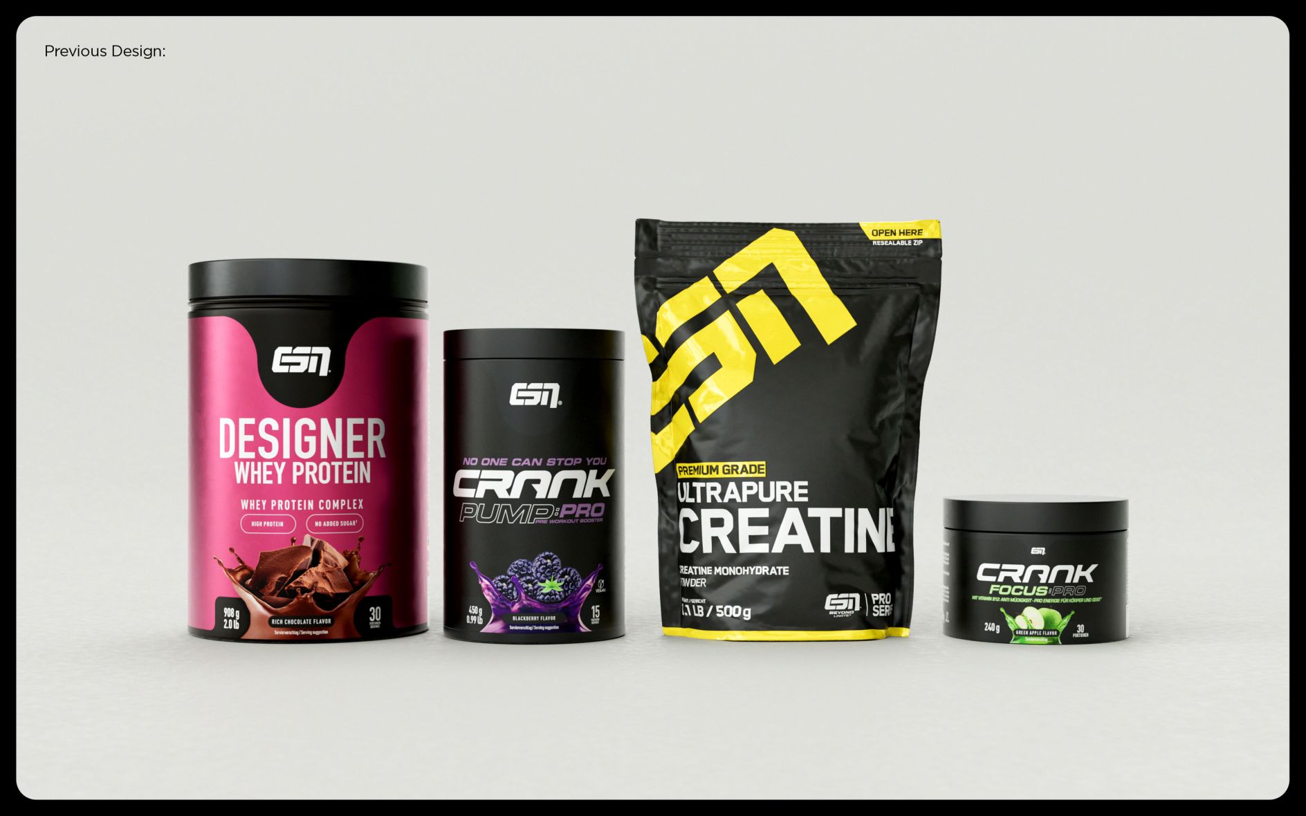
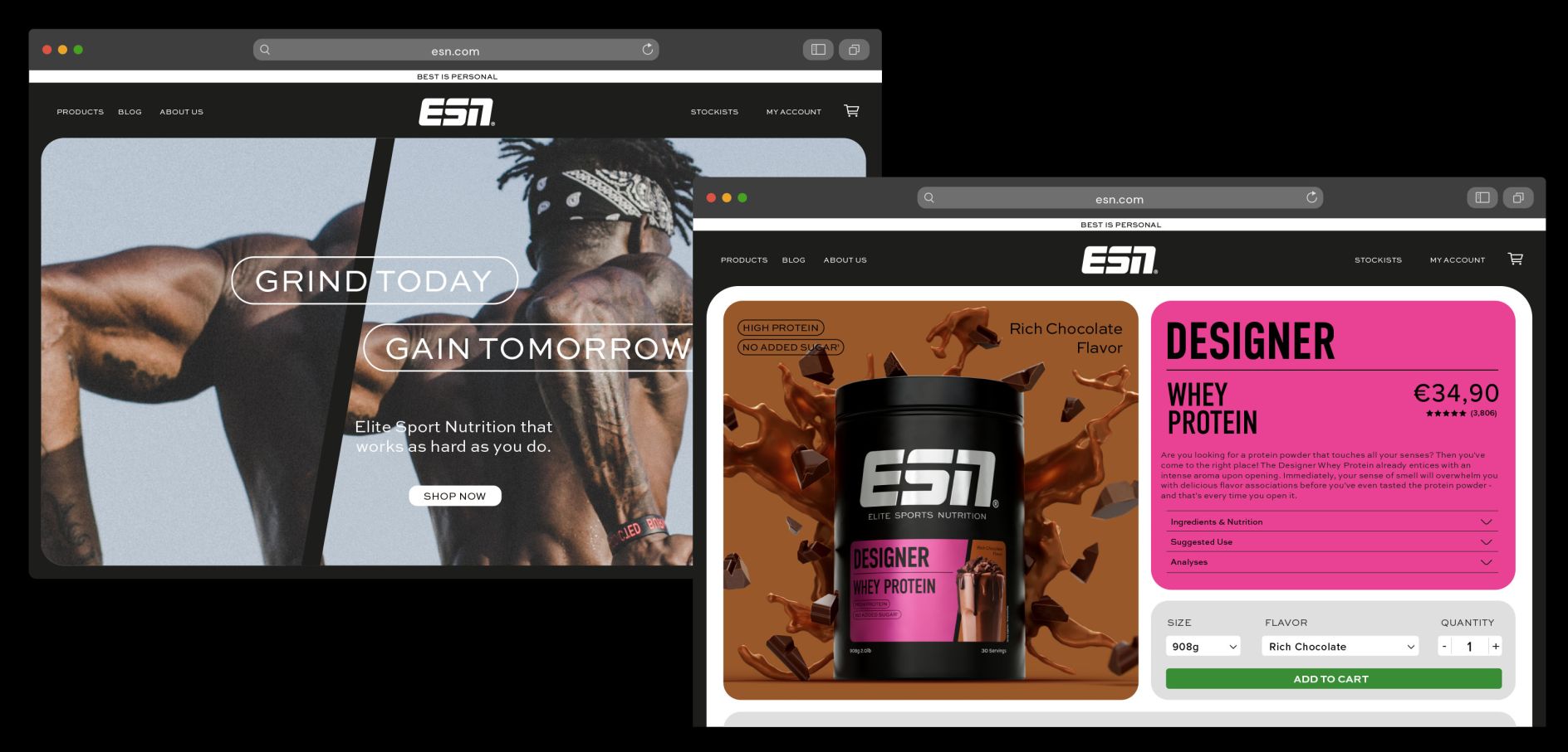
However, this strength was not reflected in the visual identity, which had become generic over the years. Robot Food then redesigned the logo and created a design system that accommodates ESN’s diverse portfolio of products, using distinctive design elements such as the ‘dynamic cut’ to create a consistent and recognizable look and feel. The primary branding colors of black and white were retained, while an additional range of colors was introduced to add vibrancy and differentiation to the product portfolio.
Typography and Photography
Robot Food carefully selected typography that reflects the attitudes of the ESN brand. The clean and modern suite of four typefaces adds character and clarity, setting ESN apart from its competitors. The headline typeface, Din Condensed, is complemented by a utility typeface, Sweet Sans Pro Regular, in the body copy.
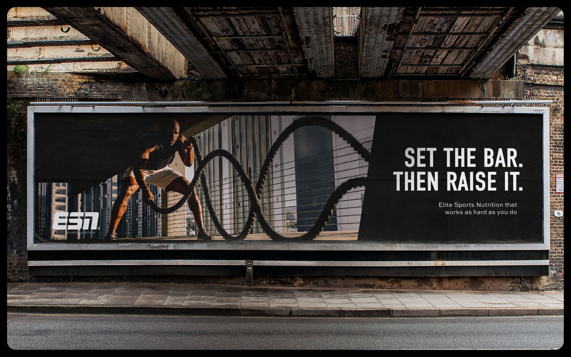
To bring the new identity to life, Robot Food created a suite of photography that showcases both the ingredient credentials and the ‘crave-worthy’ flavor of ESN’s products. On-pack photography features serving suggestions to build appetite appeal, while lifestyle photography captures athletes at the peak of their performance, emphasizing the constant push for excellence and self-improvement. These images, shot expressively and dynamically, highlight ESN’s commitment to flavor and quality.
The Power of Design
The rebranding process aimed to cement ESN’s leadership position in the sports nutrition category while remaining recognizable to existing customers. By creating a consistent and ownable design system, Robot Food provided ESN with the flexibility to manage its large product portfolio while ensuring each product remains unique and exciting. The resulting brand evolution reflects ESN’s DNA and positions the brand as a trusted workout buddy, offering science-based expertise and a winning mindset.

A Winning Partnership
ESN’s rebranding by Robot Food was a big success. The new visual identity reflects the brand’s leadership position, showcases product quality and performance, and appeals to its core audience. The design system has improved the shopping experience and created a memorable and distinctive brand identity. Marcel Henke, ESN’s creative director, is extremely pleased with the outcome and says that the new visual identity better represents their brand’s quality and gives them flexibility in managing their portfolio.
Final Thoughts
Robot Food’s collaboration with ESN strengthened ESN’s visual identity and brand positioning. By reclaiming ESN’s unique color palette, redesigning the logo, and implementing a dynamic design framework, Robot Food created a cohesive and impactful brand experience. The carefully selected typography and photography further enhanced ESN’s brand image, while the flexible design system allowed for differentiation across the product range. With an solution so intelligently engineered, ESN secures supplement supremacy, ESN is well-positioned to continue its leadership in the sports nutrition industry.

