Sundance, the U.S.’s longest-running independent film festival, has launched a new logo as part of the brand’s identity makeover. The new logo design drew inspiration from the standard cinematic widescreen aspect ratio of 16:9. It will serve as a framing device, framing footage and stills from the festival archive.
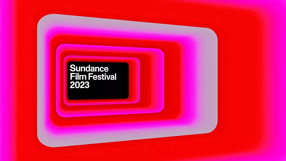
The new logo, designed by Porto Rocha – a New York creative agency, is just one part of the Sundance Film Festival’s first long-term brand identity. It underwent a more permanent identity to cover all assets and reinforce public recognition of the annual event. Porto Rocha said the identity needed to represent a legacy and forward-looking ethos, which is timeless and contemporary. The agency developed a brand language that supports all kinds of stories, like the film festival itself.
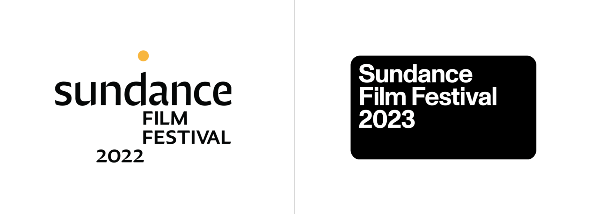
“Unlike previous years where the design solely promoted the two weeks of festival, the new identity system works more like a content-driven platform that highlights the stories and unique perspectives of independent filmmakers,” said Founder Leo Porto. The new logo boasts Dinamo’s Monument Grotesk typeface to signal the festival’s presence and for its ability to be neutral alongside diverse genres and titles.
Felipe Rocha, Porto Rocha founder, explained the only element they had to consider as part of the system was the Sundance Institute logo, which remains the same. “Our team did a bit of research of previous Sundance identities, most of which were driven by poster designs. Personal favorites include those from 1987 and 2003. As times changed, so did the festival’s approach to branding. The concept of what an event identity should look like evolved into a more versatile design system that could accommodate multiple formats.”

