Remedy Entertainment has awed fans with its redesigned logo. It’s a big step for the game development studio to rebrand after 20 years. The redesign signifies a break from the past and celebrates deft storytelling and innovation.
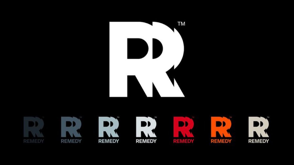
The new logo embraces this aspect of the studio, a visual identity that represents the developer moving forwards and experimenting with new ideas and art styles. It is made from three letter ‘R’s chopped and stitched together as if the letter, itself, is moving. The curved right side of the R is shaped into an arrow and the points of the character form further arrows, pointing in new directions.
It’s time to redefine our studio’s visual identity to bring more consistency, showcase our evolution over the years, and better express our vision of today’s Remedy.
We haven’t updated our logo in more than 20 years. That is, until now.
Read more: https://t.co/2pNs8cRVQp pic.twitter.com/pa8Ysm9HW9
— Remedy Entertainment (@remedygames) April 14, 2023
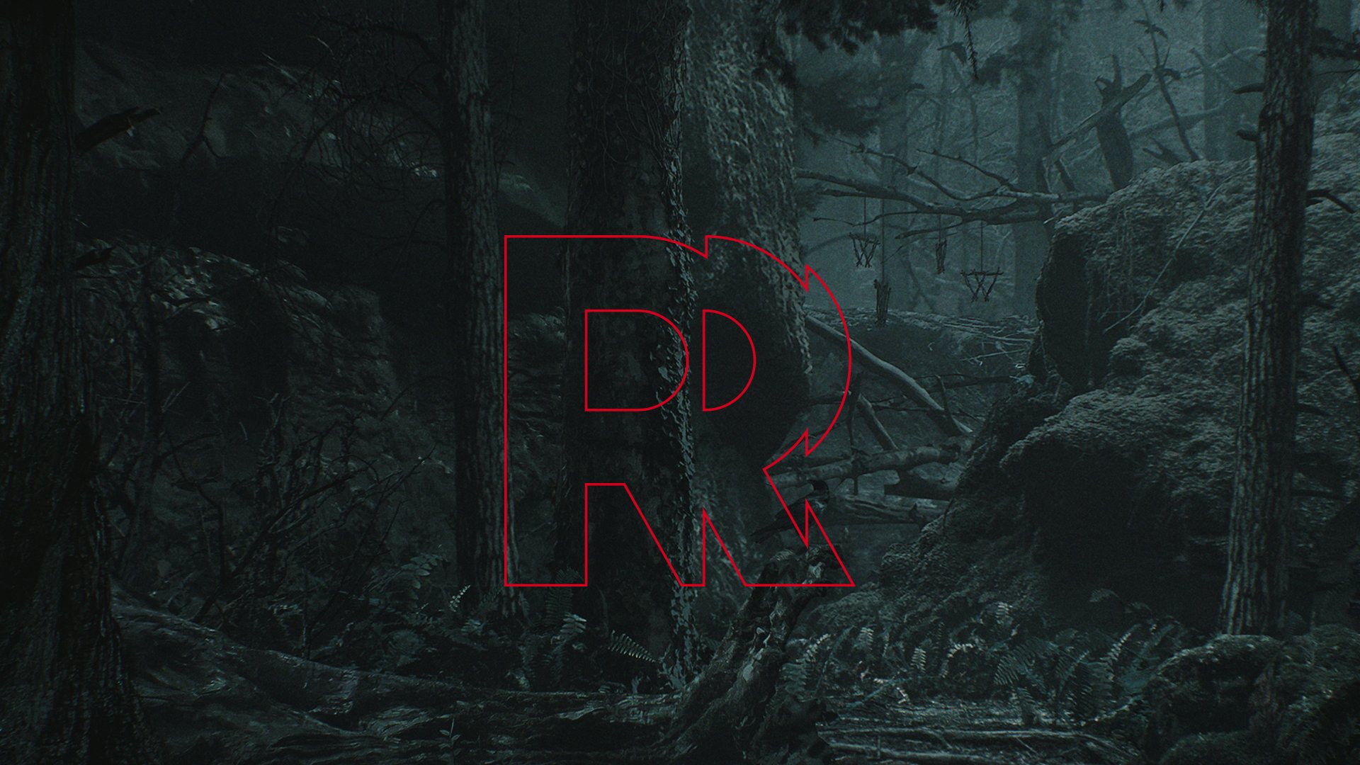
Remedy Entertainment said the bullet in the letter R in the old logo represented the era of Max Payne, but the studio is now much bigger than a single game. It has a whole portfolio of games – new and old. The studio outlined that it was time to update and refine their visual identity to bring more consistency, showcase their evolution over the years, and better express their vision of today’s Remedy.
Thomas Puha, Remedy Communications Director, said they want to create memorable worlds, stories and characters for fans to experience through their games. “We wanted our new logo to reflect how we constantly evolve and continue creating exciting games with the very best people.”

