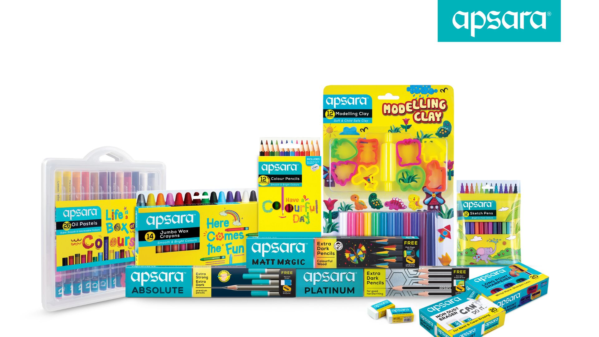
Since its inception in the 1960s, Apsara has been a legendary name in the stationery world, well-loved and easily recognizable by consumers of all ages. Being the flagship brand of Hindustan Pencils, Apsara has unveiled a significant transformation in its brand identity and packaging design. This strategic revamp is not merely cosmetic. It aims to redefine Apsara’s presence in the market, captivating consumers with a fresh, vibrant look that reflects the brand’s unwavering commitment to quality and innovation.

A Cohesive Visual Identity Across Product Lines
As part of this rebranding initiative, Apsara has implemented subtle adjustments to its logo, modernizing the typeface while maintaining its essential recognition. This thoughtful approach ensures that the brand remains familiar to its loyal customer base while attracting new audiences. The revamp introduces a cohesive visual identity across all product lines, including art materials, gifts, and stationery. Previously, each category showcased its own distinct packaging; however, this overhaul unifies them under a singular, vibrant aesthetic.
A striking turquoise shade has been adopted as the primary brand color, uniting the product range under a strong and bold identity. This enchanting hue sets Apsara apart in a competitive market, while the art materials and gifting sections now feature a vibrant yellow color scheme designed to enhance visibility and recognition. This careful selection of colors and design elements aims to create a more engaging consumer experience.
“Our new packaging is a testament to our dedication to delighting consumers with designs that are as exceptional as our products,” stated Pradip Ughade, President of Hindustan Pencils. This commitment enhances the customer experience and strengthens Apsara’s market presence across a broader spectrum of offerings.
Strengthening Market Leadership and Consumer Engagement
The rebranding efforts extend beyond aesthetics. They aim to solidify Apsara’s leadership in the highly competitive art materials and stationery market. Shashwat Das, founder of Almond Branding—the agency responsible for the revamp—commented on the transformation, stating, “This transformation solidifies Apsara’s leadership in the market. The refreshed identity resonates with both our loyal customers and new audiences, reinforcing Apsara’s influence in the stationery and art materials markets.”
With a renewed focus on quality and consumer engagement, Apsara is positioning itself as a product brand and an experience that captivates and inspires creativity. This strategic overhaul is set to elevate Apsara’s status in the eyes of consumers, ensuring that the brand remains at the forefront of the stationery and art supplies industry.
Final Thoughts
Apsara’s new brand identity signifies a pivotal moment in its journey, reflecting a commitment to excellence and innovation while honoring its legacy. The refreshed branding captures the company’s ethos of evolution while maintaining core values, ensuring that it resonates with both existing customers and potential new audiences. As the brand embraces this vibrant transformation, it invites consumers to explore a refreshed range of products designed to inspire creativity and enhance artistic expression.


