Rebranding is a bit complicated and risky. But it is even cumbersome and more perilous if once failed and unraveled again! To sort out the entanglements and to separate right from wrong is tricky. And this is what Uber is trying to do! Uber is redefining the brand, once again after the messy rebrand done two years back. Hope Uber is taking the right U-turn this time.
It may feel that things are going really in a rush, but Uber needs this rebrand right now. Two years back, Uber redefined their logo by eliminating the word Uber and bringing out a new symbolic icon with the so-called “bits of atom” structure. The idea went right, but the concept failed. The notion was to represent Uber through a brand icon, but all their brand values got messier by this way.
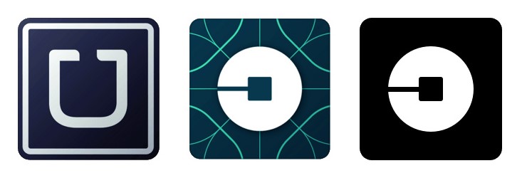
Now with the new rebrand, Uber is ditching the whole idea of symbolic reference and finding its way back to the word! The 2018 rebrand is said to be the “Doing it the right way” rebrand. But this time, engaging more customers sticking to the typeface. Sony is the first known company to stick with a customized typeface. And now, Uber is technically following its path.
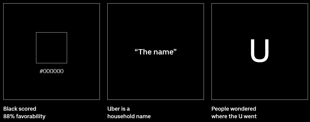
The primary aim to make the logo more approachable. Since the brand holds a significant recognition through the name, Uber is taking full advantage of this recognition by keeping the logo simple and easy to read. The new logo basically roots three significant concepts. The primary concept is to retain the U as always. From the history line, Uber has a special attachment with the letter U., And directly they are involving U by saying “People wondered where the U left.” The second concept is more market-oriented. This is to bring the name out instead of any symbolic elements. By this Uber is representing themselves as a household name. And the third most, most fine element is the usage of Jet black colour. Black scored a total of 88% favourability according to Uber. And hence the new logo is merely representing an iconic brand with the power of name recognition. This may feel odd, but for a brand like Uber, this is possible because of its huge brand recognition around the world.
The rebranding this time, focus more on dynamism since the brand profoundly believes in movements being the igniting factor for the opportunity. The brand believes in nine elements, and this constitutes the system as a whole. They are:
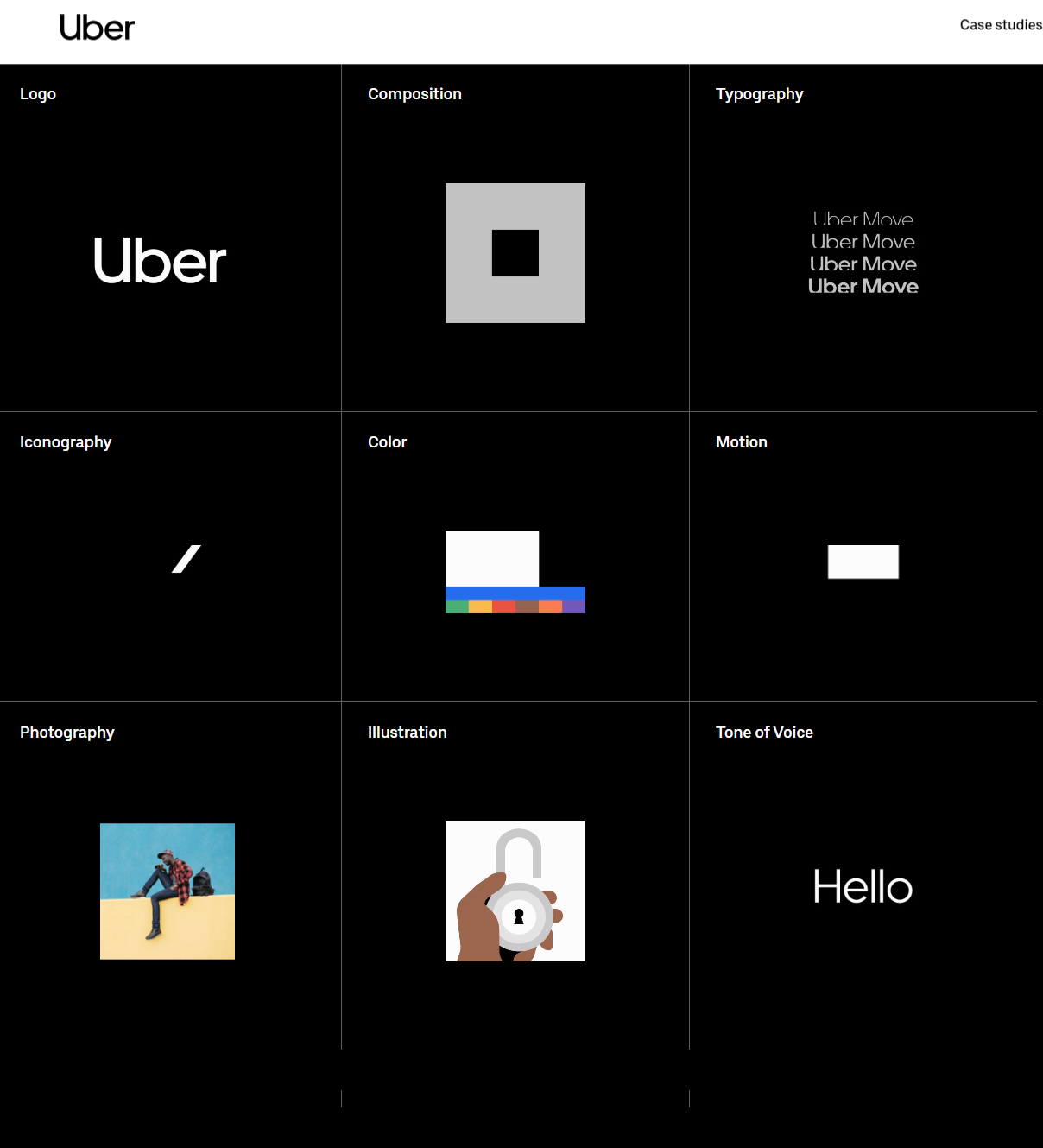
Since the brand logo focuses on a typographic one, the typeface is vital. Uber customized a particular font, and this is designed to maximize its impact concerning all their applications including Uber, Uber eats and Uber move. And with the colour palette, this time, Uber chose to be at the safe side. The primary colours are Black and White, as usual, and the secondary colours include a whole lot of colour variations including variants of green, yellow, red and blue. Apart from these, Uber also came up with a Safety colour, and these set of colours create an impact on global navigation. With motions, transitions, and stories, Uber is breaking all the elements of dynamism with its new rebrand.
Significance of Uber rebranding
The timeline about Uber tells a handful of stories regarding the logo and its impacts. This one mainly is controversial since the last rebranding did make a lot of mess. And for a brand like Uber, even if it is accessed locally, it has an expanded network all over the world. So such a dynamic rebranding is really useful. And hence the question “Why so hurry?” should be ignored! Being the second rebranding, in a span of three years, there may be “isn’t is too much” feeling, but for Uber, to reach out higher is necessary for this condition. There is still some imbalance between the last logo and the new logo. Some people are not really satisfied with the new typeface. But being a world-recognized brand, Uber gave a clear-cut idea about investing in a wordmark, not in a symbol. And with time, this will go in the right direction, may or may not follow the GPS!
Now talking about advantage, Uber is targeting large markets like India so that it can reach out to the public in very less effort. With higher consideration for the customer, Uber is dropping the classy icon image and stepping out to business. Now with this, one can say, This is rebranding done right!! The perfect U-turn indeed.


