Skittles, the iconic candy brand known for its vibrant rainbow of flavors, has undergone a redesign that takes us on a quirky and lively journey through nostalgia. The refresh is a vibrant celebration of the brand’s signature rainbow, featuring a fresh typographic spin and a flowing visual effect that brings a sense of continuity to the Skittles brand across its global market. Let’s delve into the creative ethos behind the Skittles brand refresh, exploring the dynamic design language, the impact of ‘nonsensical’ storytelling, and the brand’s eccentric journey that transcends traditional packaging.

A Fresh, Adaptable Design Language
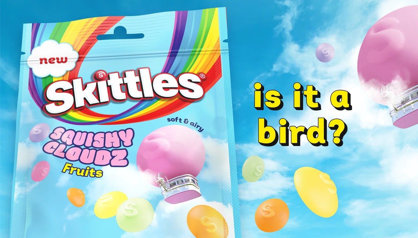
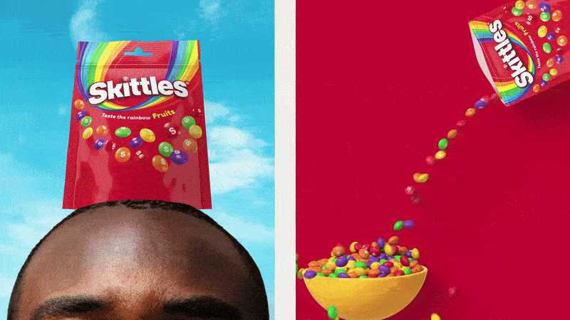
Created in collaboration with the design studio, Elmwood London, Skittle’s new packaging boasts a fresh typographic spin, a heightened vibrancy to its signature rainbow, and a new layout with a flowing visual effect. The typography, particularly the slight kick on the ‘K,’ paired with the logo’s deeper shadow, amplifies the brand’s iconic presence. This cohesive design language allows the brand to remain distinctively Skittles while introducing new and peculiar characteristics across different product ranges from ‘squishy cloudz’ to ‘wild berry’.
Elmwood’s design director, Paul O’Brien, underscores the agency’s commitment to creating a cohesive and adaptable design language for Skittles, a product available in 180 countries. The brand refresh prioritizes the rainbow’s ability to flex and have fun while preserving its iconic Skittles identity across diverse global markets.

‘Nonsensical’ Storytelling for Gen Z
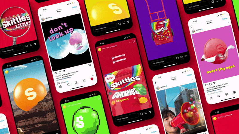
Elmwood has done a fantastic job of capturing Skittles’ distinctively lo-fi and quirky tone of voice through what they call ‘nonsensical’ storytelling. This is evident in the brand’s taglines such as ‘Taste the rainbow, refresh the rainbow’ and ‘Is it a bird’. Using lentil-shaped sweets descending on iconic landmarks creates an absurdist angle that appeals to Gen Z’s affinity for the eccentric. The brand’s ‘nonsensical’ approach has allowed it to remain an affectionate marker of nostalgia while simultaneously loudening its presence for the younger audience. By tapping into the eccentricity of Gen Z, Skittles has established a connection with a new audience while retaining its loyal following.
Escaping Common Sense with Skittles
Skittles has recently undergone a brand refresh that goes beyond just updating its packaging. The refresh touches on how the brand’s aesthetics are perceived in other realms as well. One of the brand’s assets features a window error message, which asks viewers if they wish to ‘escape common sense’. This approach not only incorporates a wide range of colors into a nostalgic aesthetic, but also takes the audience on a fun and quirky journey through the brand’s vibrant world. In this way, by demonstrating the value of exploring beyond traditional marketing approaches, Skittles is encouraging consumers to experience the brand in a distinct and exciting manner.
Final Thoughts
Skittles’ brand refresh by Elmwood London is a testament to the power of embracing nostalgia while injecting a fresh and absurdist spin. By dialing up the brand’s ability to tell a great story through ‘nonsensical’ elements, Skittles not only maintains its iconic status but also captures the attention of the Gen Z audience. With its vibrant visuals, quirky tone, and inviting call to ‘escape common sense,’ Skittles invites us on a playful and memorable journey through its colorful universe.