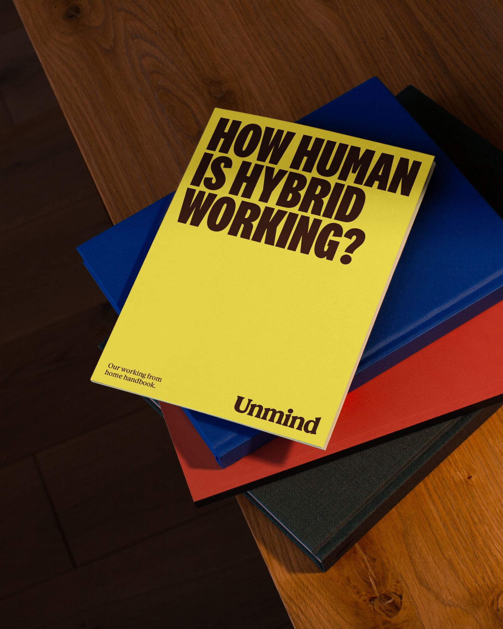
Designing a brand that encourages people to talk about their mental health is challenging, especially in a workplace setting. Unmind, a mental health and well-being platform aimed at helping employees manage their mental health, recently underwent a rebrand by London design agency Ragged Edge. It was quite challenging a task for the design agency to develop the platform. Let’s hear that story:
How Ragged Edge Approached the Challenge of Designing a Mental Health Platform for the Workplace?
The challenge for Ragged Edge was to create a brand that not only reflected the company’s data-driven approach but also resonated with users on an emotional level. Ragged Edge accomplished this by focusing on UX design that makes users want to talk about their mental health. By placing a focus on the design of mood trackers and other interactive features, the new brand’s aim is to help users feel more comfortable discussing their mental health and well-being in the workplace. The result was a refreshed brand that emphasizes user experience (UX), is based on measurable change, and is emotionally resonant.

Color and Typography: The Foundation of the New Unmind Brand
The bold yellow used in the Unmind rebranding is a nod to the company’s data-driven approach to wellness. The color palette used in the refreshed brand represents a broad range of moods and emotional states that the platform helps users measure. The sloping logotype, on the other hand, is hand-crafted to evoke human warmth and credibility. The new brand also features typography that aims to celebrate open discussions around mental health, inviting employers and employees to unite around the belief that work can and should be good for your mental health.
A Movement for Change
Ragged Edge’s Unmind rebrand is focused on creating a movement for change. Co-founder Max Ottignon explains, “In a category that tends to offer sticking plaster solutions, Unmind offers a holistic and genuinely transformational approach. So we framed the brand around a movement for change.” The new brand invites employers and employees to unite around the belief that work can and should be good for your mental health. The campaign-style typography celebrates open discussions around mental health and challenges perceptions on an institutional level.
Final Thoughts
Ragged Edge’s Unmind rebrand is a bold and innovative approach to designing for well-being in the workplace. The brand’s focus on creating a UI that is based on measurable change while still feeling human and approachable is a testament to its commitment to mental health. By creating a movement for change, Unmind is challenging perceptions and encouraging open discussions around mental health in the workplace. The brand’s use of bold yellow and a secondary colour palette demonstrates the wide range of moods and emotional states the platform helps to measure, making it a more accessible and approachable solution.


