In the bustling heart of London’s Zone 2, a visionary rebranding is taking root at Canada Water Dockside. But this isn’t your typical city experience. Here, the focus is on a “healthier mix” of nature, work, and play, creating an environment that fosters personal growth and well-being. Let’s delve into the unique features of Canada Water Dockside and explore the fresh approach taken to shape the area’s identity.
Crafting a Botanical Oasis in the City
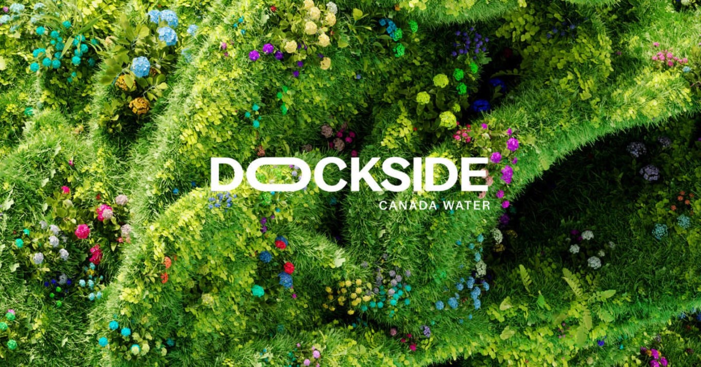
Canada Water Dockside’s rebranding, spearheaded by the innovative design agency SomeOne, in collaboration with ArtInvest and Liam Pitchford, is a celebration of self-discovery and community. By leveraging the natural beauty of the 5.2-acre green site, they’ve created a visual narrative that’s a ‘botanical playground”, encouraging residents and visitors to thrive. The flexible logotype and ultra-high-definition botanical forms are designed to adapt and highlight the best of Dockside living, creating a sense of belonging and optimism.

Designing for a Sustainable Future
It’s not just about aesthetics. SomeOne’s approach goes beyond the usual logos and color palettes. SomeOne has taken a holistic approach, understanding that ‘placemaking’ is akin to brand building. They’ve created a visual narrative that feels more like a playground, bursting with life and possibility. The team has incorporated wider concerns into their design process, aiming to leave a lasting positive impact on both the present and future. Carefully chosen fonts, like the adaptable Bagoss, and a suite of icons and signage seamlessly integrate with the physical space, both online and offline. Supergraphics – large-scale branded elements – subtly introduce the Dockside identity into surrounding areas, further reinforcing the message of development and growth. As SomeOne aptly puts it, “You’ll find more than you were looking for on the Dockside – and the same can be said for the new visual identity.“

Embracing Opportunities with Dockside Mascots
Adding a touch of relatable charm, SomeOne has collaborated with Arcade Studio to create a library of Dockside mascots. These mascots highlight the plethora of opportunities available to visitors and residents, including swimming, paddleboarding, yoga, and bird-watching. By infusing conventional charm into the identity, SomeOne captures the essence of the Dockside experience. Furthermore, these elements helped in forming a brand narrative that’s ethical, sustainable, and respectful, aiming to foster a healthier tomorrow.
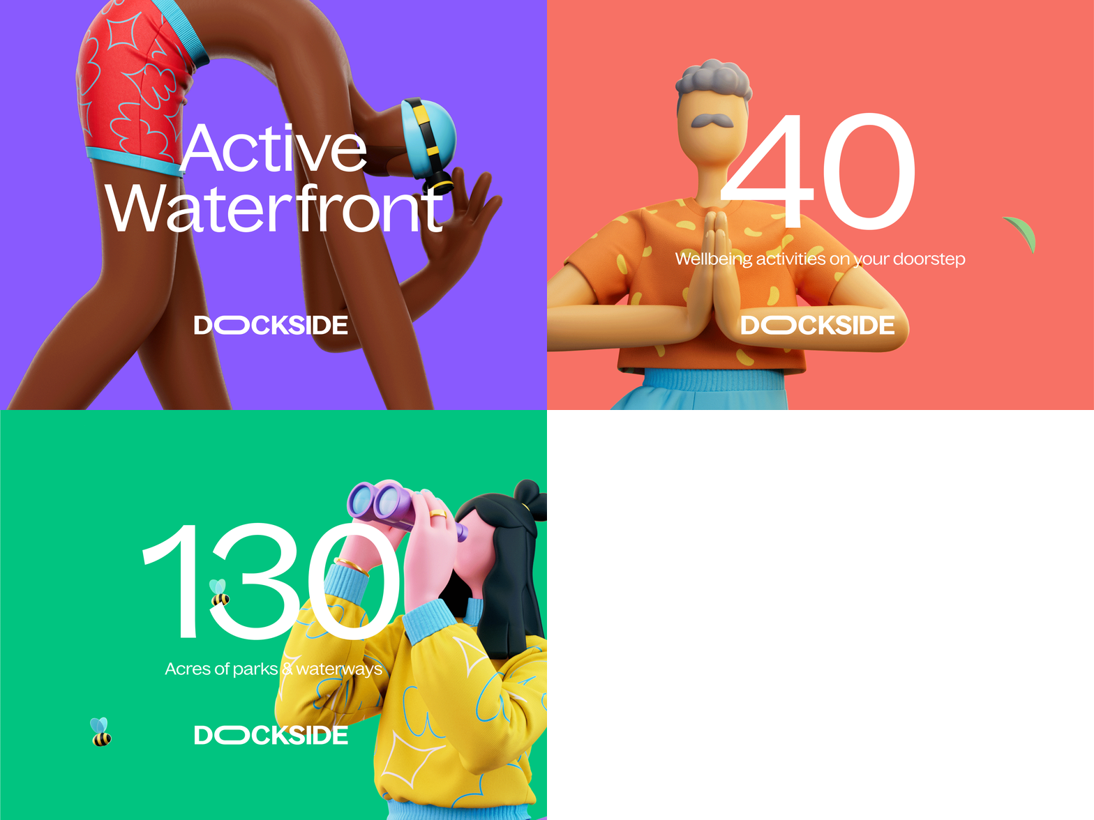
“This is a highly recognizable, enduring branding program for a place being reinvented from many points of view for many differing audiences,” says SomeOne founder Simon Manchipp. “It makes sense for this to be a visual shapeshifter where themes tie together – avoiding fixed repetitive stamps.“
Final Thoughts
SomeOne has developed an innovative branding program for Canada Water Dockside that blends illustration, typography, strategy, animation, and other elements to create a highly recognizable and enduring brand identity. The redesigned space is aimed at catering to diverse audiences, with a focus on self-discovery and development. The Dockside experience offers more than meets the eye, encouraging exploration and promising an unforgettable journey. Needless to say, this rebranding initiative by SomeOne goes beyond visual transformation and is a commitment to the well-being of the community and the planet’s future. It’s a promise that at Canada Water Dockside, you’ll find more than just a place to live – you’ll find a place where you can truly flourish.
