In the 1900s, the best combination for tea was tiger biscuits! School intervals and a pack of Little hearts, won many hearts. From crunchy rusks to crackers, Marie gold to Nutrichoice, Good day to Bourbon, 50-50 to Milk bikis and a wide range of bread, cakes and dairy products, Britannia evolved. And the nostalgia is no match to that of sandwiches, burgers or pizza these days. Britannia from being a product grew into a brand and then to a legacy. Being one of the largest trusted food brands in India, Britannia is passing a century! Yes, a century and their campaign say it as “100 years gone, 100 years more to go.”

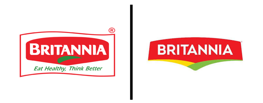
Surviving in a global industry for 100 years is not a joke. Britannia, being a native establishment, made its worldwide presence and stood shoulder to shoulder with other international brands. And with the centenary functions, Britannia got rebranded. The new brand identity still sticks on the core values as they have only changed the outlook, keeping the core elements. From “Eat Healthy, Think Better,” they graded up to “Exciting Goodness.” The color palette is pretty same with slight variations. It was red, green and white back then, and now changed to red yellow and green, but with more vibrancy. Now the intensity of yellow and green made a different pair, and this is enhancing the red elements where the font is represented. Being a heritage brand, Britannia never thought of a complete change in logo, and because of that, it remains reproduced. It feels like a refresh done to the old logo by sorting pulsating colors.
Britannia: Products and Packaging
Now coming to the products, bread packaging has entirely changed with energetic colors such as cyan and purple. Biscuit products have adjusted with the new identity, but there are no significant changes in packaging except for the crackers. Diary packages also made its impression with bright cyan, and this is complimenting both the product and the logo. From consistency, the brand is focusing on dynamism with the addition of vivid bright colors. The arch underneath, being the new and updated element enhance the dynamic trait more into the logo. And as a running background, it adapts to the level of the logo.
At one point, the logo can be compared to that of Levi’s with the detailing and shape. And this is creating mixed opinions about the rebrand. The level of color upgrading is not getting accepted with the degree of heritage for some people, and thus for some people, the brand lost its good-old-memories. With an experience of over 100 years, Britannia sustained as a heritage brand, and apart from a few negative opinions, the brand created a new sensation with their legacy. Competing with brands like Patanjali and Parle, this rebranding was utterly needy so as to let the audience realize that the brand is more trustworthy than any of the others. And now with the conceptual advertisement campaign “tu sau saal jiyega” (you are going to live 100 years), the brand is spreading its legacy all over the nation.
Another significant evidence for being into the market is the announcement about launching 50 new products in the next twelve months. Now that sounds crazy, but since the company focus on dairy products, they could make this statement come true in 12 months. Britannia proved that the age is just a number. Though they hit 100, Britannia is still in its youth!
Check out how Google evolved from the past 20 years: https://brandthechange.com/2018/09/google-birthday/


