Appy Fizz, Parle Agro’s fruit-flavoured drink, is donning a new design that gives the brand a fresher, re-imagined and bolder look. It unveiled a new brand identity with a bolder and re-imagined look while keeping its taste and flavor unchanged.
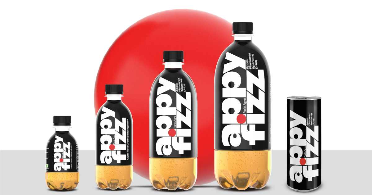
Appy Fizz’s iconic red, white and black colors have been rearranged in a contemporary, eye-catching font for the logo. Moreover, its fresh packaging aims to make a bold statement and standout from the crowd.
Nadia Chauhan, Parle Agro’s Joint Managing Director & CMO, outlined Appy Fizz’s distinctive position as a beverage that makes a statement and maintains a unique identity. Appy Fizz’s exceptional innovation and quality sets it apart from its rivals. Parle Argo wants to mark Appy Fizz’s remarkable quality and introduce a revolutionary new appearance to the market of sparkling fruit-flavored drinks with the brand’s redesign. The company wants to usher in a new period of growth and disruption.
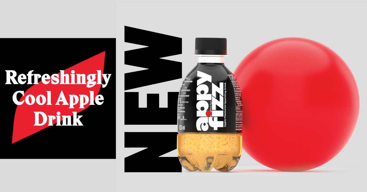
Harry Pearce, Partner, Pentagram Design Ltd – the company that designed and conceptualized the new packaging, said the idea was to modernize and create a more visually arresting identity and bottle shape moving the brand away from copycats. “We re-addressed the emphasis giving the word ‘Appy’ equal prominence to ‘Fizz’ and employed a distinctive font with custom elements.
Appy Fizz is the dominant player in the beverage industry with a 99% market share. The brand is marketed as a healthier alternative to colas. Appy Fizz continues to fascinate consumers with its lively and exuberant advertising campaigns.

