Protein Studios, a London-based event space, and co-working community has revealed a retro-inspired new look. Let’s explore how the rebrand brings together Protein’s physical and growing digital presence while representing its diverse community.
A Pixelated Nostalgic Design for a Modern Community
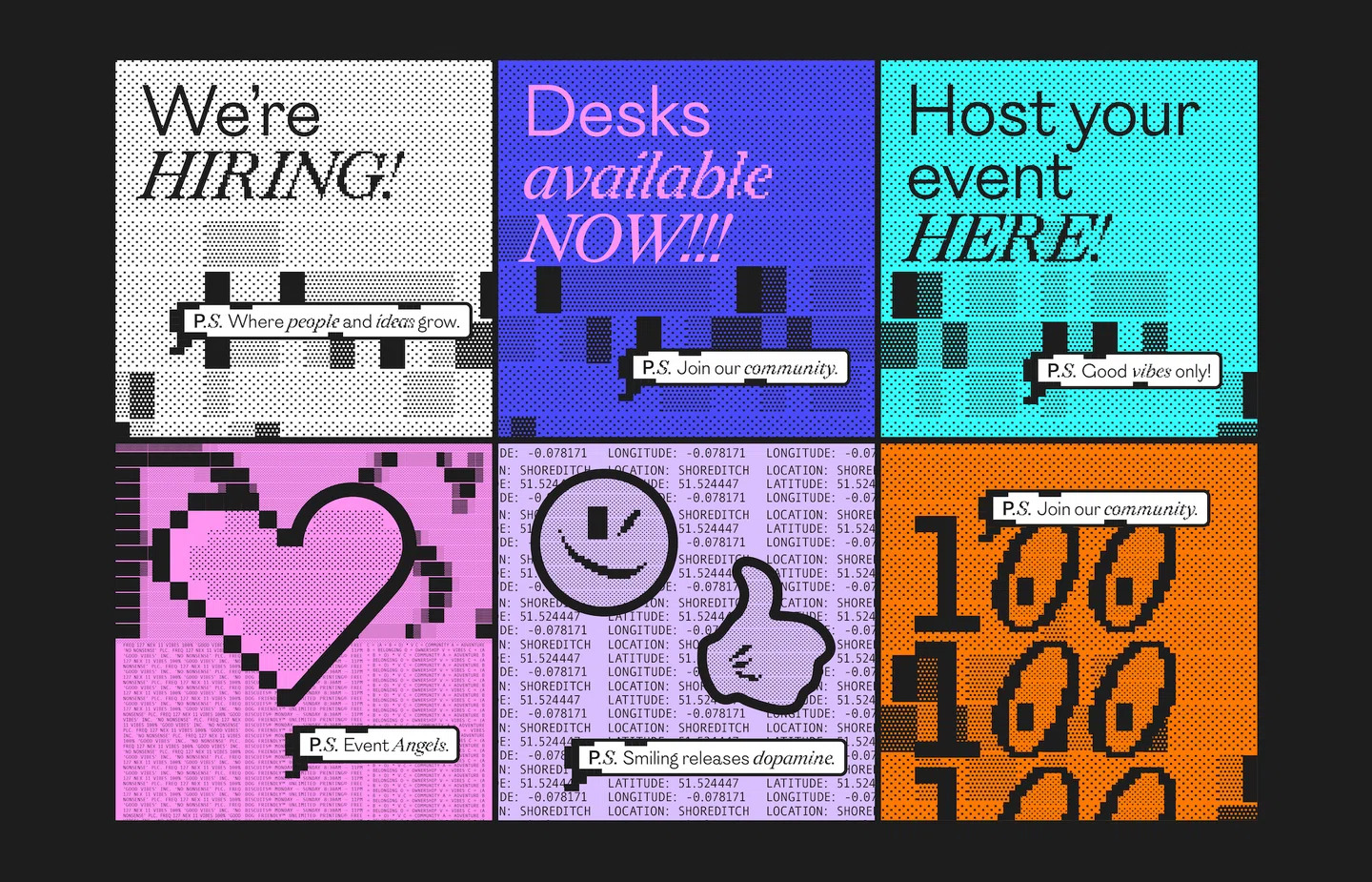
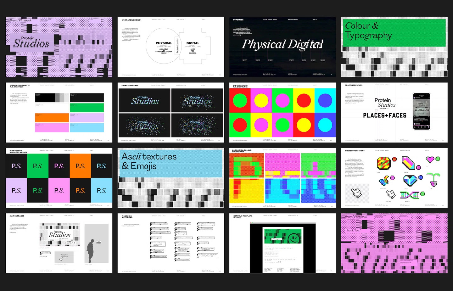
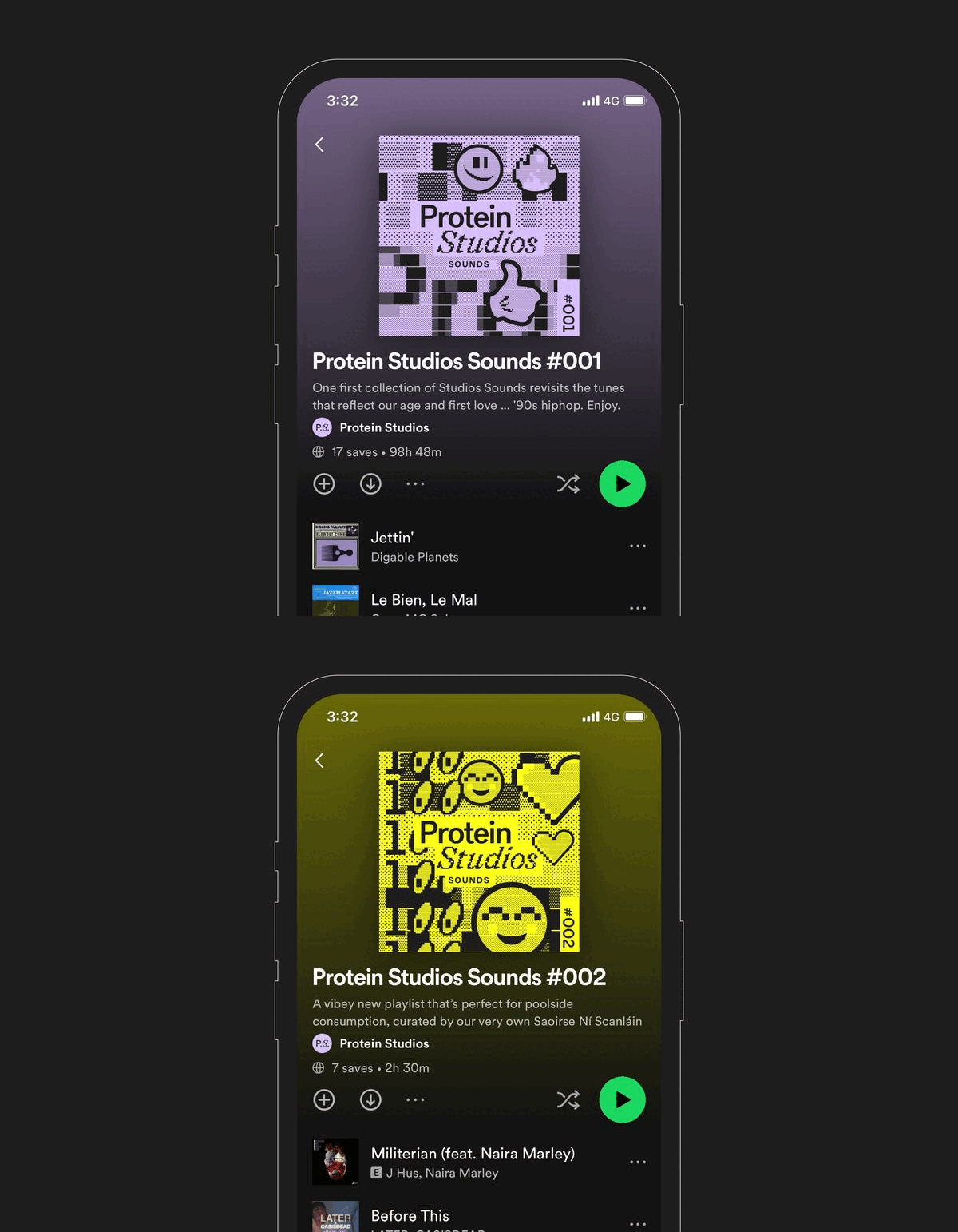
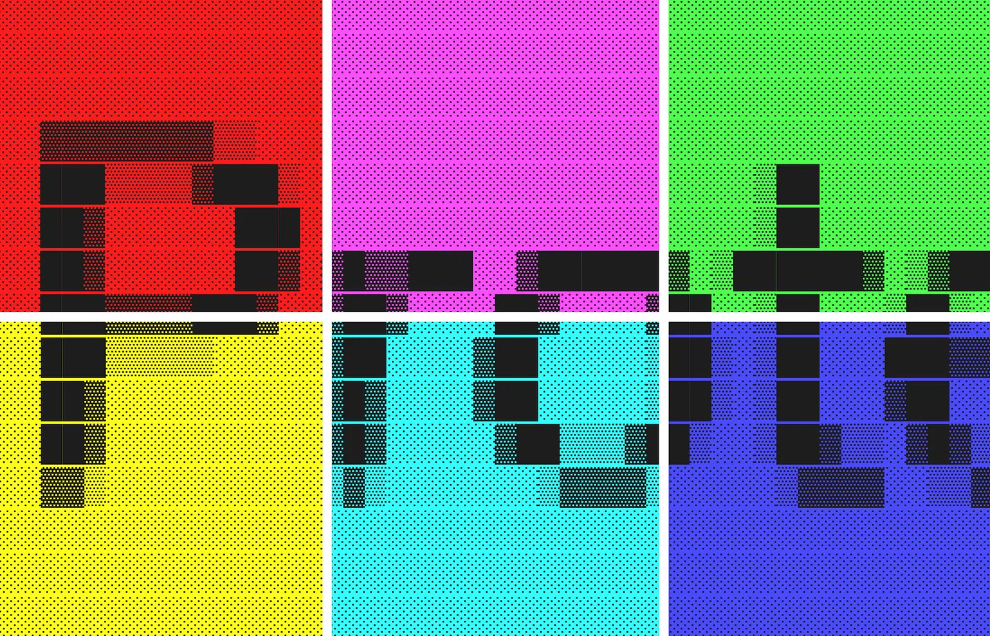
With a nod to its early 1990s heritage, when the use of pixels was prevalent in the digital world and created in collaboration with the London agency They That Do, the new identity has a design system that uses pixels as a central graphic component. The pixelated wordmark, emojis, and background pattern of assets all contribute to the overall nostalgic feel of the rebrand. Pixels take center stage as the defining graphic element, also chosen for their nostalgic ‘Web1’ feel. But pixels also represent the individuals that make up the Protein community, coming together like modules on a circuit board. Pixels feature throughout the redesigned logo, typeface variants, and motion graphics.
IRL Meets URL
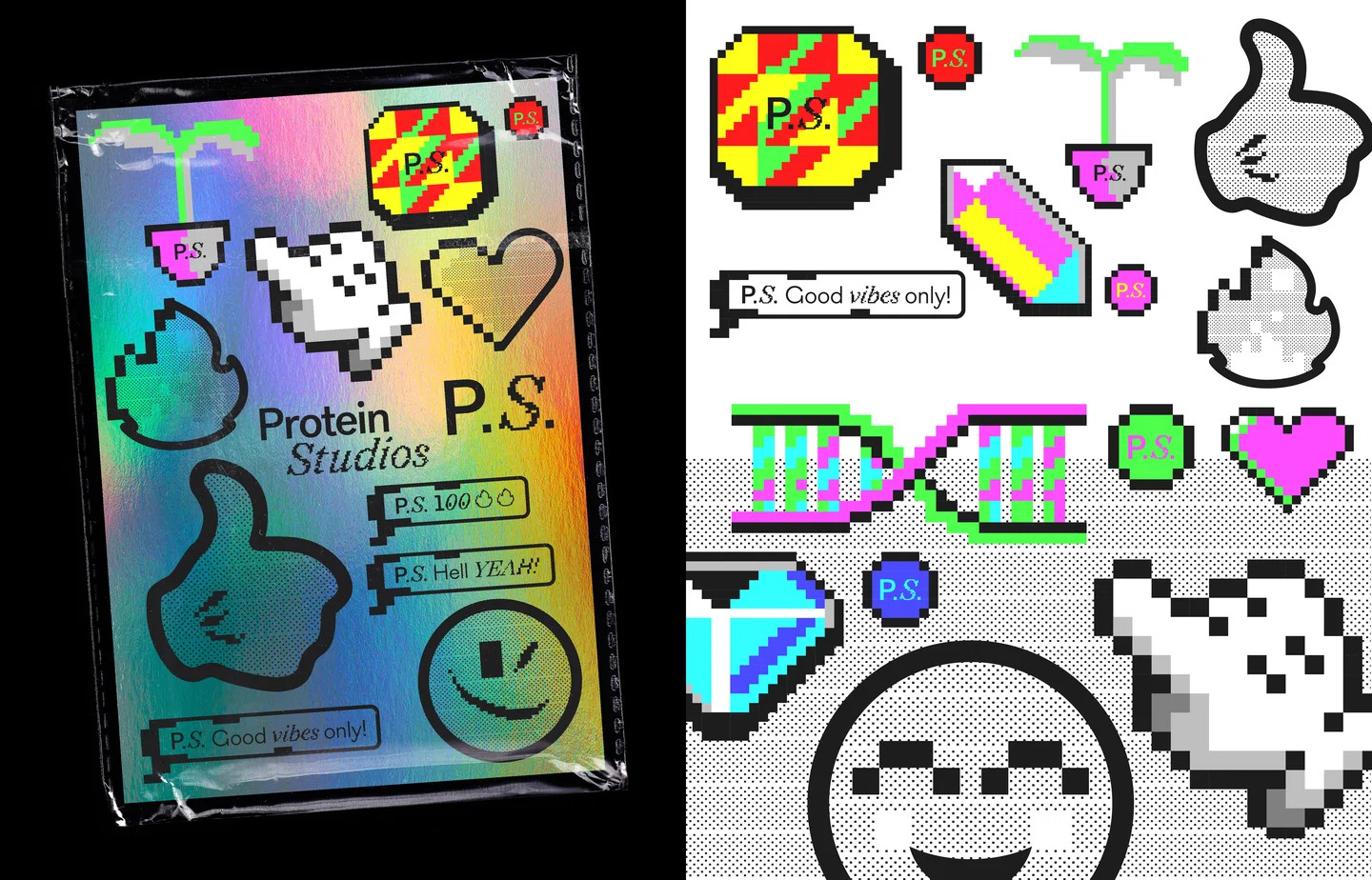
The rebrand aimed to bridge Protein’s in-person and online worlds. Designer Vincent Howcutt of They That Do explained that “everything rallied around where the physical meets the digital.” From colors to custom emojis to pixelated patterns, the visual system works seamlessly across platforms. To better illustrate the IRL/URL approach, the typeface alternates between ordered and pixelated styles. The motion wordmark features the disintegration of ‘studios’ into colorful pixels before reforming.
A Playbook for Protein Studios to Add Character and Convey Good Vibes
The designed palette of parts in the rebrand is a playbook for Protein Studios to add character and layer as they need across physical and digital platforms for the brand. The smorgasbord of parts instantly conveys the good vibe nature that Protein Studios stands for. The motion wordmark is particularly satisfying, with the ‘studios’ in Protein Studios disintegrating into a myriad of colorful pixels before reforming once more.
Final Thoughts
Protein Studios’ rebrand combines nostalgia with modernity, fusing pixels with creativity to embrace unity and diversity. With the rebrand, the studio enters a new era of limitless possibilities, bound by a shared passion for the blend of the real and virtual.
Also Read: A Ripple Effect of Change: Natural History Museum’s 150th Anniversary Rebrand
