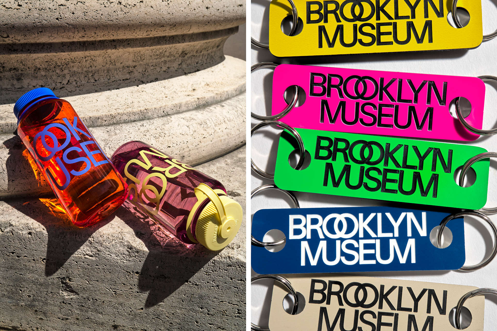
The Brookly Museum has undergone a brand refresh for its 200th anniversary, boldly stepping into the future. It now has a new logo and visual identity that reflects its past and an exciting new chapter.
Anne Pasternak, Shelby White, and Leon Levy, Director of the Brooklyn Museum, said the ways that audiences are engaging with museums are expanding. They highlighted that the Brooklyn Museum needed a new brand that meets the demands of the day, honors its rich history, and brings in energy.

The New York City-based museum took up the new identity in time for its 200th anniversary, reflecting two centuries of history. The new visual identity drew inspiration from the original neoclassical design by McKim, Mead & White, 1930s modernism, and recent projects. The visual identity was designed by a Brooklyn-based graphic design studio Other Means. It took up a modern sans serif typeface and ligatures that express the Museum’s multidimensionality within the new logo.
It features two dots – an echo of the two ‘O’s in ‘Brooklyn’. The museum says they can be activated in motion graphics, used as bullets in text or as functional features in signs, and occasionally replaced with symbols or illustrations to add meaning or a sense of play. It has also intertwined the double ‘O’s in Brooklyn and merged the ‘M’s and ‘U’s in ‘Museum’.

Moreover, the Brooklyn Museum’s new visual identity includes a range of grays which pay homage to its limestone building. There are brighter and saturated hues to give a distinct Brooklyn vibe. According to the Brooklyn Museum, the two dots, overlapping letters, and kaleidoscopic colors showcase the museum as a place where a multiplicity of ideas, identities, and points of origin converge.
Also Read: Ascott Revamps The Unlimited Collection, Continuation of Brand 360 Strategy


