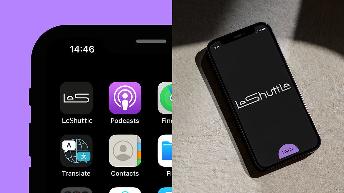
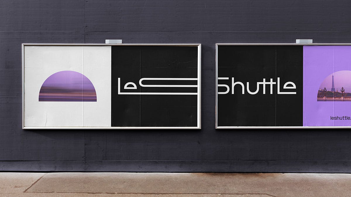
Eurotunnel LeShuttle, a channel tunnel service that carries passengers by rail and road vehicles such as cars and campervans, has recently undergone a significant rebranding effort. With the aim to re-establish the brand as a relevant and unique form of low-carbon transport, the new Eurotunnel LeShuttle logo represents an efficient journey, highlighting the speed of the service.
Sleeker, Simpler, and Futuristic
The largest refresh in 30 years for LeShuttle is a strategic move to attract a new generation of travelers and to remove the hassle that many people associate with travelling. To achieve this, Landor & Fitch, the agency behind the rebrand, removed all extraneous details from the previous logo and embraced futuristic simplicity. The new design features a series of ligatures that reflect the ease of connections, while the eyes of both ‘E’s represent point A and B of travel, entering and leaving the Channel Tunnel. Rounded bowls have been introduced to represent care and sharp corners to emphasize speed.
Evoking Emotion and Separating from Traditional Train Services
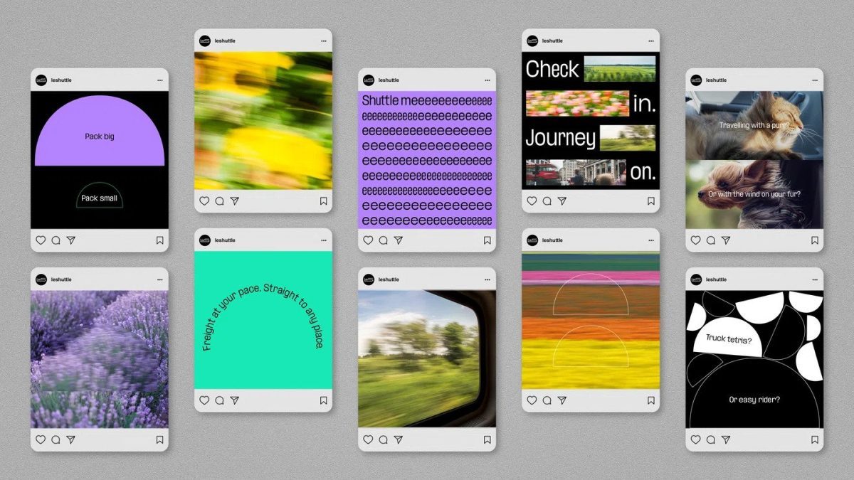
The wider identity attempts to separate itself from traditional train services by using brand photography that appears user-generated and details that center on ‘evoking emotion’. The color palette has also been shifted away from the nationalistic identity to predominantly black and white with hints of purple. This approach is aimed at creating a more personal connection with customers, especially with the younger generation.
Targeting the Next Generation of Travelers
The rebranding effort highlights the confusion that exists around the service, particularly for Gen-Z and millennials, who are more familiar with flying than self-driving. According to a release from Landor & Fitch, “there are generations of travelers born after the Channel Tunnel’s opening, who are unaware of the unique offering LeShuttle provides.” As such, the new Eurotunnel LeShuttle logo represents a concerted effort to target the next generation of travelers.
Rethinking the Channel Tunnel Experience
The rebranding is part of a strategy to rethink the Channel Tunnel experience over the next decade. By making the service more relevant and efficient, the new design is aimed at attracting a new generation of travelers who value convenience and sustainability. With the emphasis on low-carbon transport, the new Eurotunnel LeShuttle logo represents an opportunity for the brand to differentiate itself from other traditional transport services.
Final Take
The rebranding of Eurotunnel LeShuttle represents a strategic move to target a new generation of travelers, remove the hassle associated with traveling, and differentiate the brand from traditional transport services. The new Eurotunnel LeShuttle logo represents an efficient journey, highlighting the speed of the service, while the wider identity attempts to create a more personal connection with customers, particularly the younger generation. With the rebranding, LeShuttle is poised to rethink the Channel Tunnel experience over the next decade, positioning itself as a relevant and unique form of low-carbon transport.