EA Sports has recently revealed its new brand identity, EA Sports FC, marking a significant shift from their well-known Fifa brand. Uncommon Creative Studio is behind the new vision and identity, with motion design from Buck.
Triangular Logo Inspired by Gaming History and Player Control Indicator
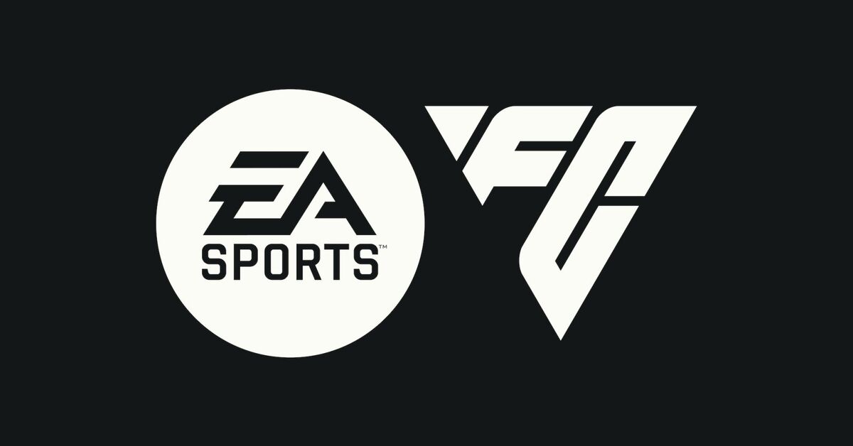
The most noticeable change in the new branding is the triangular logo, drawing inspiration from the floating triangle that appears above player characters in the Fifa game. However, Uncommon highlights that this shape can also be seen in passing patterns and set plays within football, as well as in the isometric angles and triangular polygons of vintage and modern video games. The new logo features the FC initials in a triangular grid system, and appears in three versions across the identity – a primary logo, two-letter product prefix, and authenticity mark.
Custom Typefaces Inspired by Football Legends
In addition to the new logo, EA Sports FC also has two custom typefaces inspired by legendary football players Johan Cruyff and Marta. The first font is based on Cruyff’s style and guides the structural form of character stems with ink traps adhering to a triangular system. The second font “romanticizes the style and flair of Brazilian footballer, Marta,” according to Uncommon.
Motion Design System Evokes the Energy of the Game
Buck’s motion design and 2D animation complement the game-focused approach of the new branding identity. The goal was to imbue the visual identity with the energy of the game itself – its structure, dynamics, and forward momentum – to evoke how football feels both as a player and a fan.
Rebranding as a Strategic Move
The shift towards a new branding identity is a strategic move for EA Sports, allowing them to differentiate their football offerings from the Fifa brand. The triangular logo is a creative and unique way to incorporate the gaming and football worlds, with the new typefaces adding a personal touch and paying homage to football legends.
https://www.linkedin.com/embed/feed/update/urn:li:ugcPost:7085304816884715520
Final Thoughts
Overall, EA Sports’ rebranding as EA Sports FC is a bold and exciting move that aligns with the company’s focus on innovation and creativity. The new triangular logo, custom typefaces, and motion design system all work together to create a fresh and unique branding identity that captures the energy and spirit of football.