Soft drink giant Fanta, owned by the Coca-Cola Company, has undergone a major global rebranding that promises a “bright and bold” look. The revamp is led by the Coca-Cola Global Design team in collaboration with Jones Knowles Ritchie (JKR) design agency. The rebranding aims to give Fanta a playful image that appeals to all ages. Here are some of the key features of the brand redesign.
New logo and custom typography
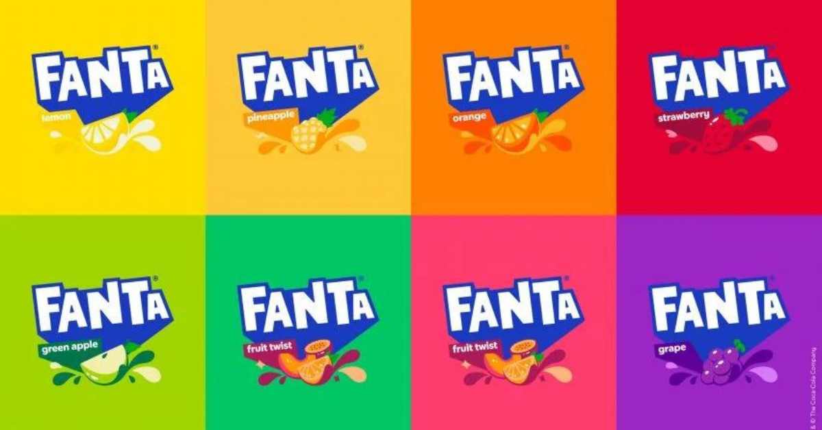
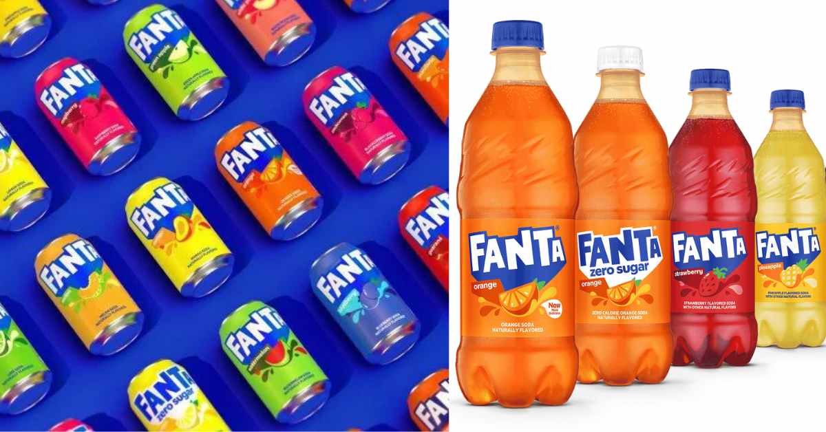
The previous Fanta logo was a classic, colorful logo with a bubbly and playful look. The new logo keeps the same spirit of fun but takes a more streamlined approach. The design team has created a stripped-back flat logo, which has removed shadows and the smile-shaped icon from within the second letter A. Additionally, custom typography has been created to give the brand a more unique look.
Brand color system and graphic system
The brand color system is comprised of “identifiable” colors that help to create a graphic system that is supported by illustrations worked on in partnership with Brazilian artist Lucas Wakamatsu. The brand’s new graphic system is meant to help give Fanta a unified global identity based on fun.
Unifying Fanta’s Identity
Fanta’s rebrand follows many different changes over the years, and the biggest challenge was to stop that. The design team needed to crystalize Fanta’s brand identity under one identity and stick with it for years to come. However, it was also about evolving what people love and know about Fanta. The rebrand captures playful indulgence and brings Fanta’s fruity tastes to life. The new identity is bold and iconic, ensuring it stands the test of time and is recognized worldwide. The design team hopes that the global rebrand will unify Fanta’s identity and stop any more redesigns from happening for a long time.
Revitalizing the brand assets
According to Rapha Abreu, global vice president of design at The Coca-Cola Company, the goal of the brand redesign was to “revitalize Fanta’s brand assets and reclaim play as something that people of all ages can embrace and benefit from.” The focus was to shift the brand’s focus to reflect an attitude that values spontaneous play.
Crystalizing the brand elements
Sue Murphy, senior design director at The Coca-Cola Company, has stated that the aim of the rebrand was to “crystalize each element of the brand to be bold and iconic to ensure it would stand the test of time and be recognized worldwide.” The new design is meant to unify Fanta’s identity and stop any more redesigns from happening for a long time.
Bottomline
Fanta’s global brand identity redesign is a refreshing new look that captures playful indulgence and appeals to all ages. The stripped-back flat logo, custom typography, and brand color system create a bold and iconic identity that ensures it stands the test of time and is recognized worldwide. The redesign unifies Fanta’s brand identity and stops any more redesigns from happening for a long time. The new identity is a testament to Fanta’s commitment to evolving what people love and know about the brand while also reclaiming play as something that people of all ages can embrace and benefit from.