Headspace, renowned for its iconic orange smiley and breath-driven animations, is expanding its offerings beyond meditation. Following a $3 billion merger with mental health service Ginger in 2021, the brand is rolling out a one-on-one coaching service and undergoing a brand redesign. Let’s explore Headspace’s evolution and its transformation towards a more professional image while preserving its playful essence. We will also cover the reasons behind the rebranding, the visual modifications, and how Headspace aims to remove the stigma associated with seeking mental health care.

From Meditation to Comprehensive Support
As Headspace ventures beyond its meditation roots, the brand recognizes the need to cater to a wider range of mental health needs. With members seeking support for better sleep, everyday stress, anxiety, depression, and more complex issues, Headspace aims to create a kind, warm, and welcoming identity. The brand’s transformation reflects its commitment to addressing various need states and providing comprehensive care for individuals on their mental health journey.

Colors that Inspire and Uplift
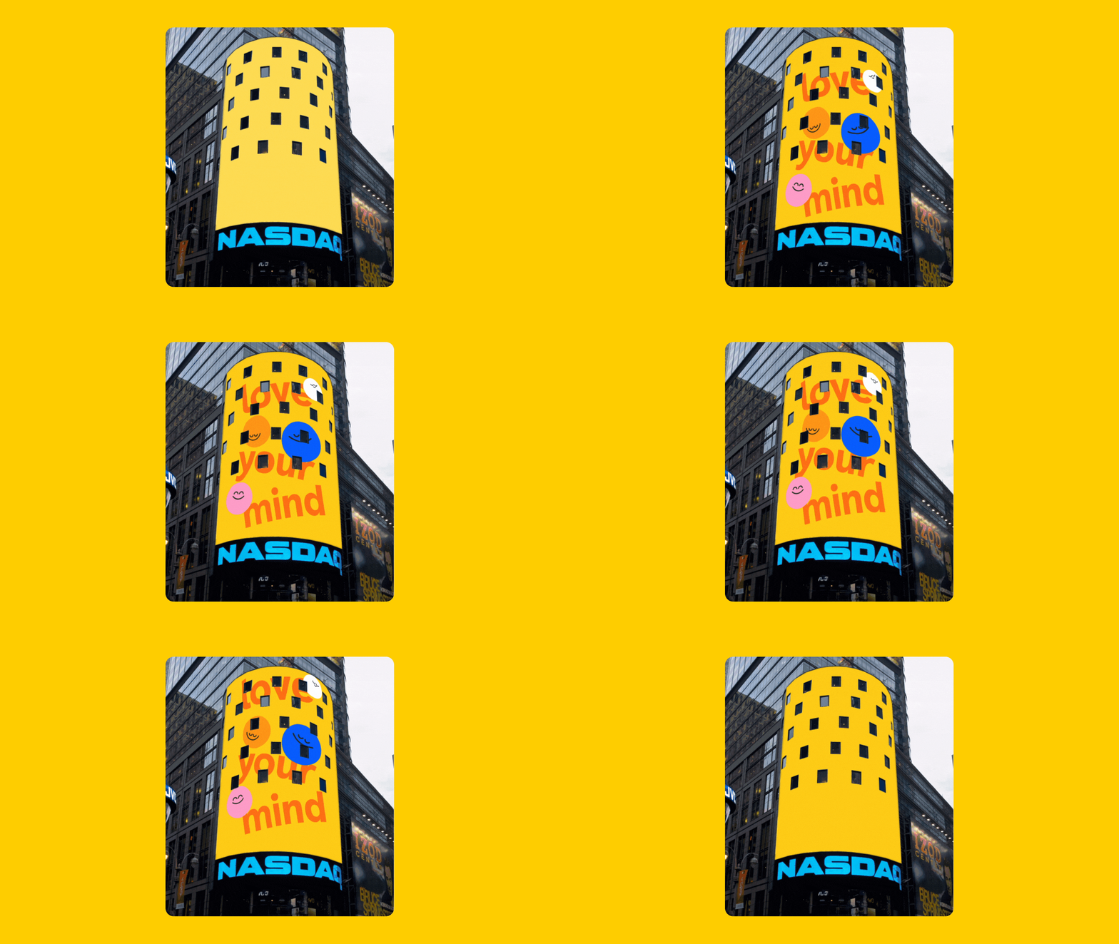
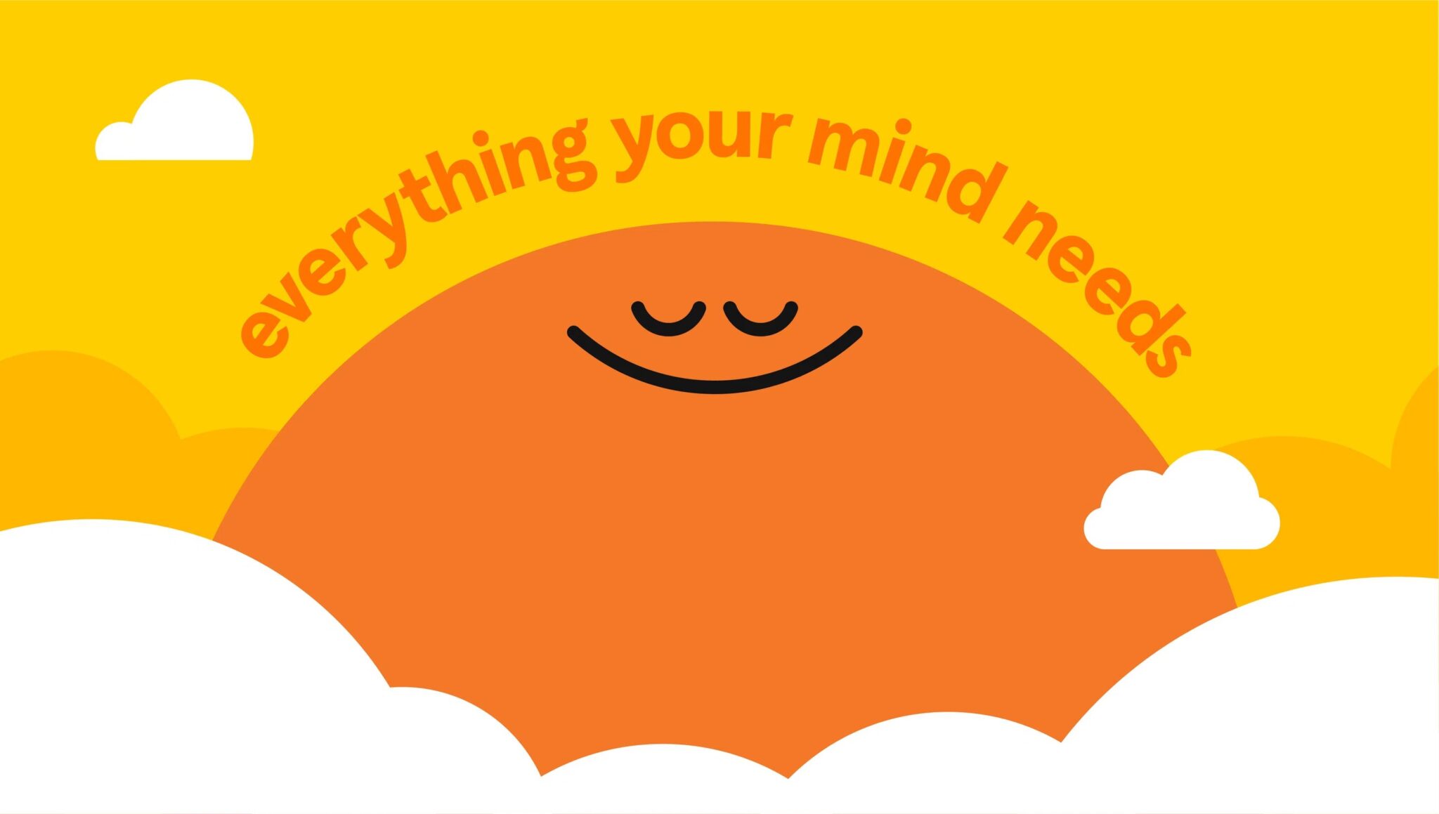
In their new brand identity created in collaboration with italic design, Headspace updated its color scheme to better represent a range of human emotions while still maintaining its signature orange hue. The addition of a supporting palette enables the brand to convey a diverse range of feelings and moods. By departing from the typical blues and greys associated with mental healthcare, Headspace aims to stand out in the industry and create a visually uplifting experience. The brand has introduced a new typeface that can adapt to different use cases, from playful to clinical. The illustrations have evolved to showcase a range of emotions beyond just a smile. The color palette has also expanded to include bold, high-contrast hues that represent the range of human emotions. The brand’s use of bright, bold, and lively colors aligns with its mission to normalize discussions about mental health and make seeking care approachable while being aesthetically pleasing.
Balancing Playfulness and Professionalism
The Headspace team identified the need to create a kind, warm, and welcoming brand identity to cater to the needs of its members seeking support for a range of mental health issues, from everyday stress to clinical anxiety and depression. In order to strike a balance between being playful and informative, the redesign features signature playful elements such as animations to simplify complex ideas, while also incorporating more photography to showcase its expanded services. The redesigned identity aims to provide a more holistic and accessible approach to mental health support.

Making Mental Health Feel Approachable
The rebrand has been a refreshing change for the mental healthcare industry. Headspace’s new approachable and personality-filled aesthetic has helped destigmatize mental health issues and made them feel more approachable to those seeking care. Even with new offerings like coaching for anxiety and depression, Headspace has kept its signature smiling face as a reminder that even during life’s toughest moments, there is still room for lightheartedness and joy.
An “Emotions” Rebrand for the Full Spectrum
Headspace’s brand redesign marks an exciting chapter in its journey towards offering comprehensive mental health support. Balancing professionalism and playfulness, the brand embraces change while remaining true to its distinctive identity. By incorporating photography, evolving its illustrative style, and introducing a vibrant color scheme, Headspace aims to create an emotionally resonant experience for its members. Through its visually engaging approach, Headspace seeks to destigmatize seeking care and foster a sense of approachability and normalization in the realm of mental health.

