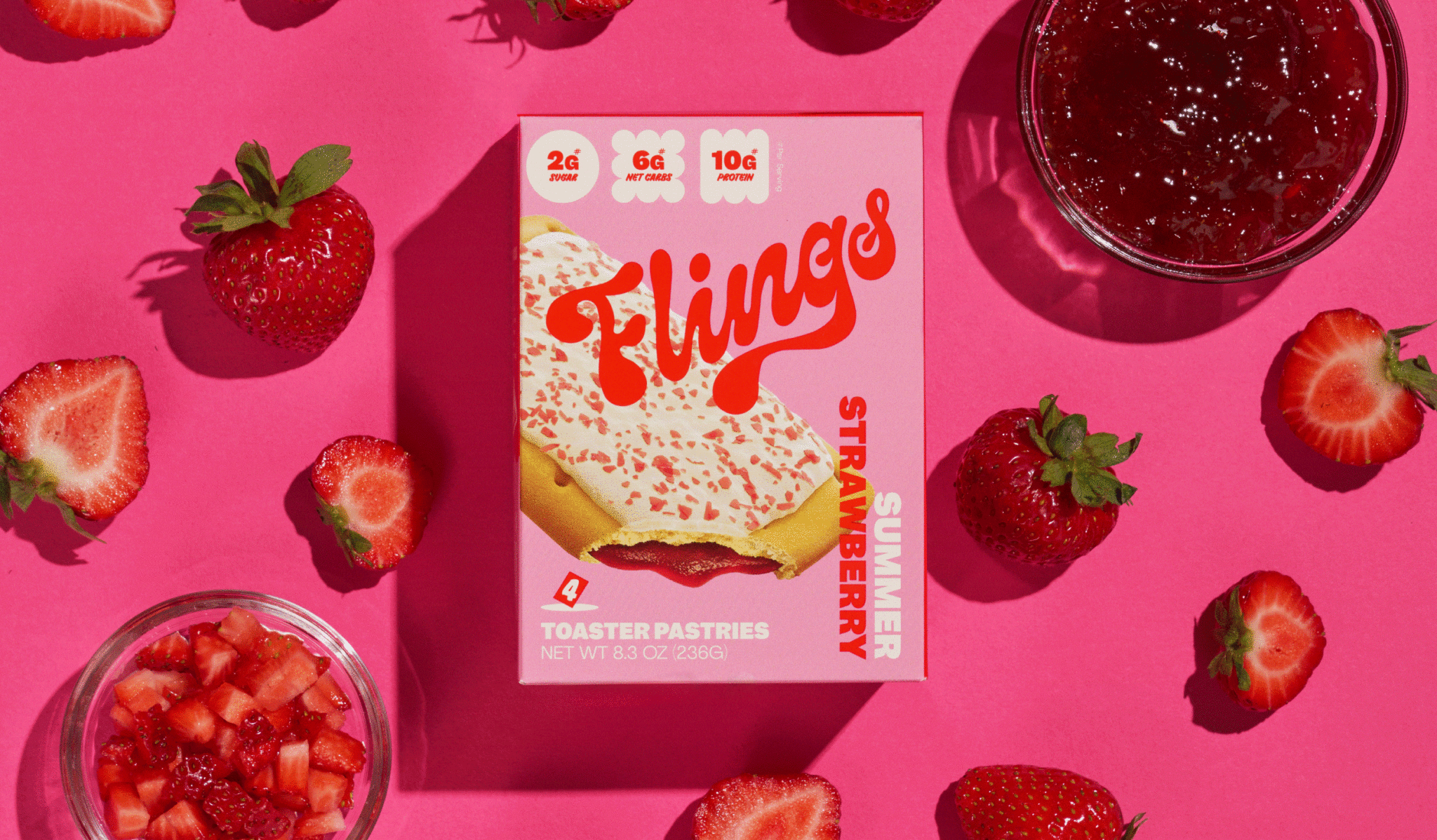
Sometimes the best innovations are inspired by our past. Do you remember the toaster pastries that you used to enjoy as a kid? The ones that were filled with sweet jam, covered with icing, and popped in the toaster for a warm and gooey treat? If you do, then you might be interested in Flings. Flings, a new keto-friendly toaster pastry snack, puts a modern health twist on a classic childhood indulgence.
Flings is the creation of food entrepreneurs Dino Vassiliou and Benjamin Outmezguine. To bring their brand to life, Flings rebranded with a mission to bring their vision to reality that evokes a sense of innocent delight. Let’s explore more about their rebrand.
Recapturing the Magic of Sneaking Snacks After School
Growing up, who didn’t love rushing home to enjoy a sweet treat after the school bell rang? For many kids in the 80s and 90s, that often meant a classic toaster pastry that was cheap, portable, and just the right blend of sugar and carb-loaded comfort. Flings aim to evoke the joy and comfort of childhood while catering to the nutritional needs of health-conscious adults. For this, Dino Vassiliou and Benjamin Outmezguine, have taken the beloved toaster pastry snack and transformed it into a healthier, more natural adult treat with their keto-friendly, gluten-free, and zero artificial colors sweet snacks.
Balancing Fun and Health-consciousness
To truly embrace the nostalgia, Flings turned to the creative agency Blurr Bureau. The challenge for Blurr Bureau was to strike a balance between lightness, cheekiness and designs that appeal to health-conscious consumers. While Flings’ branding aims to capture the essence of childhood treats, it also acknowledges the nutritional needs of adults. Blurr Bureau’s extensive consumer research revealed that adults often seek the indulgence of sugary snacks as a life hack. Flings aim to be the guilt-free indulgence that satisfies both taste buds and health-consciousness.
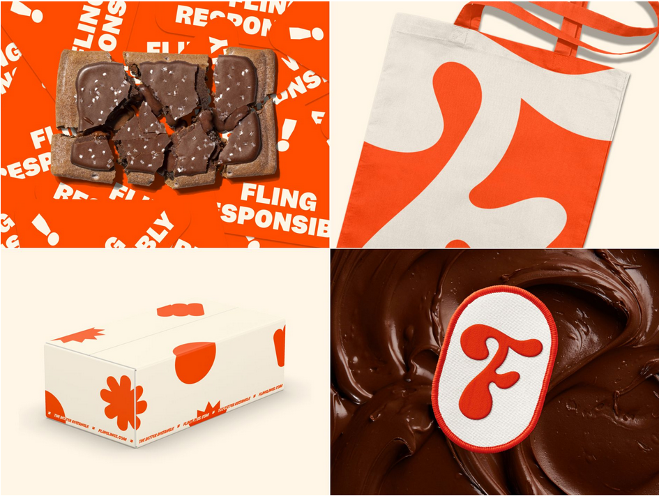
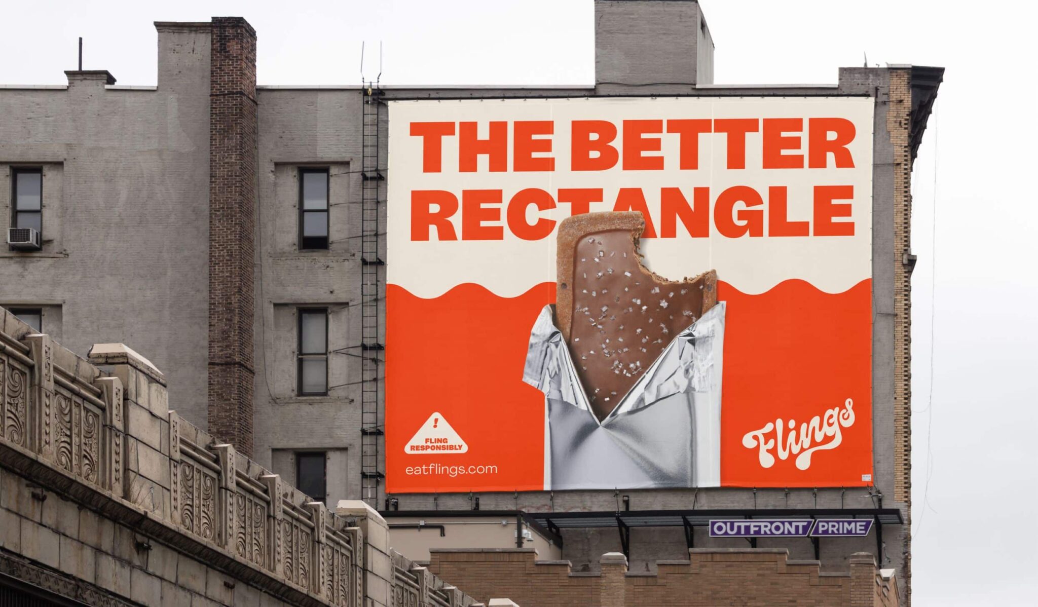
Logo, Colors, and Typography Satisfying Past & Present Cravings
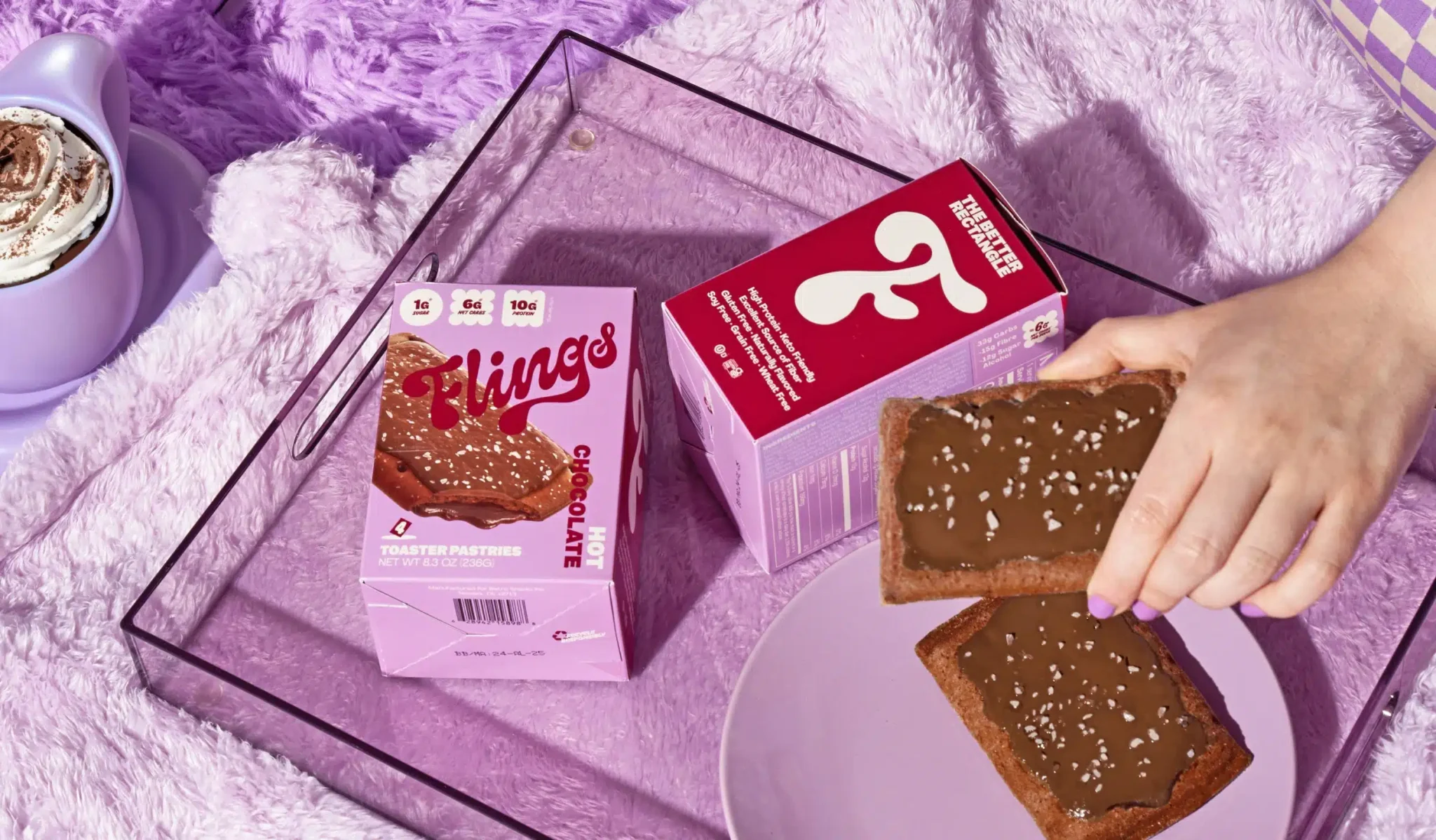
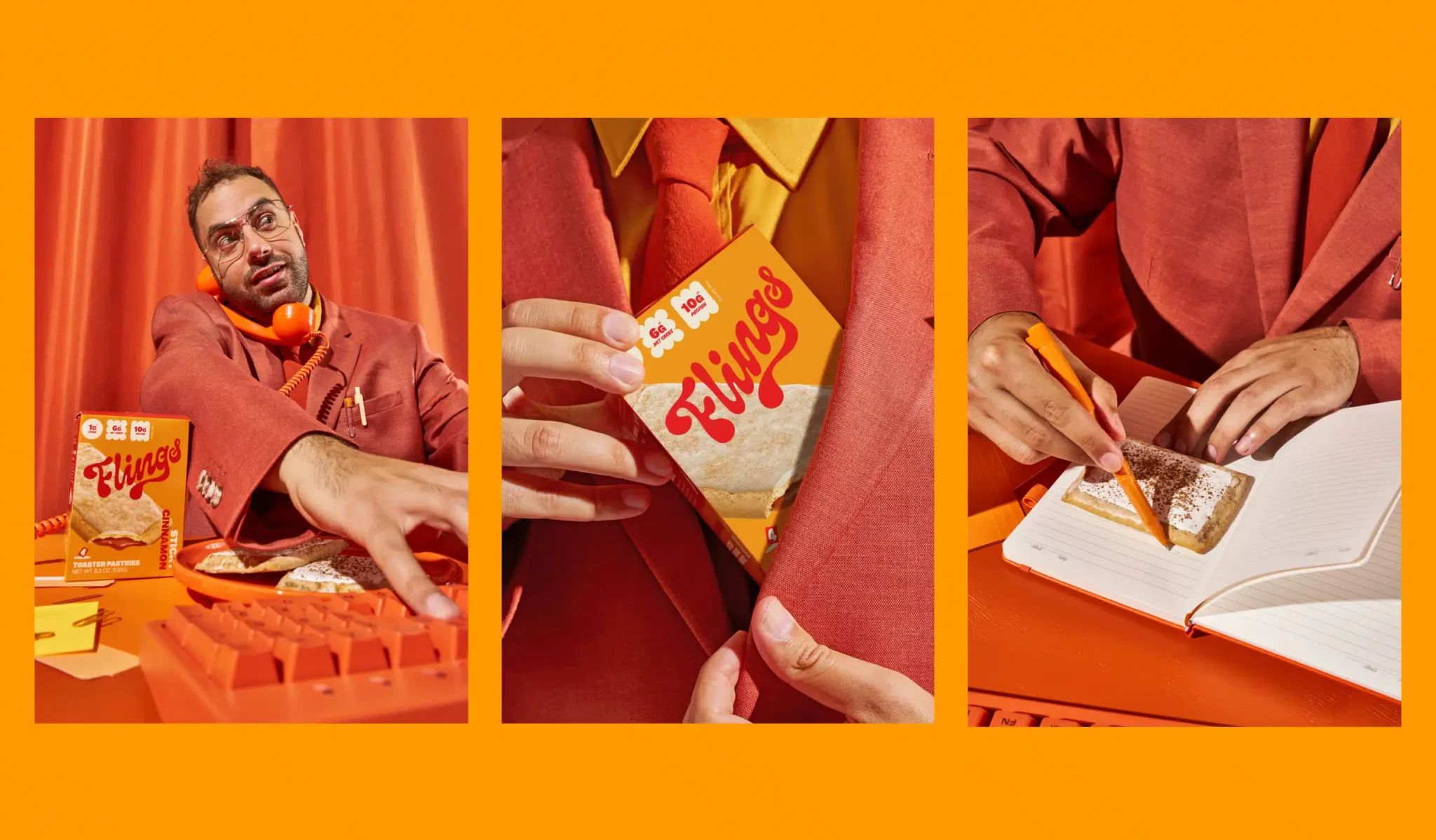
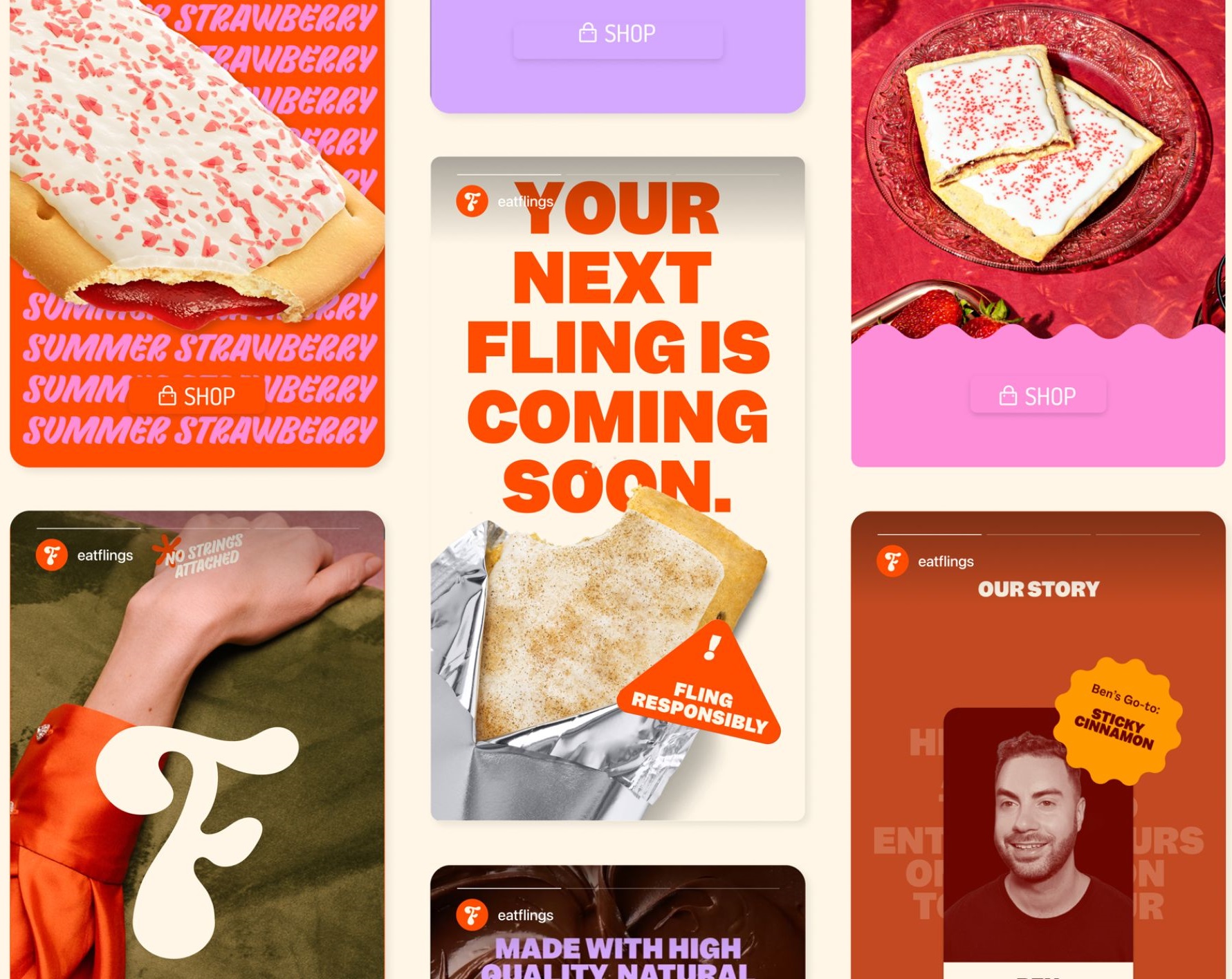
The brand story is expressed through the branding, tone of voice, and packaging of Flings. The logo is a simple and bold wordmark, with a playful twist on the letter “i”, which resembles a toaster pastry. The colours are bright and vibrant, reflecting the flavours and the mood of Flings. The typography is a mix of modern and vintage fonts, creating a contrast and a harmony between the past and the present. The imagery is a combination of nostalgic textures and patterns, such as polka dots, stripes, and stars, and more modern and clever language, such as puns, jokes, and slogans.
A Luxury Box of Surprises
The packaging is a bespoke luxury red box, that contains six toaster pastries, each with a cheeky and romantic name, such as “Hot Chocolate”, “Summer Strawberry”, and “Sticky Cinnamon”. The box is designed to look like a gift, a surprise, and a treat, that invites people to open it and discover the delicious and satisfying bakes inside.
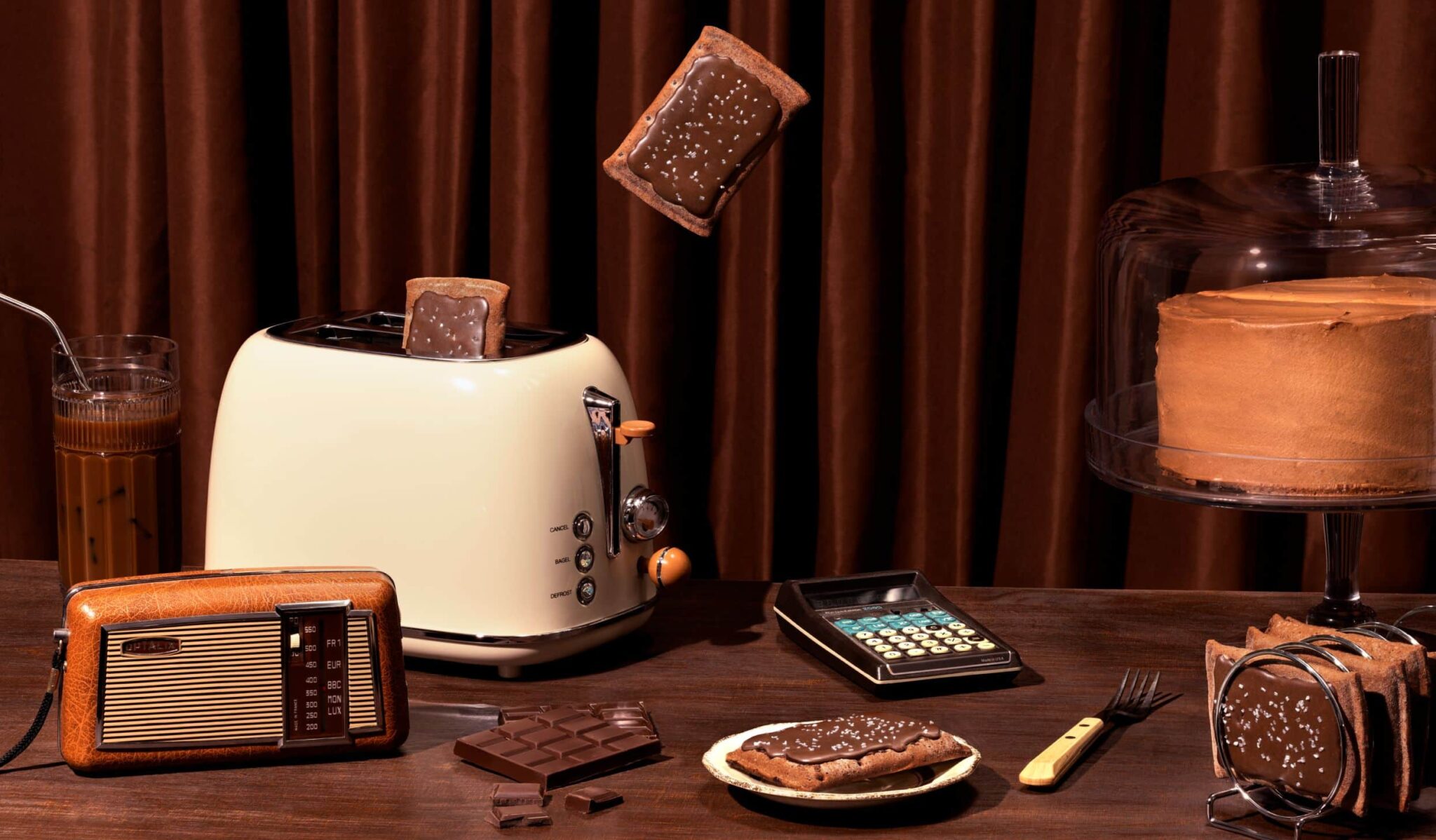
Time-Traveling Treats
Led by founder Jessica, the Blurr team approached the branding from a ‘retro-futuristic’ perspective. Across every touchpoint, from packaging to marketing, they married 1980s motifs with modern wit. The results are designs that look like they time-traveled from your childhood straight to today. According to Jessica, it was key to balance the cheeky callbacks with wider consumer desires like healthfulness. Just one month after launching, Flings exceeded their sales goals by 100% – proof positive that sometimes the best innovations are inspired by our past.
A Delightful Blend of Nostalgia, Innovation and Success
Blurr Bureau’s research spanning two years in the US and Canada uncovered a market expanding to include older consumers seeking convenience, familiarity, and health benefits. Flings’ brand language visually transports consumers back to the ’80s, a time when brands were more authentic and analog. Utilizing a retro-futuristic direction across all touchpoints, the brand marries nostalgic textures and patterns with modern, clever language. The result is a delightful blend of the past and present, dressed in velvet and bright, happy pants.
The Takeaway
The collaboration between Flings and Blurr Bureau has created a unique brand journey that captures the essence of childhood, ignites nostalgia, and delivers a guilt-free indulgence for health-conscious adults. With their keto-friendly, gluten-free, and zero artificial colors sweet snacks, Flings offers a taste of the past with a modern twist. The success of Flings’ launch, exceeding its sales target by 100% within the first month, demonstrates the power of evoking childlike joy and nostalgia in the hearts and taste buds of consumers.