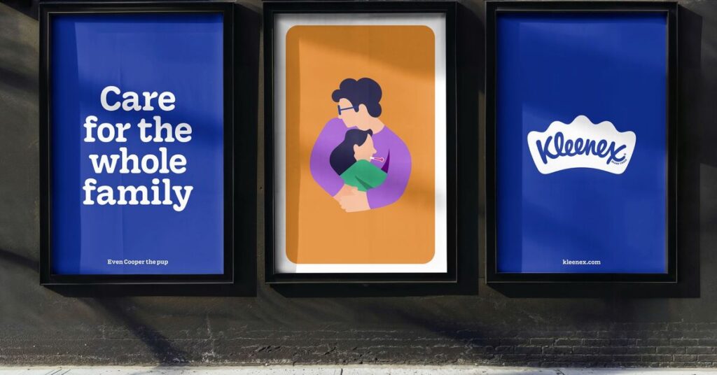
Popular tissue brand Kleenex is celebrating its 100th anniversary with a new global visual identity. Brand agency Turner Duckworth updated Kleenex’s brand identity.
The new identity comes as fresh air for Kleenex because it lost some visual consistency, varying logos and color schemes over the years. Jennifer Kasmarick, from Kimberly-Clark, said the rebrand is a pivotal moment for Kleenex. “It’s not just about celebrating the past – it’s about deepening the emotional connection with consumers as we look to the future.

Turner Duckworth acknowledged that Kleenex has been a name in millions of households and is a truly beloved icon of personal care. The creative agency created a more unified, singular, global visual identity that reinforces love and loyalty as Kleenex reaches the century mark. It highlighted that the new visual identity is centered around the tissue-inspired crown that contains it, underscoring Kleenex’s leadership and its core brand idea of delivering strength in everyday moments.
Moreover, Turner Duckworth took to a tighter, richer color palette – blue to give depth and controllable variety to the system. It said the new approach to illustration reflects the soft curves of the crown and reinforces the brand’s role in life’s unexpected moments like that mighty sneeze, untimely spills, and tears of joy. A clear visual throughline connects all aspects of the brand and helps Kleenex continue to lead the category and attract new consumers.

Furthermore, the brand has adopted Kleenex Serif – a custom typeface developed with type designers Alec Tear and Lewis Macdonald. It draws from the nuances of the original script, and conveys the brand’s strength and adaptability.
Also Read: ‘U by Emaar’ Upgrades Visual Identity, Enhances Brand Recognition


