London is known for its vibrant and diverse culture, and now its public transport system is reflecting that. The iconic London Overground is getting a vibrant new look after nearly two decades, in a move that’s set to revolutionize the city’s public transit experience. Transport for London (TfL) isn’t just changing the Overground’s color, but also renaming all six of its lines. Let’s explore this amazing transformation and what it means for commuters and visitors alike.
Why the Rebrand?
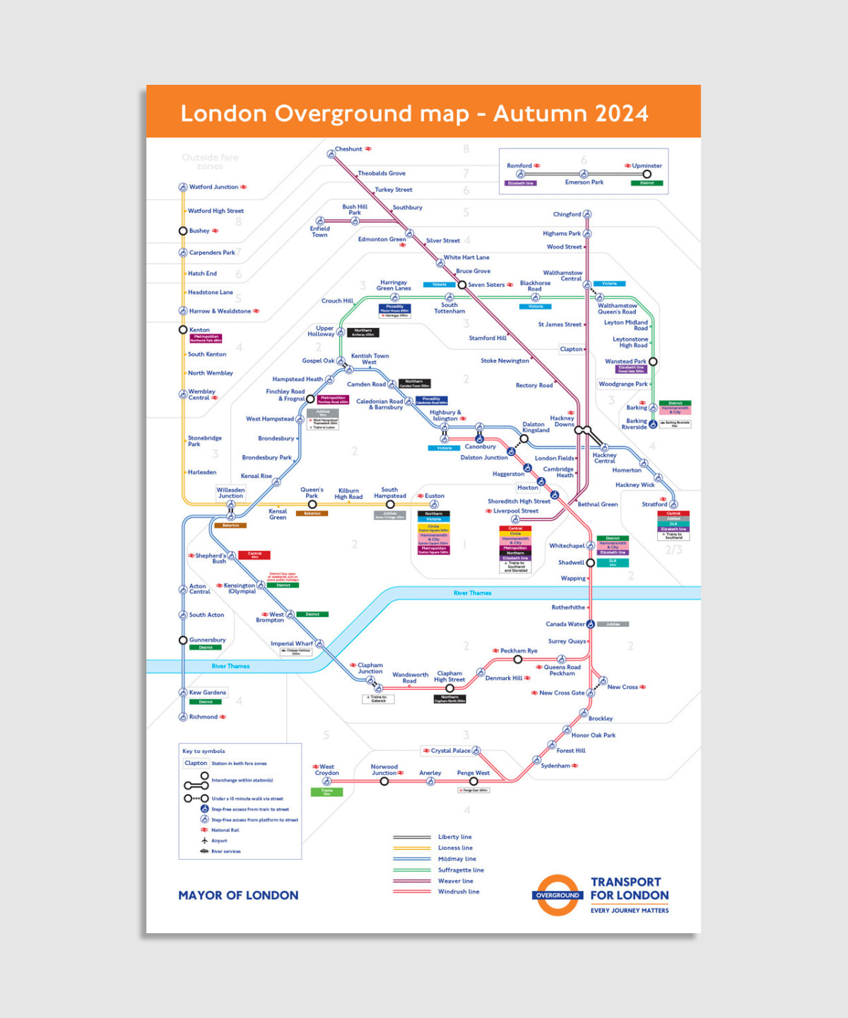
The London Overground was built in 2007 by TfL, creating ‘a fully orbital network’ around the capital. On London’s iconic Tube Map, all six of these lines were represented in orange and eventually nicknamed “the Ginger line“. But as it’s grown over time, the simplicity of the iconic Tube Map began to diminish, prompting the need for change.
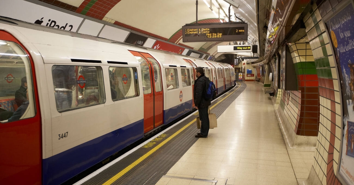
London’s Tube Map was originally designed by Harry Beck in 1931 and has since been lauded for its simplicity and topology-forward perspective. However, research from the TfL uncovered that the ever-expanding monotone Overground lines were making the map less legible. Now, each line will be redesigned with its own color and culturally significant name. The full rebrand is expected to cost $7.9 million and reach completion by the end of 2024.
Embracing Diversity and Commemorating History
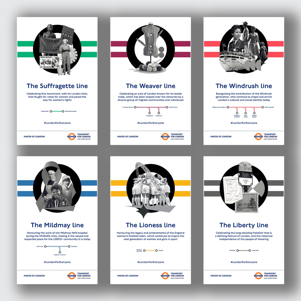
Central to the rebranding initiative is the infusion of cultural significance and homage to local heritage. Collaborating with a diverse group of stakeholders including customers, historians, and transport specialists, TfL embarked on the task of renaming each line. To breathe new life into the Overground, each line has been allocated its distinct color and culturally significant name. The Yellow Lioness line is a tribute to England’s women’s soccer team and their achievements. The Blue Mildmay line is named after a small hospital that played a crucial role in supporting the community during the HIV/AIDS crisis. The Green Suffragette line celebrates the brave efforts of working-class women who fought for equal voting rights. The Red Phoenix line symbolizes the resilience and regeneration of London in the aftermath of disasters. The Purple Thames line reflects the importance of the river Thames for London’s history, commerce, and culture. Finally, the Orange Ginger line pays homage to the original color and nickname of the London Overground.
TfL collaborated with customers, local historians, and transport specialists to select names that pay homage to local landmarks and influential figures. This approach not only enhances navigation but also celebrates London’s rich history and diverse communities. “There are so many fascinating, and often forgotten, stories from our city that should be told and remembered,” London’s Mayor Sadiq Khan told the TfL. “Naming the lines will not only help educate visitors about our amazing city and its incredible history, but will also make it easier for people who live, work, or visit London to navigate the city.”
A Modern and Diverse Transport Service
The London Overground rebranding process that is expected to offer several benefits. Firstly, it aims to improve the customer experience by making the network more user-friendly, intuitive, and attractive. Secondly, it seeks to enhance the identity and recognition of the London Overground as a distinct and modern transport service. Thirdly, it aims to celebrate the diversity and heritage of London and its communities by highlighting their stories and achievements. Fourthly, it aims to encourage more people to use the London Overground and explore different parts of the city. Finally, it is expected to support the economic recovery and growth of London after the COVID-19 pandemic by boosting tourism and business.
Final Thoughts
The London Overground is already one of the most popular and reliable transport services in the city, carrying over 200 million passengers a year. With its new look and branding, it is set to become even more appealing and accessible for everyone. By embracing distinct colors and culturally significant names, Transport for London aims to enhance legibility, celebrate local landmarks and leaders, and educate visitors about the city’s remarkable past. As the Overground undergoes its multimillion-dollar rebranding project, Londoners and tourists alike can look forward to navigating the city with greater ease and discovering the captivating stories woven into its transport network.
