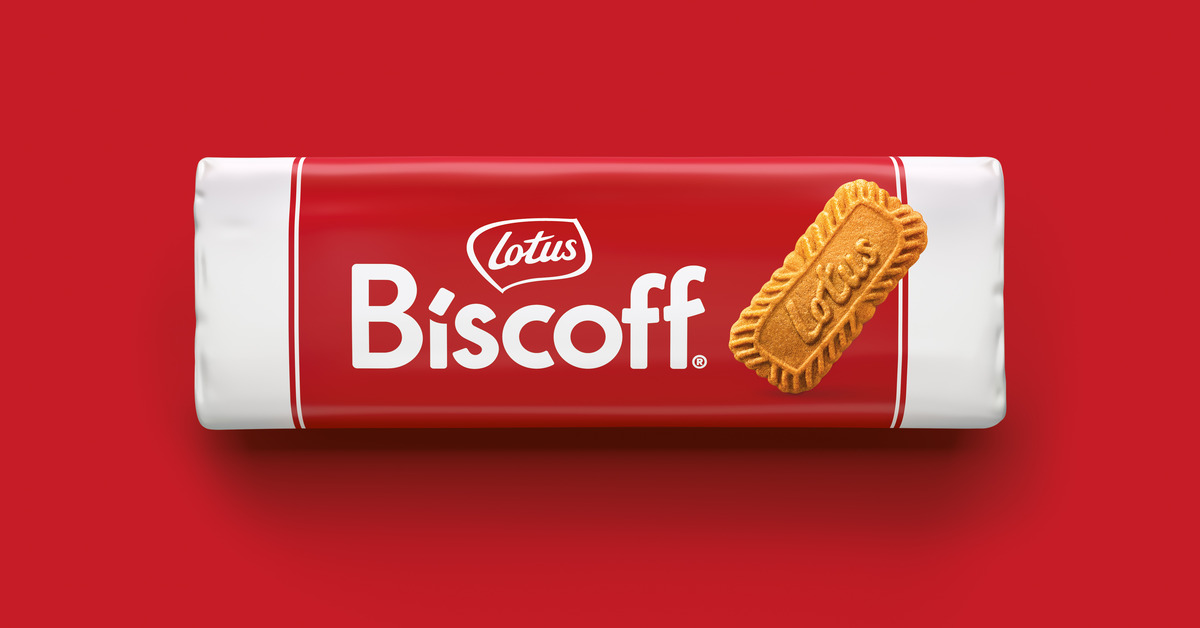
One of the world’s favorite Belgian cookie brand, Biscoff has undergone a brand refresh for a stronger, more unified, and distinctive identity. Biscoff partnered with BrandMe to turn over a new page for a redesign.

Erin Tucker, BrandMe client partner, said the redesign comes as Lotus Biscoff moves into a crucial period of global growth. He explained the cookie brand needed to drive global recognition and smoothly transition to one consistent brand. “The focus was to unify the brand globally and drive a stronger, more distinctive brand identity to reinforce global recognition.”
The agency said this required synergy without disrupting recognition for existing consumers. Moreover, the brief called for better communication of the brand’s joyous, uplifting, and approachable personality, which needed to be brought to life.

Tucker pointed out that protecting Lotus Biscoff’s relationship with its passionate consumers was crucial to getting the work right. “BrandMe did this by giving a lasting impression that supported the love for the brand, retaining the delicious taste Biscoff is known for. We built on rich brand equity but were single-minded in our approach. We dialed up the essence of Biscoff’s personality and celebrated the brand’s joy and positivity.”
The creative director Charlotte Elder said the new identity brings to life Biscoff’s bold, joyful personality in a contemporary way and continues to communicate the brand’s delicious taste experience. “There is a sense of warmth and inclusivity in the confident new brand mark. Positive, friendly and always approachable.”
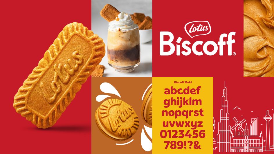
Elder said they created a bold new visual identity that puts the emphasis heavily on the Biscoff name, building more standout and ensuring a consistent global brand presentation. “The form of the wordmark creates a semiotic smile that reinforces the brand’s joyous positivity. The logo pays homage to the original cookie in the title of the ‘i’ allowing the iconic Lotus cookie to appear on every brand touchpoint. We crafted a bespoke brand typeface to build personality and charm while ensuring more visual consistency. The chunky letters utilize the high contrast red and white of the brand to ensure a strong presence, while the generous curves help drive Biscoff’s friendly and approachable personality.

As such, the brand now has a modern foundation from which it can continue to build and capitalize upon its popularity, expanding into new categories and exploring new innovations to excite consumers.
Also Read: Health and Sustainability: Snack A Jacks Adopts New Packaging Format


