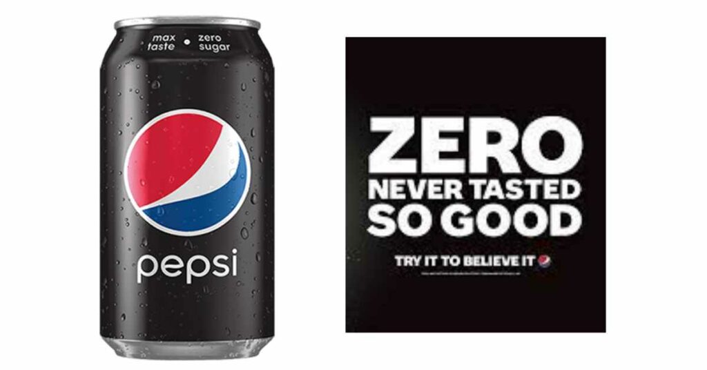
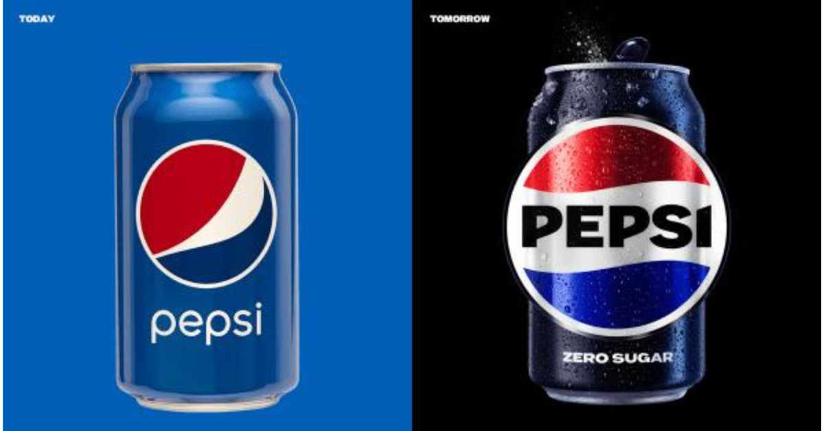
PepsiCo has unveiled its new logo and brand system, designed to distance itself from its association with sugar and promote its Zero Sugar products. The new design uses high-contrast visuals, with black cutting through the red, white, and blue palette to bind the brand together. Rolling out in North America this fall and globally in 2024, the updated logo puts the “Pepsi” wordmark back into the company’s patriotic yin-yang “globe.” Here are some key highlights of Pepsi’s latest rebrand.
The War on Sugar and the Rise of Pepsi Zero Sugar
PepsiCo’s revenue is growing, but that growth is mostly due to the company increasing its price of soda rather than extending its reach. Meanwhile, Pepsi has started something of a war on sugar as consumers are looking to drink less of it. 30% of Gen Z in particular claim to avoid it altogether. In recent years, the company’s move away from sugar has represented billions of dollars in investment and divestment for Pepsi, as the company sold off its juice brands and pumped more resources into its concentrate-based SodaStream platform, which it first acquired in 2018. Pepsi’s new black and blue brand system is built to distance the brand from sugar and promote Pepsi Zero Sugar.
The Power of Contrasting Visuals in Branding
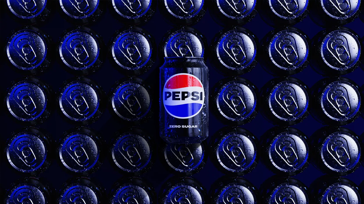
The addition of black in Pepsi’s new brand system significantly increased the pop of its visuals, allowing the brand to cut through the noise of social media and other digital environments that are defined by eye-sizzling over-saturation. The brand’s blue has also gotten richer and skews closer to midnight than Pepsi’s blues of the past. The new brand system is designed to reflect the next generation of consumers and appeals to them on social media and other digital platforms.
Flexible and of the Times
Pepsi’s new brand system is flexible and designed to work well in various contexts, from Instagram to branded merchandise. The brand system uses silhouettes like cans and cups to frame the logo in food service contexts and features sharply detailed, macro food photos as photographic backdrops. Expect to see fresh animations along these lines for the next decade of Pepsi ads.
Overall, Pepsi’s new branding is designed to appeal to a new generation of consumers and promote its Zero Sugar products. With high-contrast visuals that cut through the noise of digital environments, the new design is of the times and reflects the cultural zeitgeist of 2023. The brand system is flexible, designed to work across a range of platforms, and is a logical, bold update that captures the essence of Pepsi’s evolution.

