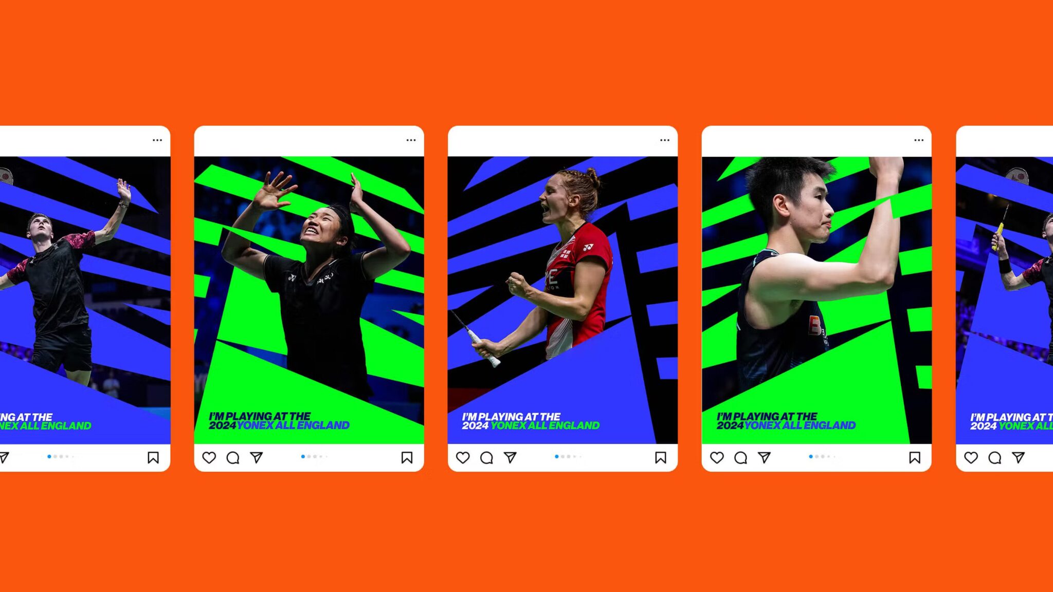
The YONEX All England Open Badminton Championships, or simply the YONEX All England, is the oldest and most prestigious badminton tournament in the world. To introduce the exhilarating experience of live badminton to new communities, as well as bring together the sport’s global fanbase, Badminton England is proud to have redefined the visual identity of the brand. Let’s explore those thrilling changes that promise to electrify the tournament’s identity.

Bringing the Energy of Live Badminton to Life
Badminton England invited the creative agency Monopo London to ensure the new visual identity felt exciting and dynamic but also stayed true to the heritage of the tournament. The rebrand retains the tournament’s iconic roundel logo but is now re-energized for a digital-first identity that engages youth audiences. In the same respect, the new color palette infuses the blue and green heritage colors of the tournament with a vibrant neon tone and accents of burnt orange, inspired by Badminton England’s brand color, bringing in a touch of warmth.
Monopo wanted to convey the “lightning-fast speed of the shuttlecock” in the redesign, especially after Indian player Satwiksairaj Rankireddy set a new world record in April 2022 for the fastest badminton serve at 565 km/h. Vibrant patterns and colors mimic shuttlecocks whizzing by, creating visual drama fitting of the action on the court. The agency also implemented a masking technique to develop an iconic graphic accent stripe. Overall, the visual identity reflects the pulse-pounding thrill of watching top-tier badminton in person.
Inspiring the Next Generation
The Yonex All England’s rebrand isn’t just about revitalizing its image; it’s about igniting a passion for badminton in the hearts of a new generation. The focus is on connecting and growing the badminton community worldwide. Although the rebrand introduces an exciting new aesthetic, it also pays homage to the tournament’s rich 123-year history. The iconic blue and green color palette remains, now amped up with neon accents. The classic roundel logo format has also been preserved but modernized. The changes help broaden the tournament’s appeal, especially among younger viewers. As the Yonex All England prepares to showcase elite badminton in 2024 and beyond, the revived branding sets the stage.
Energizing the Brand Identity
Monopo’s additions like explosive photography and typography that makes viewers feel like they’re ‘leaning into the action’ inject energy into the tournament’s identity. Animated graphic elements and cropped images that highlight intense on-court moments also contribute to the dynamic, digital-first aesthetic. For both live spectators and those watching remotely, the reimagined visuals allow them to experience the thrill of world-class badminton.
A Digital Focus
The rebrand also aims to transform the Yonex All England into a dynamic brand platform capable of hosting a year-round spectrum of content. It’s an invitation for audiences across the globe to discover the electrifying world of live badminton, both online and offline.

Bottomline
With its slick new look, the rebranded Yonex All England tournament is ready to capture the attention of badminton fans worldwide during one of the sport’s most anticipated events in 2024. The redesign successfully retains the championship’s spirit while positioning it for an exciting future. No matter how viewers around the globe watch the action, they’ll feel like they have a courtside seat.


