YumBun, London’s original streetside bao, has a fresh new look that reflects the brand’s progressive optimism. The new visual identity showcases the fusion of East and West present in their bao buns. The new logo, color palette, and typography formats all embody YumBun’s playful energy and standard-raising culture. Let’s know more about the brand’s latest overhaul.

A Playful Palette to Match the Mood
How&How, the agency behind the rebranding, developed an upbeat color scheme inspired by sunrises and steaming bao to reflect YumBun’s optimistic spirit. Vibrant yellows, pinks, and purples in gradient forms conjure up images of clouds at dawn and buns rising in their baskets. The lively palette perfectly matches YumBun’s lively and innovative fare.
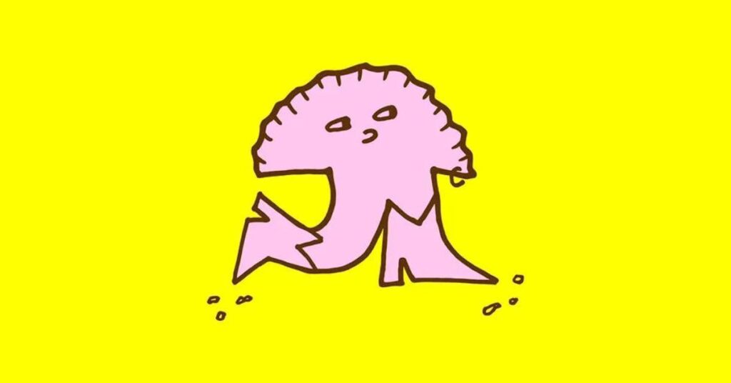
An Adorable Mascot to Raise Smiles
How&How created an endearing mascot, Bowie, to embody the brand’s uplifting vibe. Bowie, the ‘bouncy bao’, aims to put a smile on customers’ faces and spread good cheer. His simple yet charming design is one of the project’s crowning achievements, according to How&How co-founder Cat How.

A Meaningful Logo Rooted in Craft
The new YumBun logo takes inspiration from traditional Japanese Hanko stamps and uses the Ogre Mono Grotesk font. Its bold and rounded footprint pays homage to YumBun’s pedigree in artisanal cooking and fusion of classic Eastern and modern Western influences. While the gradients on the branding convey steam and elevation, the vibrant red shade reinforces the brand’s appetite for innovation.
Raising the Bar Through ‘Progressive Optimism’
YumBun’s mission to push the envelope of ethical and sustainable street food in London served as a key inspiration for the rebrand. How&How aimed to reflect YumBun’s standard-raising practices and ‘progressive optimism’ through every aspect of the new visual identity. From the luscious new photography featuring fresh ingredients to the warm and uplifting tone of voice, the revamp embodies the brand’s aspirational ethos.

Emotional Narrative and Typography Formats
How&How created an emotional narrative around the new identity, with a “bunrise” metaphor that pairs the rising of the buns in their steaming baskets with raising standards in the food industry. YumBun’s fusion of East and West is reflected in the typography formats that reflect different sights and sounds of the kitchen, such as “Steamy,” “Sizzling,” and “Goodness.”
Final Thoughts
The new YumBun identity is a visual representation of the brand’s optimistic outlook and culture of raising the bar in the street food industry. It celebrates YumBun’s fusion of East and West through playful energy, bold typography, and a “bouncy bao” mascot. The brand’s new website and identity will enable YumBun to strengthen its position as London’s original streetside bao brand and continue to set the standard for ethical and delicious street food.