Trustpilot, the Danish review website, has recently undergone a visual overhaul that celebrates its diverse range of user reviews. The new look, designed by independent creative company Barkas, takes a unique approach to branding by embracing the full spectrum of customer experiences.
Let’s take a closer look at Trustpilot’s new visual identity, including its use of color, typography, and imagery. We’ll also explore how the company’s approach to reviews is reflected in its new branding, and how it sets itself apart from other review platforms.
A More Colorful Approach
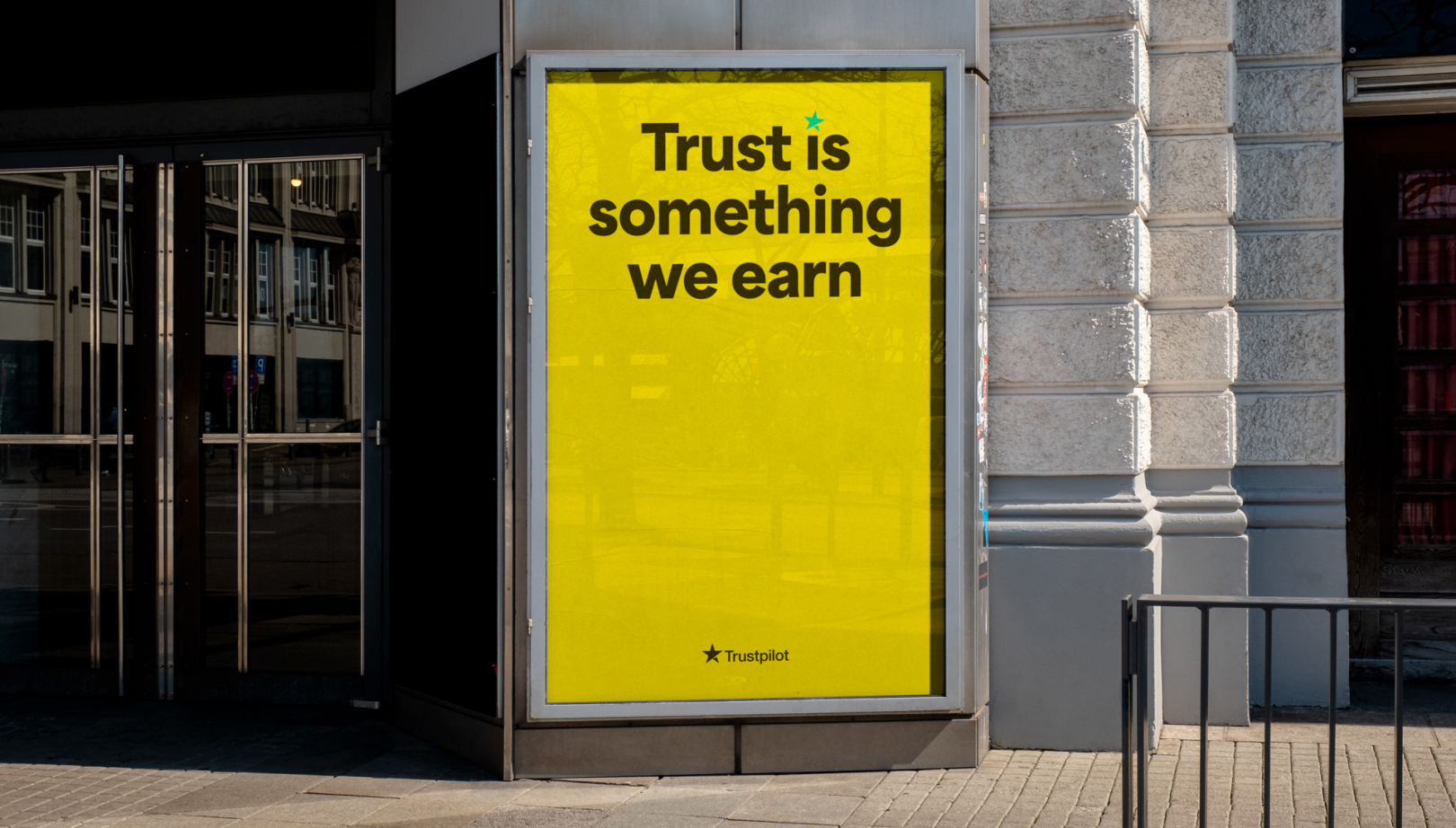
Trustpilot’s new visual identity moves away from the classic green and red associated with review platforms. Instead, the company has introduced a broader range of in-between colors that represent the diverse range of reviews left by its users. By embracing the more nuanced aspects of customer feedback, Trustpilot can remain neutral without being bland or corporate.
A Typographical Refresh
While the previous branding’s typographical anchor, Helvetica Neue, remains in place, Trustpilot Display has been introduced to add a “valuable splurge of distinctiveness.” This new typeface is more personable and suits campaigns and marketing efforts where a sense of identity trumps day-to-day review impartiality. The custom weight from Blazetype creates a friendly, fun, and funky yet highly readable display typeface that is trustworthy for all reviews – good, bad, and everything in between.
Authentic Imagery
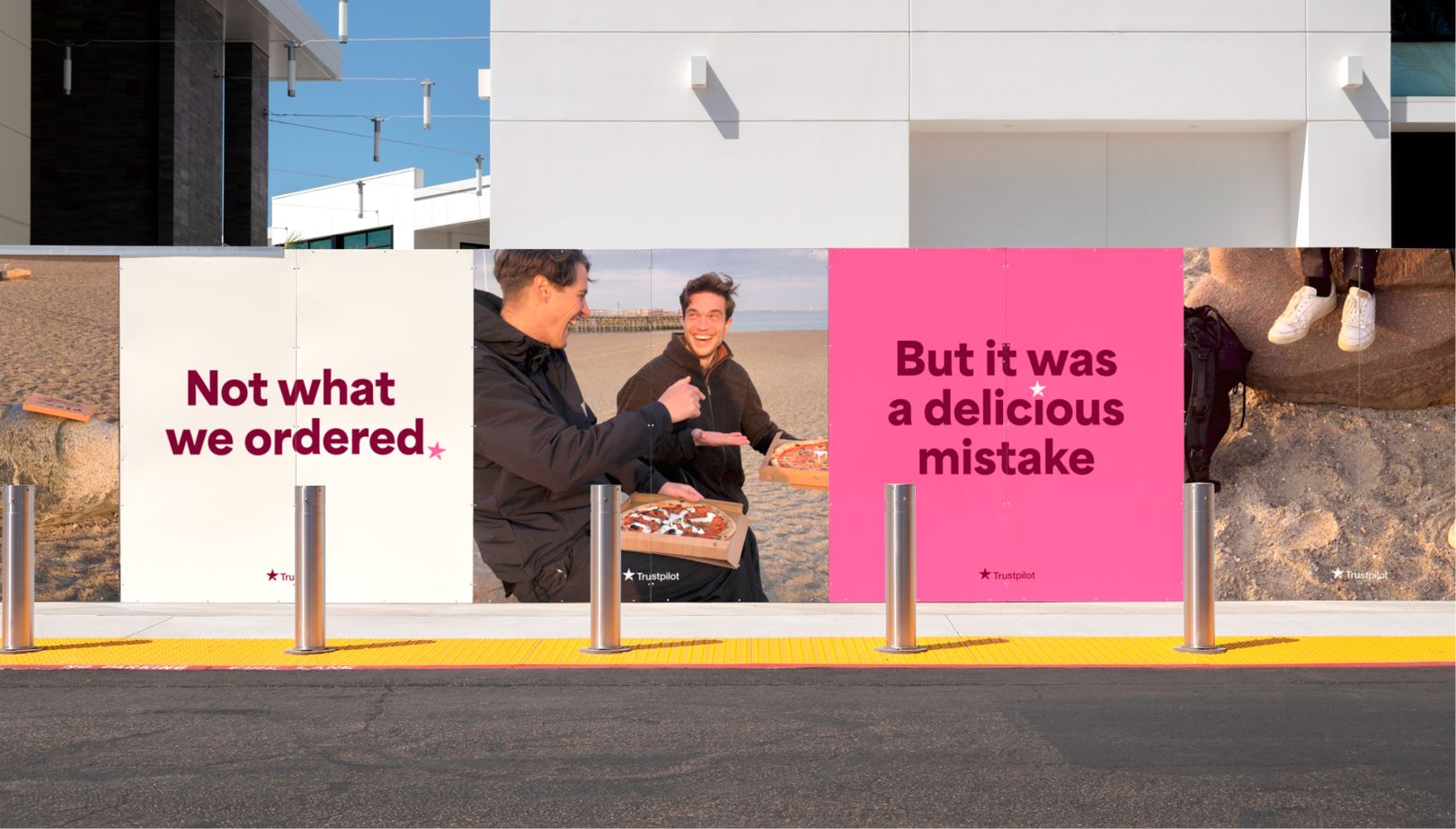
Trustpilot’s new visual identity also features unedited and honest imagery that captures authentic human emotion and relatable experiences. The images, sourced directly from employees and collaborators, show real people in real-life situations. This reinforces the company’s connection with its users and drives home the concept that Trustpilot champions these sometimes overlooked messages.
A Celebrated Star
The Trustpilot star remains at the forefront of the new look, taking on a more personified role that allows it to express itself outside of the logo. This symbol acts as a signal of trust between users and the platform and has become fundamental to the brand’s identity. By featuring funny, angry, and surprising excerpts from its 167 million reviews, Trustpilot highlights the importance of championing these sometimes overlooked messages.
Bottomline
Trustpilot’s new visual identity celebrates the vast constellation of user reviews that form the basis of the platform. By embracing the diverse spectrum of experiences that customers have, the company sets itself apart from other review platforms and reinforces its commitment to impartiality. With its new color palette, typography, imagery, and celebrated star, Trustpilot’s new look is sure to make an impact in the world of customer feedback.

