Insurance companies often find it challenging to merge the worlds of finance and aesthetics. However, with Marshmallow‘s fresh approach to insurance branding, we witness a unique blend of financial security and creative design. Let’s explore more about their brand revamp.
A New Perspective on Insurance
Marshmallow stands as an outlier in the insurance landscape, proudly covering individuals who have traditionally been challenging to assess. These include the over one million people who have migrated to the UK from diverse corners of the world. The creative mastermind behind this transformation, Ragged Edge‘s brand strategy and visual identity seamlessly encapsulate this distinctive quality and transform it into a celebration.
Challenged With Representing Diversity
Marshmallow prides itself on covering people who are typically underserved in the insurance industry – like immigrants to the UK. They needed to create an identity that celebrated Marshmallow’s support for diversity and has succeeded in crafting an identity that not only distinguishes Marshmallow but also celebrates the diversity it serves.
“We built the brand around ‘valuing difference’ – an idea that’s as distinctive as it is relevant to an audience who are consistently penalized for their diverse backgrounds, experiences, and circumstances,” explained Ragged Edge co-founder Max Ottignon.
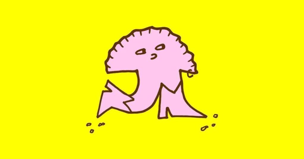
Marshforms: A Representation of Humanity
One of the highlights of Marshmallow’s rebrand is the Marshforms. They manage to represent a spectrum of individuals without resorting to stereotypes. The way these shapes are used across various touchpoints, from mobile animations to air fresheners and furniture, underscores the identity’s strength and adaptability.
Language as Inclusive as the Brand
Marshmallow’s new tone of voice is crystal clear and inviting. The language has been meticulously crafted to be inclusive, accommodating individuals with varying levels of English proficiency. Even the typeface is a custom version of Youth by the AllCaps foundry, chosen for its bold yet playful character. Ottignon notes that they worked with the foundry to enhance readability, making it accessible to all.
Marshmallow’s Vision
Marshmallow aspires to be the premier insurance company for individuals on the rise. To achieve this vision, Ragged Edge embarked on a comprehensive rebranding journey, encompassing brand strategy, visual identity, and verbal expression. This transformation aimed to rally the internal team around a unified mission, in addition to external repositioning.
Valuing Difference: The Core Idea
At the heart of Marshmallow’s new brand is the concept of ‘valuing difference’. Ottignon elaborates that this idea speaks directly to an audience that often faces adversity due to their diverse backgrounds. The challenge was to design an identity that communicated this unique ethos in a clear, inclusive, and empathetic manner, all while retaining its distinctive character.
Custom Typeface Prioritizes Accessibility
Marshmallow Youth, the company’s bespoke typeface, is a tailored version of the rounded Youth font by AllCaps foundry. Chosen for its bold and playful character, this typeface perfectly aligns with the brand’s tone.
Bespoke Characters Bring the Brand to Life
To represent diversity in a friendly, approachable way, Ragged Edge created a cast of characters called Marshforms. The Marshforms are a modular system of shapes and sizes, each with a unique personality. They can be used in endless compositions across any touchpoint.
A marshmallow-shaped mascot brings extra warmth. As design director Jessica Bong put it, “Creating an endless variety of Marshforms that each had character and personality felt like the perfect solution.”
Tone of Voice Exudes Empathy
Beyond visual elements, Ragged Edge introduced a new tone of voice that conveys empathy and understanding for the diverse journeys of Marshmallow’s audience. The goal was to create a brand that is both highly adaptable and instantly recognizable.
A Unified Identity Across Touchpoints
The new identity has seamlessly extended across all physical and digital touchpoints, including the app, website, advertisements, and communications. This holistic approach ensures a consistent and compelling brand experience for Marshmallow’s diverse customer base.
Bottomline
The transformation journey of Marshmallow’s rebranding showcases the impact of design, which can enhance industries that are typically linked with monotony and bureaucracy. The creative vision of Ragged Edge has not only elevated Marshmallow’s brand but also celebrated the diversity and individuality of its customers.