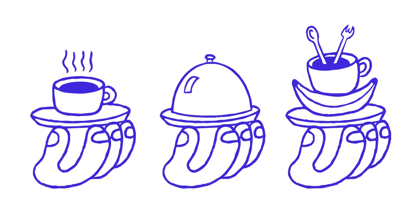
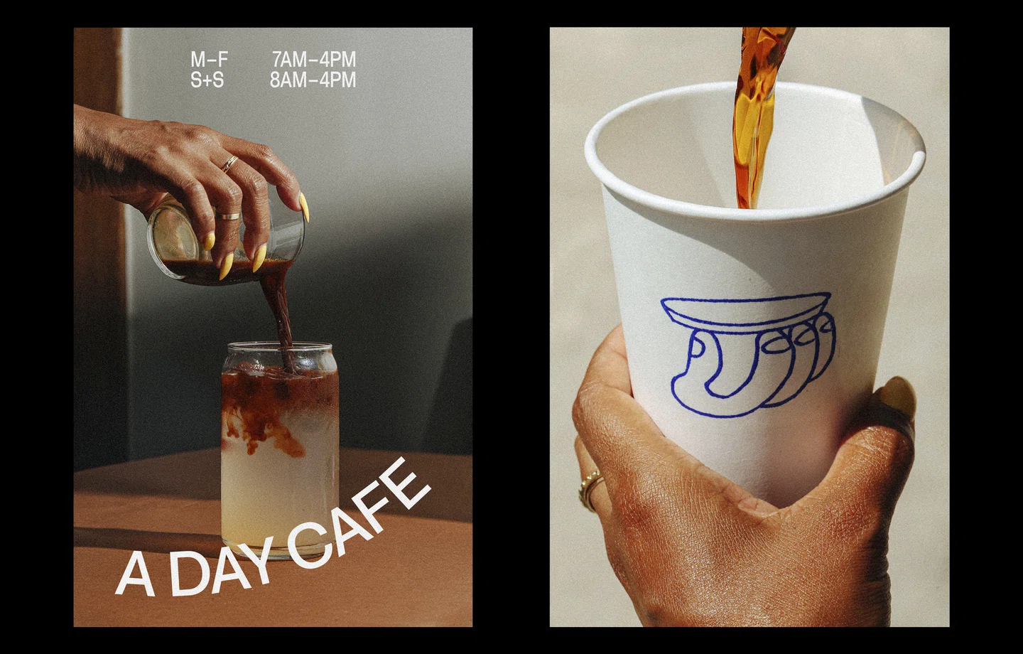
Wim, the new coffee joint in Philadelphia, has been creating a buzz in the city’s cafe scene with its refreshing typographic take on branding. Created by designers Hanna Karraby and James Paris, the identity balances a heavy graphic logo with playful illustrations, resulting in a contemporary yet approachable look. Through this post, I am attempting a closer look at the design process behind Wim’s identity, including the challenges of finding the right typeface and the benefits of a collaborative approach.
The Story Behind Wim’s Identity
Wim is the brainchild of Shannon Maldonado, the founder of Yowie, one of Philadelphia’s go-to independent shops for well-designed, creative goods. The cafe is situated in Yowie’s new multi-level space, alongside the shop and a new hotel, creating a new hub for creatives. Hanna Karraby, the designer behind the identity, aimed to create a look that was both bold and welcoming, design-forward yet approachable. The result is an identity that has the same elevated, playful spirit as Yowie but with enough differentiation to stand on its own.

Finding the Right Typeface: The Hardest Part of the Design Process
According to Hanna Karraby, finding the right typeface for Wim’s logo was the most challenging part of the design process. As ‘Wim’ is a great word to work with, she experimented with dozens of different typefaces in search of the perfect tone. Some felt too retro, while others were too contemporary and expressive. After a long period of experimentation, she finally settled on a typeface from Benoît Bodhuin, which she felt hit every note she wanted for Wim. The dense letterforms are a bold statement, softened by exaggerated curves and dips, and the “knockout dot” within the eye adds a unique touch inspired by Bodhuin’s other type of work.
The Collaborative Element of Success
Wim’s identity is a refreshing typographic take on cafe branding that successfully balances a heavy graphic logo with playful illustrations. Hanna Karraby and James Paris brought their different skill sets together to create a full identity that represents the core of the brand. Wim’s visual identity is both bold and welcoming, design-forward but approachable, which is exactly what Hanna Karraby aimed for. At the end of the day, it was the collaborative effort of designers Hanna Karraby and James Paris to come up with a rebranded identity that is contemporary yet approachable look for Wim which found fruitful in perfectly representing the brand’s playful spirit.