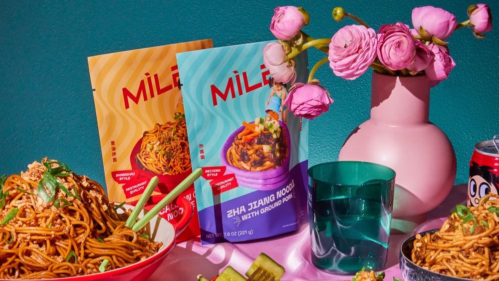
Chinese food brand Xiao Chi Jie (XCJ), which had rebranded to MiLa earlier in the year, has come up with new packaging. MiLa’s packaging system showcases its co-founders Jennifer Liao and Caleb Wang experiences as “third culture” kids – Chinese and American, not either/or.
Tracy Chow, MiLa’s Creative Director, says the branding reflects third culture by bringing together Chinese and English characters. “This is especially evident in our secondary logo, where Chinese characters are the primary anchor, and the words Mi and La are hidden within it.” Chow explained that the hidden English characters reflect the idea of finding something familiar and comforting in a dish. Moreover, it also reflects an experience of discovery the brand wants its customers to have.
Balances Nostalgia and Modern Design
MiLa worked with Design Army to construct a whimsical approach that beautifully balances nostalgia and modern design elements. Chow pointed out they wanted to ensure a level of playfulness in packaging because the brand wanted to be approachable and welcoming. “This supports our mission in sharing authentic modern Chinese cuisine with everyone and anyone willing to try it. The packaging is pure comfort food, allowing consumers of all backgrounds to feel embraced and welcomed into tasting the product.”
Chow believes nostalgia is a really important component of the packaging. “For many third culture citizens, food plays a prominent role in telling a story where you’re from, provoking memories and past times. It’s reflective of the transportive nature of a home-cooked meal.” Chow highlighted that building the brand has been a journey of self-discovery for their co-founders, and self-discovery involves looking forward and backward. MiLa’s packaging design reflects the idea of bringing the future and the past together.
Showcases Brand’s Playful Personality
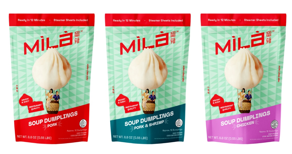
The new packaging conveys the restaurant’s quality products without sacrificing to showcase the brand’s playful personality. Chow said ‘Grandma called, she wants her soup dumplings back, splashed across the soup dumpling pack, proves the brand put a little extra love in the details. It understands the importance of harnessing the power of all elements in packaging design.
Jennifer Liao, the co-founder, explained that MiLa stands for honey and spice in Chinese. “The idea is we now have products that are sweet and spicy, and this name will better encompass our expanded offering, which includes not just soup dumplings but noodle kits, BBQ skewers, sauces, seasonal ice creams, and kitchen accessories, like bamboo steaming baskets.”
The packaging’s collage of modern and nostalgic images and the expanded color palette draws on the colors of neon street signs that influenced the brand’s original packaging and bold primary red, which holds significance in Chinese heritage and culture.
However, there’s the risk of confusing or losing existing customers. Liao said the company has already given repeat customers a heads-up and will include cards in the physical packaging to explain the new look and name.