In the vibrant tapestry of the Middle East’s culinary scene, few brands have captured hearts quite like Yamama. A sub-brand of the esteemed Beirut-based Gandour, Yamama beautifully marries tradition and quality, offering a delectable range of baked goods since the 1980s. Leveraging over 150 years of confectionery expertise, Yamama secured its position as a beloved family brand, renowned for high-quality cakes at affordable prices. However, even beloved brands must adapt and innovate in a rapidly evolving market. Let’s explore how Yamama revitalized its brand identity while staying true to its roots.
The Challenge of Modernization
Despite its strong legacy and nostalgic value, Yamama faced the challenge of appealing to a new generation of consumers. As competition intensified, the brand took a proactive approach to revive its image and reach a broader audience. Recognizing the urgency for a refresh, Yamama enlisted the help of the design studio Derk&Eric, based in Clerkenwell. The design studio was tasked with the ambitious mission of reimagining Yamama’s identity and worked with the primary objective of revitalizing the brand’s appeal without alienating existing fans. Through careful research and collaboration with local teams, Derk&Eric focused on keeping the heart of Yamama alive. They finalized on the idea of using the cherished connection between parents and children, which was essential for crafting a design that resonates across generations.
Crafting Connections Through Design
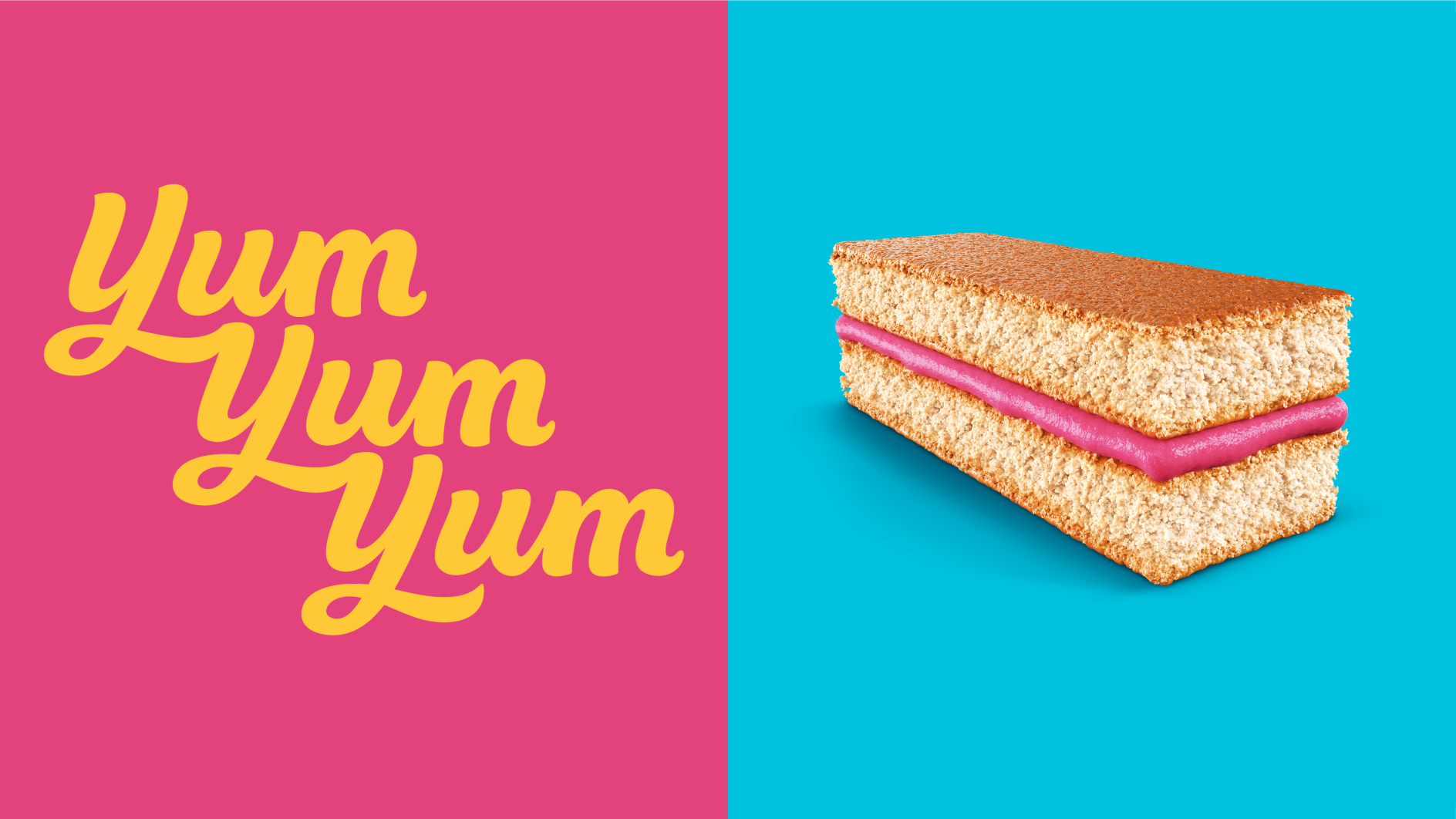
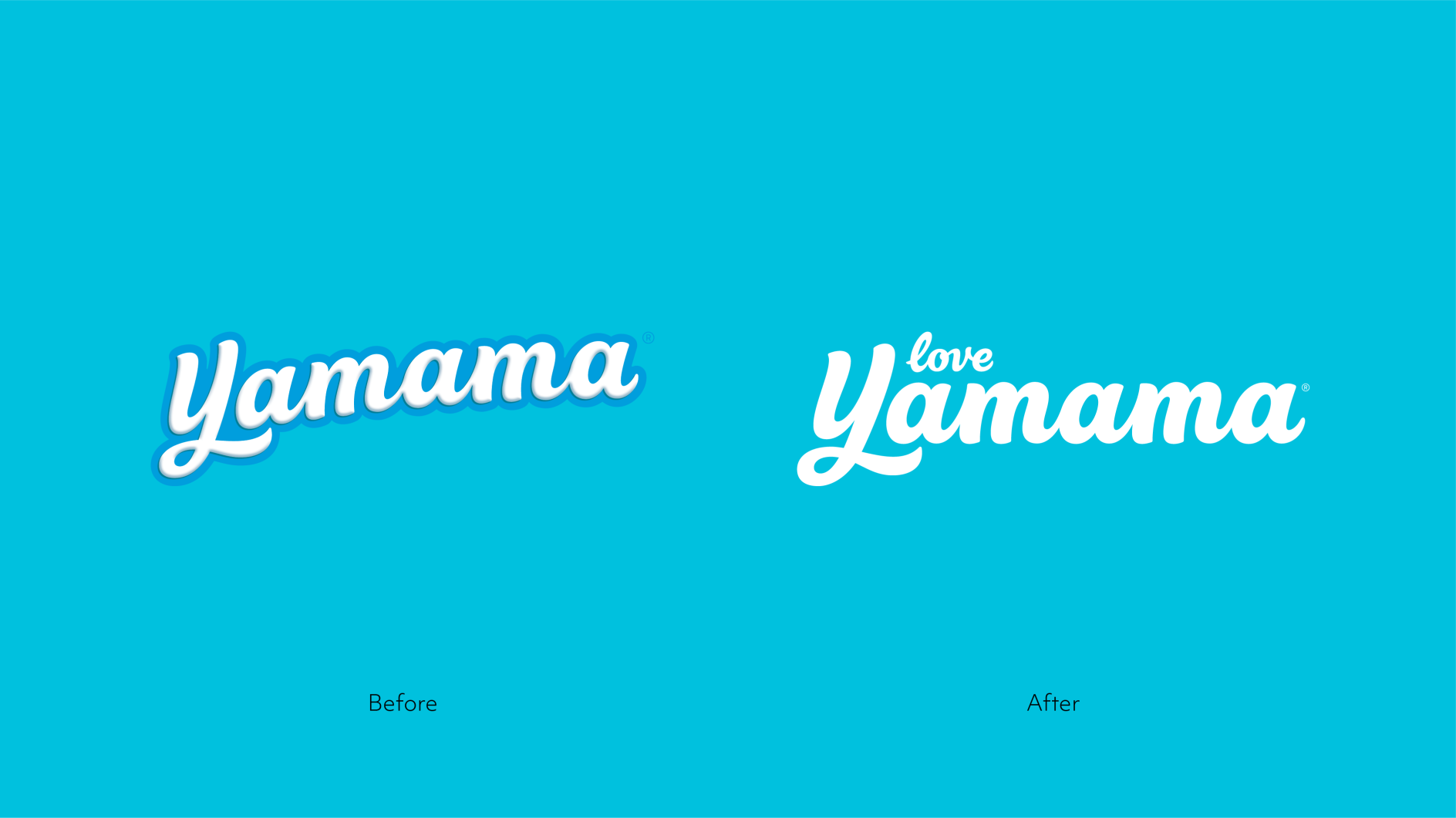
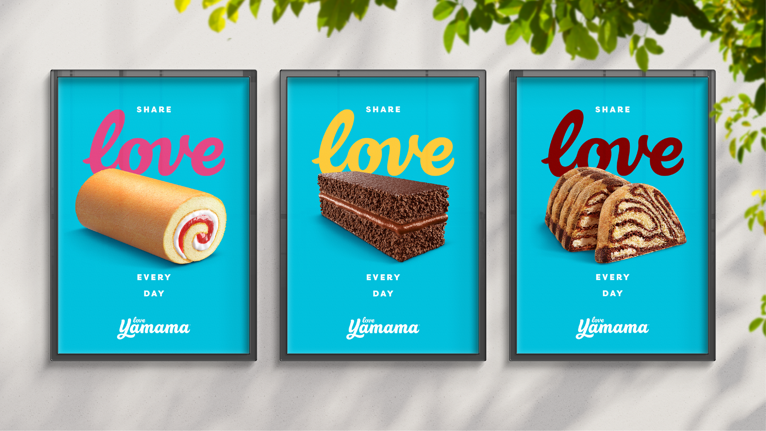
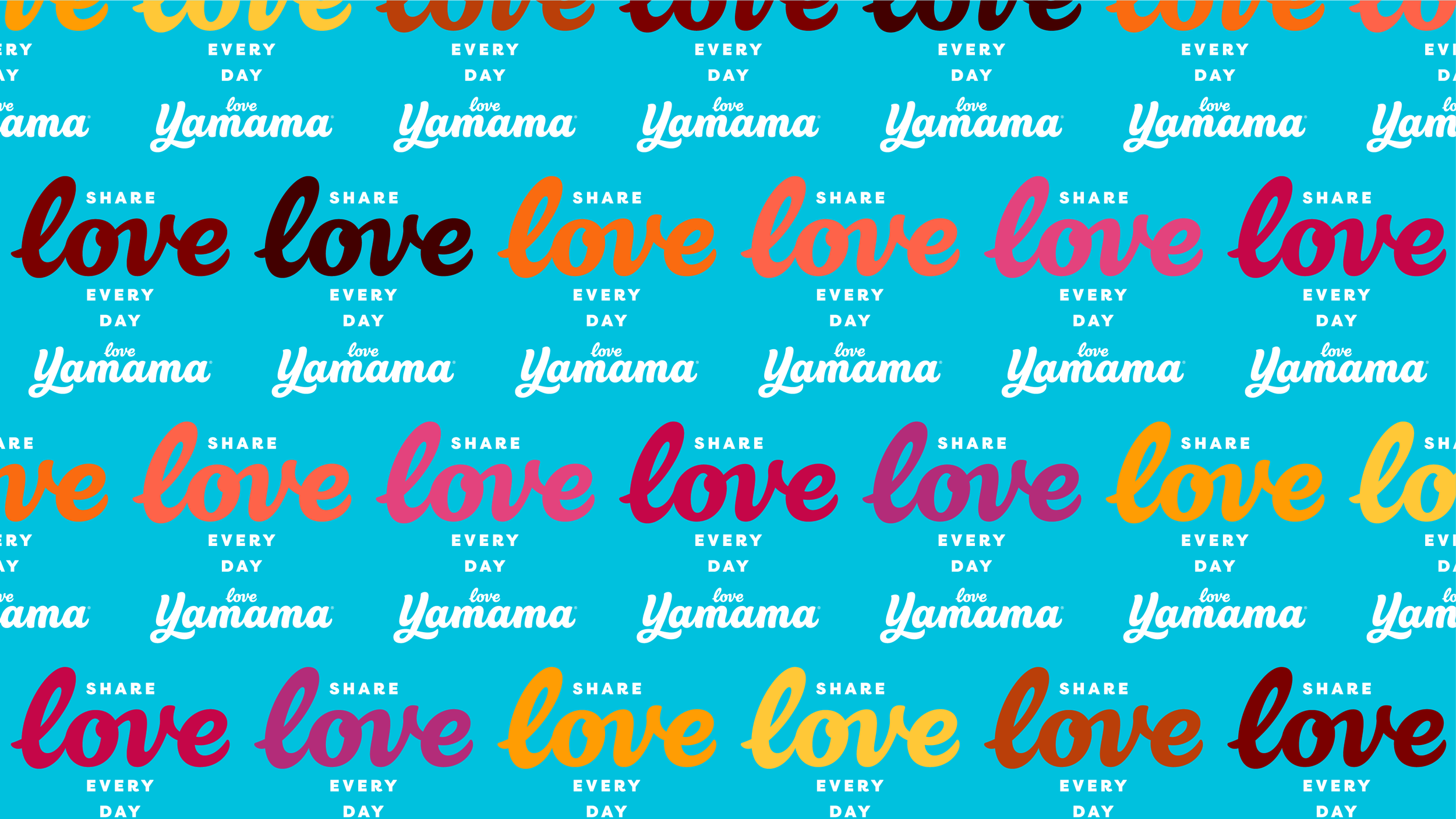
At the core of Yamama’s offering lies a profound connection between parent and child, often celebrated through shared moments over cakes. This emotional connection became the foundation for the new brand identity. The design team introduced a ‘smooth and creamy infinite pattern’ in the logo, alongside a refined logotype that incorporated the word ‘love’, symbolizing the warmth and joy that Yamama cakes bring to families. The new visual style bursts with colorful energy and generous abundance, cleverly layered over a refreshed blue background. The bespoke logotype, crafted by type guru Rob Clarke, features smooth, looping letterforms that evoke the piped cream filling of Yamama’s beloved cakes. This distinct typographic element not only enhances brand recognition but also creates a deliciously ownable asset for communication and packaging.
A Fresh Palette for a Timeless Favorite
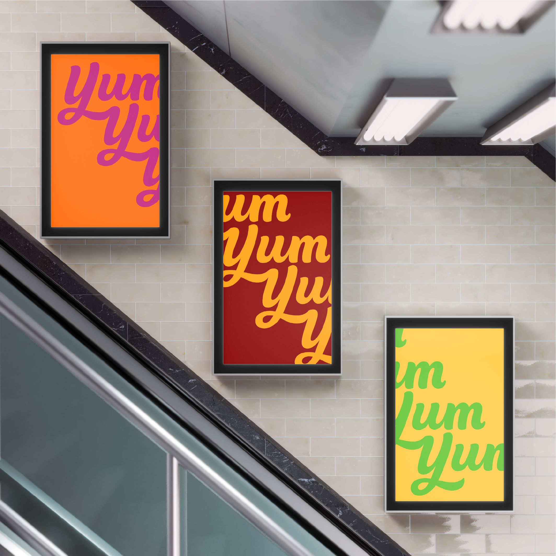
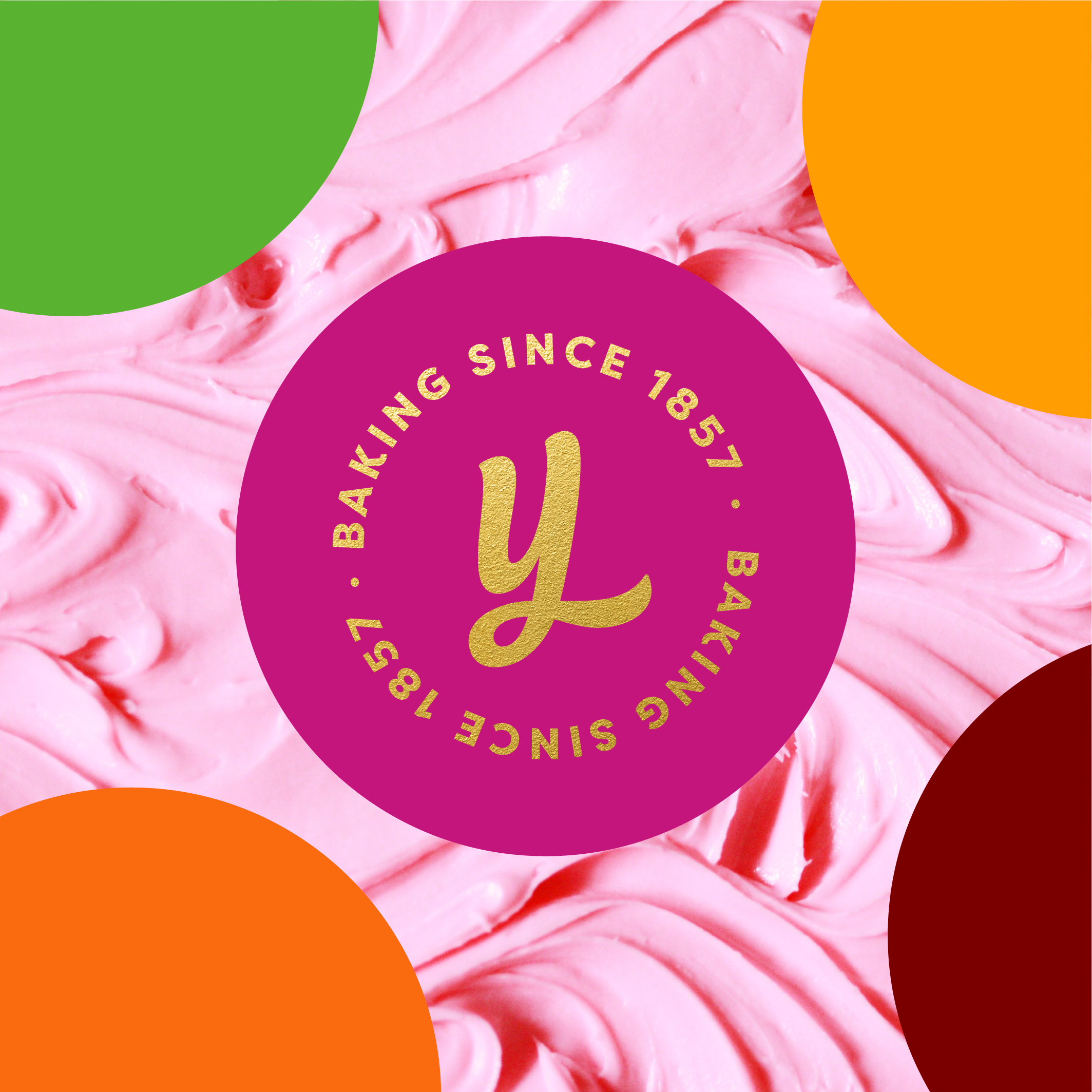
In redesigning the color palette, Derk&Eric took a gentle yet strategic approach. By maintaining familiar hues while introducing a fresh twist, they preserved the brand equity Yamama has cultivated over the years. The result is a visual identity that resonates with both long-standing fans and new customers, ensuring that the essence of Yamama remains intact. The studio also crafted innovative packaging that reflects the brand’s new identity. By incorporating an interconnecting pattern inspired by the creamy logo, the cakes now boast a visually appealing design that creates a delightful, endless pattern when stacked together an embodiment of the joy and celebration that Yamama cakes represent.
The Big Picture
According to Jon Gibbs, managing partner at Derk&Eric, the relaunch of Yamama’s new identity has yielded remarkable growth for the brand. The rebrand demonstrates the design’s effectiveness in attracting new customers while maintaining the loyalty of existing ones. The successful collaboration between Yamama and Derk&Eric highlights the transformative impact of thoughtful design in revitalizing a beloved brand. As Yamama continues to bring joy to families across the Middle East, its refreshed identity strikes a perfect balance by honoring its rich legacy and embracing a bright future.
