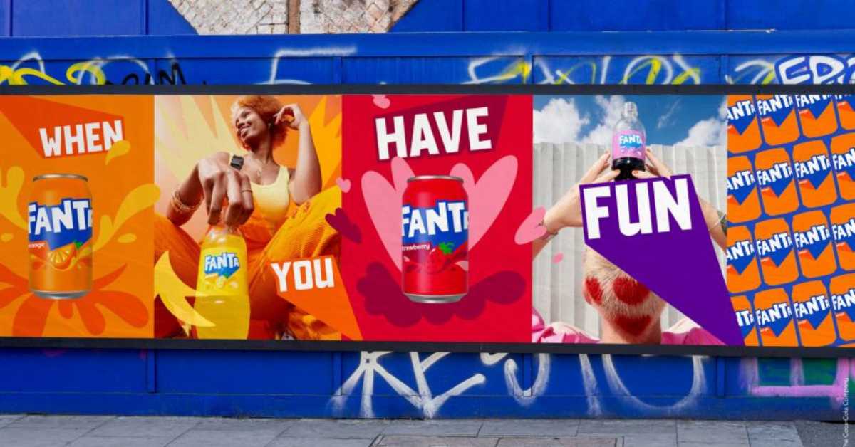
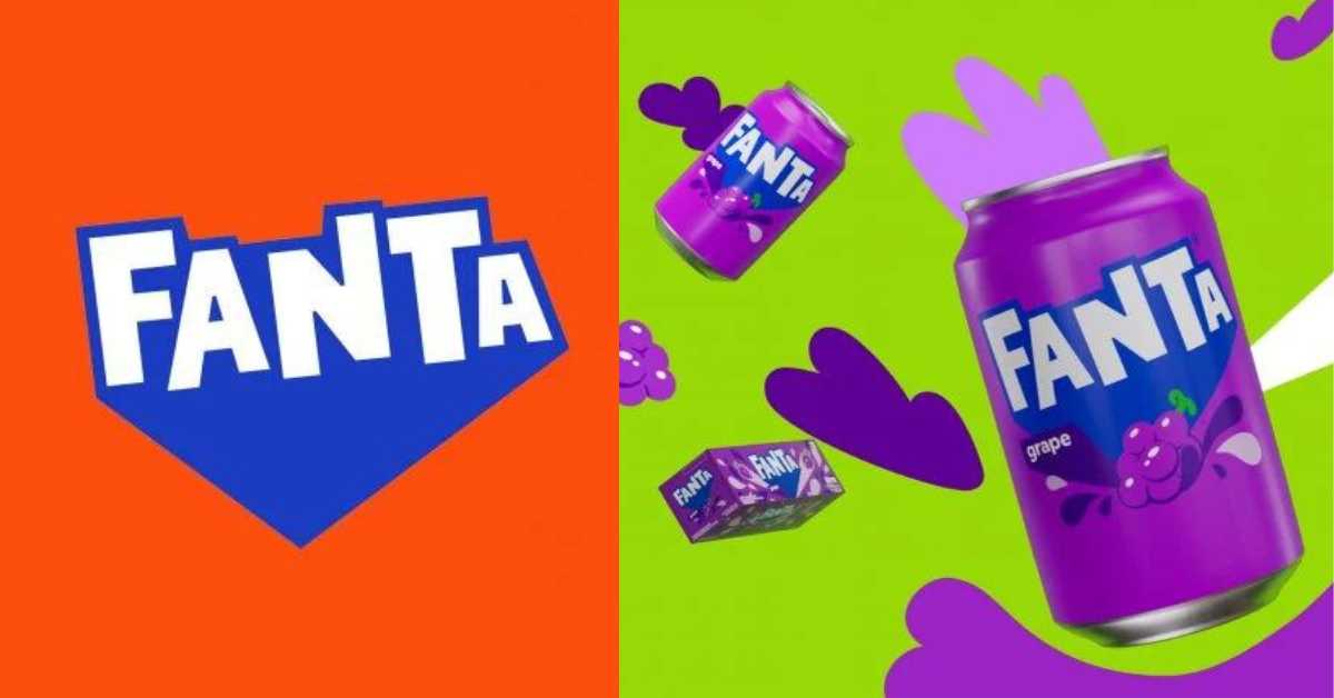
Fanta’s logo has been overhauled to give the brand a unified global identity based on fun. The rebranding, a collaboration between Coca-Cola Company and Jones Knowles Ritchie, gives Fanta a playful image that appeals to all ages.
Rapha Abreu, Coca-Cola global VP of design, said they focused on an attitude of “playfulness and fun”. They wanted to move Fanta from being seen as a brand exclusively for a younger audience and to broaden its reach. Abreu shared that the team elected to adapt the international logo instead of the rounder, more youth-skewed U.S variant. “By removing the orange and relocating the relevant fruit on the packaging, the boisterous ‘pop’ logo springs forth more readily. The brand’s full line of flavors, meanwhile builds out a kaleidoscopic palette that brims with energy.”

Lisa Smith, global executive creative director at Jones Knowles Ritchie, said it’s the largest spectrum of colors she has ever worked with. She pointed out that the pop speech bubble aesthetic communicates spontaneity and being of the moment, elements that reinforce the brand’s goals. “The work takes an intentional anti-precious, imperfect bent. The team explored all the opposites of what formal typography is all about – making the logo deliberately very, very playful.”
The New Identity
Coca-Cola said the new identity dovetails with Fanta’s new and controversial fruitless formula for its orange soda. Rebranding brought about a stripped-back flat logo. The lettering has been neatened and shadows removed along with the smile-shaped icon from within the second letter A.

A lighter shade of blue was used for the thick shadow, which was extended downwards to form a point. The logo will be used across all of Fanta’s range of flavors, as well as its orange variety. It should be noted that the orange roundel and leaf from the logo has been removed. Abru explained that it was important that the new brand identity was an accurate reflection of the Fanta brand. In regards to the old logo, he said it was confusing to have an orange in it when Fanta has a range of flavors that go beyond orange. “We didn’t want the other flavors to be compromised even though we know that orange is the most iconic flavor.”


