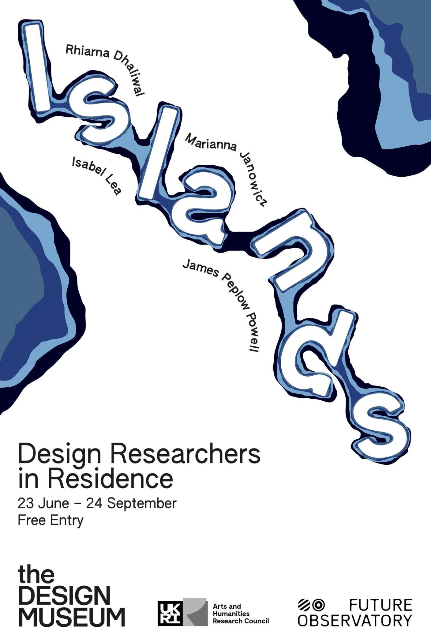
The Design Museum‘s annual residency programme has always been a platform for designers to bring together their ideas that explore environmental and social challenges. The theme for this year’s residency programme is framed around Islands, which showcased a diverse range of projects. Their latest visual identity that accompanies the exhibition interweaves projects focused on climate challenges through sustainable materials and decolonized design strategies. Let’s explore more about this sustainable brand-new identity.
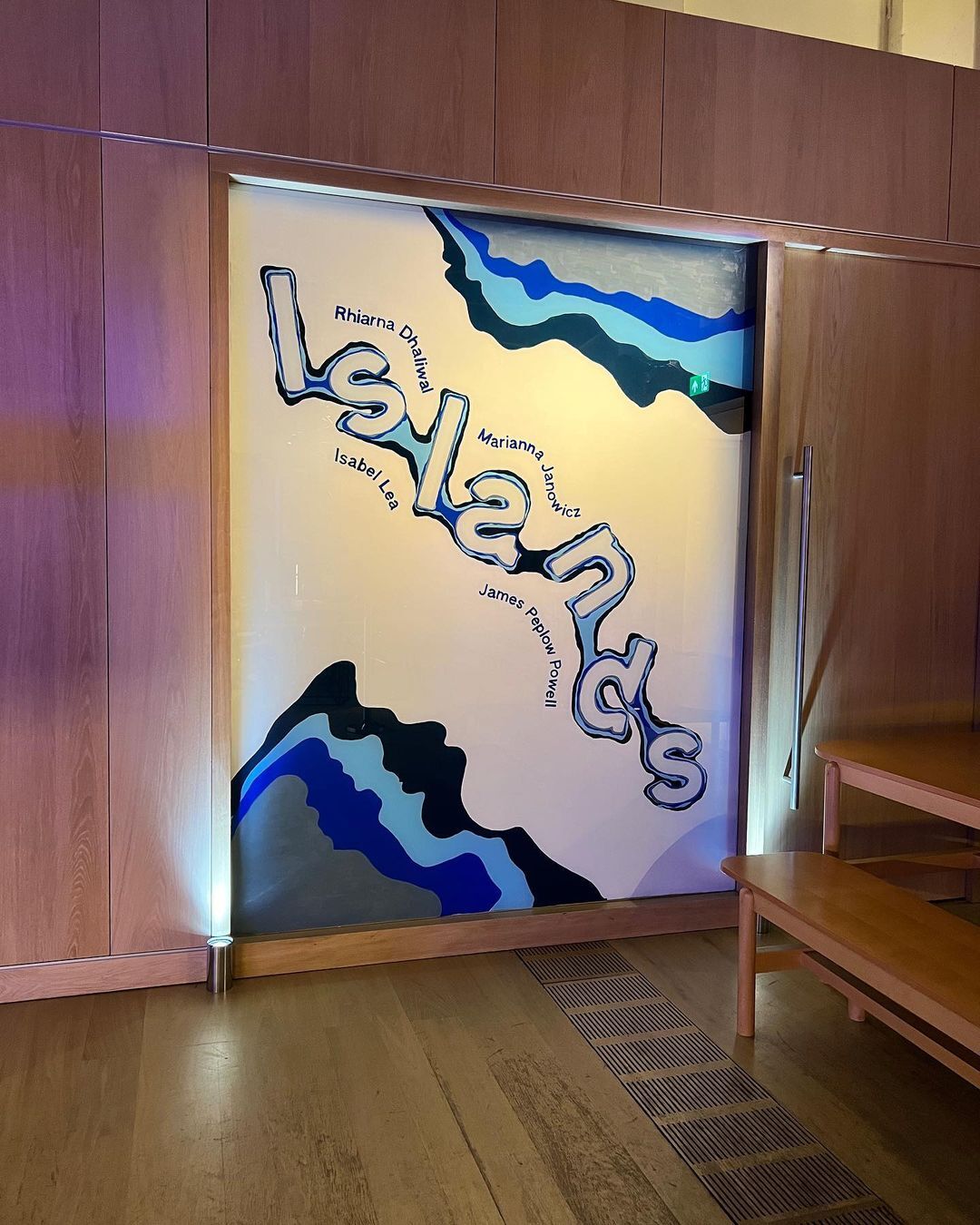
Weaving Islands of Climate Challenges
Design Museum’s residency program revolves around the theme of Islands, which serves as a platform for showcasing innovative projects addressing climate challenges. London-based design studio Plan B created the Island’s identity by utilizing its commitment to concepts rooted in sustainability and cultural decolonization principles. They champion intersectional and underrepresented viewpoints while aiming to create impactful experiences that echo in the viewer’s mind. It is this ethos that feeds directly into the identity of the annual residency.
Decolonized Mapping Informs Contextual Basis
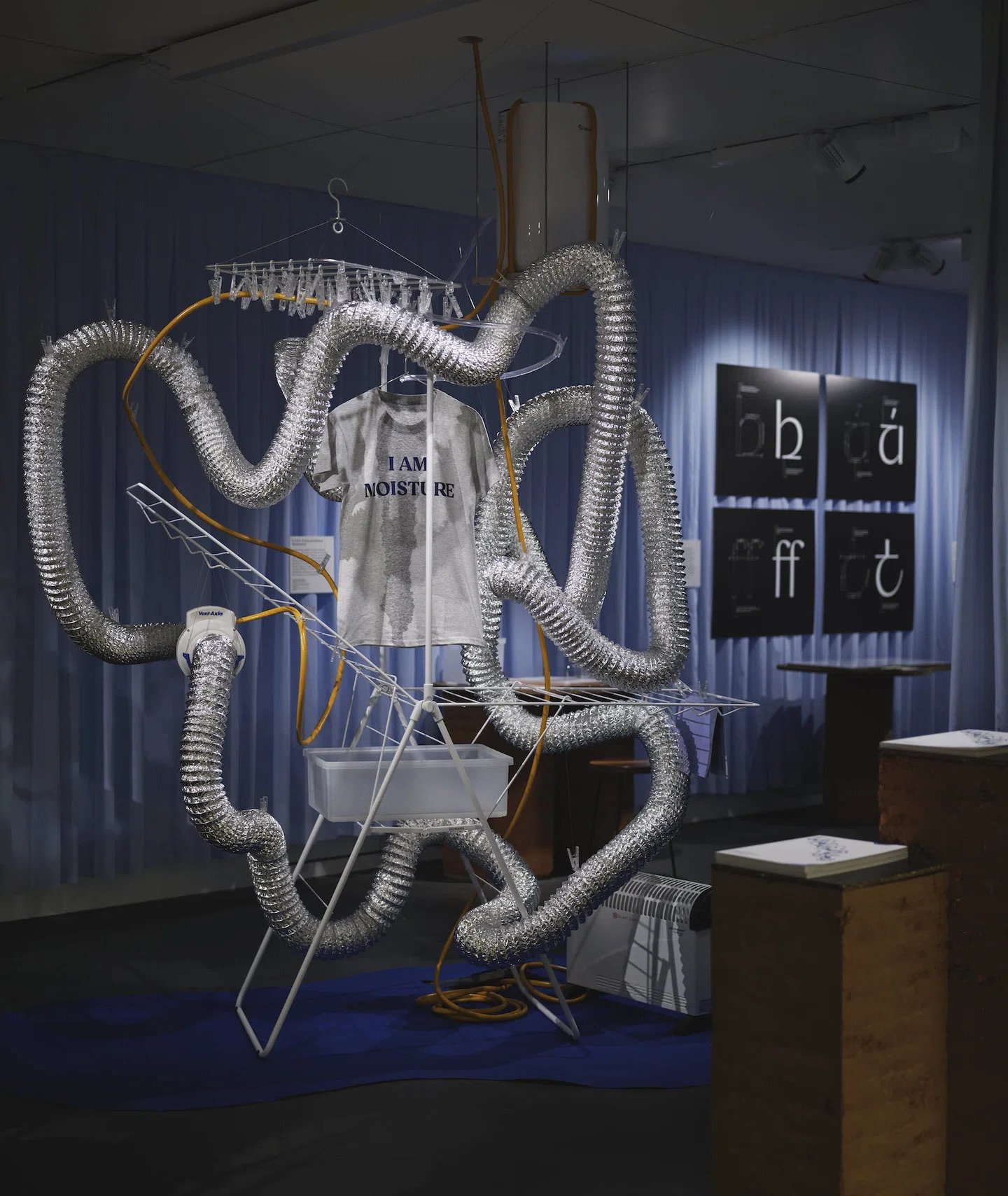
Plan B Studio went above and beyond in bringing a broader context to the Island’s identity by collaborating with Bushra Mohammed from Msoma Architects and using decolonial mapping strategies. Departing from the traditional view of maps as a factual and precise representation and approaching them as expressive and communicative tools was a unique approach. Applying this across the exhibition space, the team treated each resident project as a unique island, brimming with its own biodiversity, culture, and laws. Treating each resident project as an independent island, the identity embraces symbiosis. Distinct islands coexist to form a rich tapestry within the overall residency.
Sustainable Materials Align With Exhibition Theme
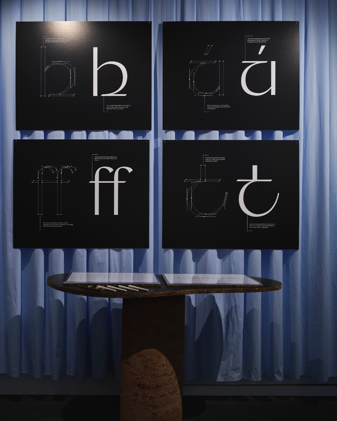
Plan B carefully considered each material and graphic element to reflect the sustainability and diversity values of the Islands. The central waves visual was hand-painted by sign painter Good Night Vienna on easily removable materials. The main typeface used is Authentic Sans, designed to challenge Eurocentric standards and promote inclusivity. This choice complements the decolonized approach to the identity.
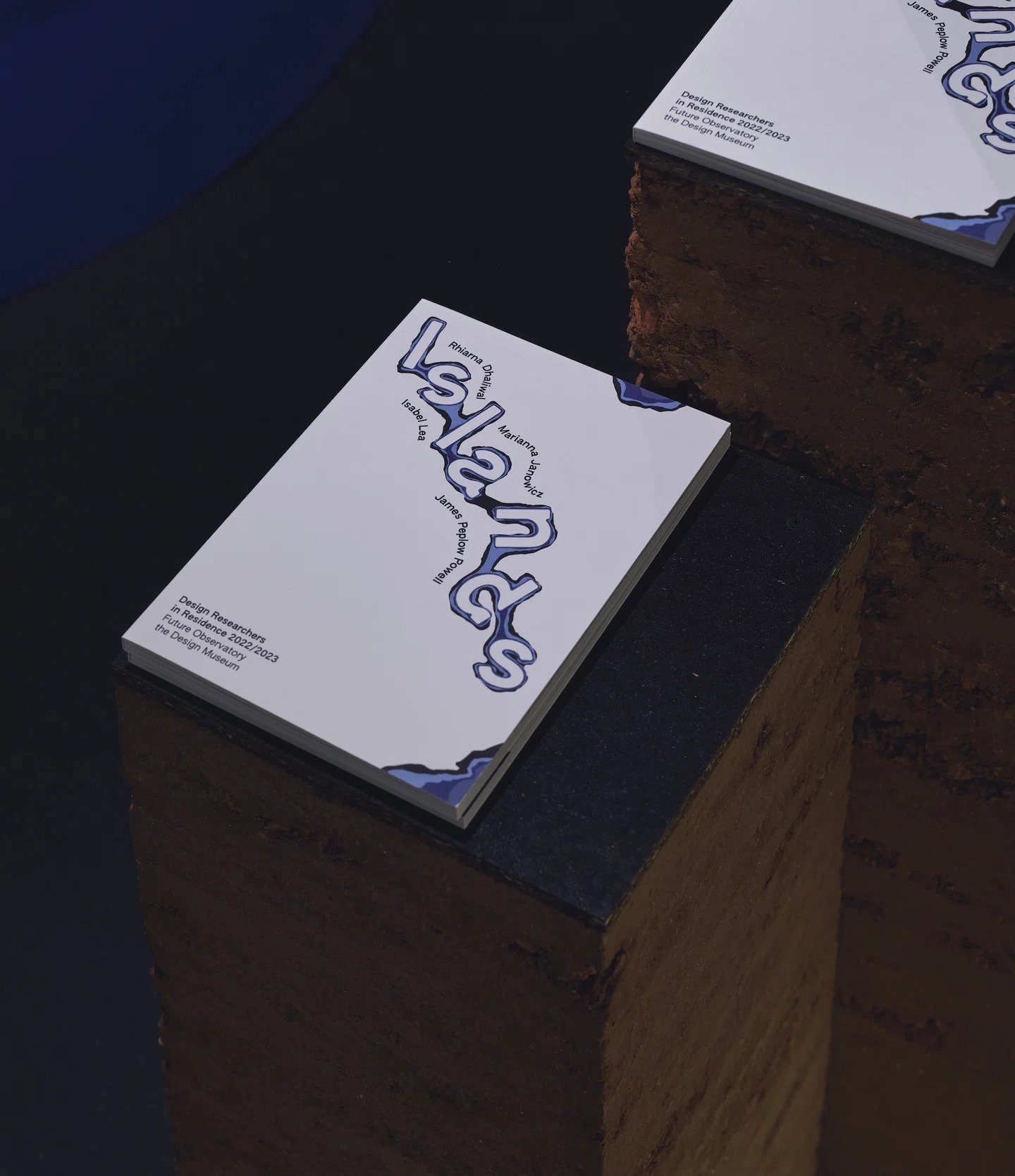
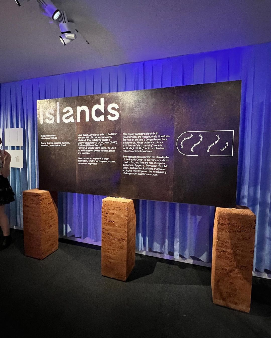
Exhibition plinths were constructed with chemical-free hemp boards by 121 Collective. The exhibition publication uses hemp paper and a seaweed-based bookmark. These material choices align with the residency’s focus on climate challenges.
Final Thoughts
The way I see it, Plan B’s identity is sure to raise important questions about design’s relationship to sustainability and cultural diversity. While their thoughtful approach realizes the complex themes of the Islands residency, their visual identity shows the power of a visual language that champions sustainability and decolonization, leaving a lasting impact on visitors and inspiring conversations around these crucial topics.
