Certain brands from our childhood are so cherished that they play a significant role in shaping who we are as individuals. One such brand is American Girl, founded by Pleasant T. Rowland in 1986 and is now part of Mattel. In a world where childhood memories often stay with us forever, their line of 18-inch historical dolls, along with their corresponding books, has inspired millions of young girls. These iconic dolls and their captivating stories have helped girls grow up with courage and confidence, shaping their lives in meaningful ways. The brand has recently undergone a transformative rebranding that celebrates its rich heritage while ushering in a new era of female empowerment and inclusive storytelling. Let’s explore more about this exciting redesign.
Reclaiming the Essence of American Girl
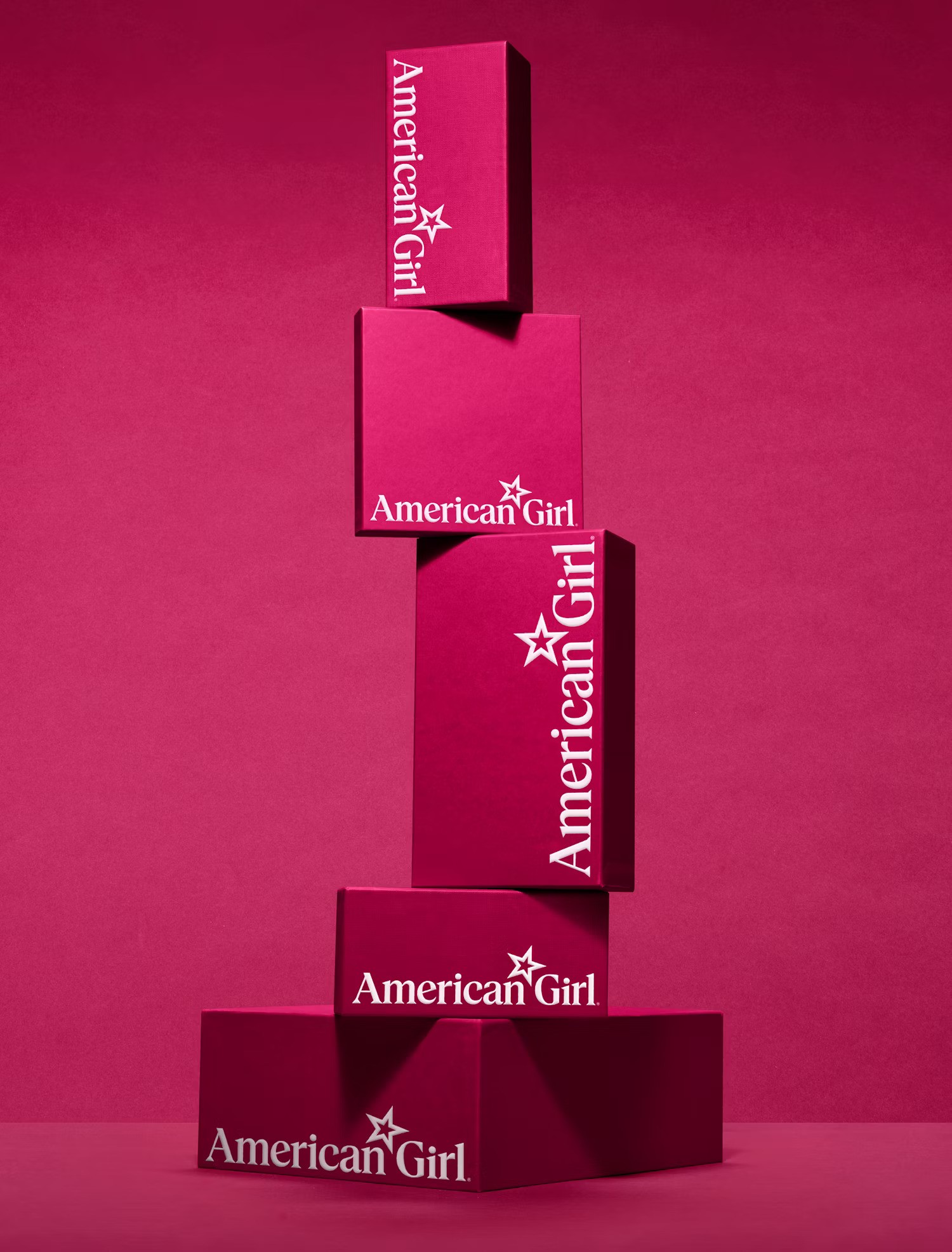
The new visual identity and brand strategy for American Girl created by the award-winning design studio, Pentagram, draws on the company’s rich history to build a more premium and cohesive experience for the brand. The framework encompasses a new wordmark, bespoke typeface, expanded color palette, packaging, environmental graphics, and an array of historically inspired patterns, glyphs, and other graphic elements to create a distinctively ownable, playful, and modern system. The brand positioning, brand voice, and messaging recenter storytelling to authentically speak to a new generation of girls and share the ‘Exceptional Story of Girlhood’.
This new sense of purpose is infused into an updated, simultaneously nostalgic and modern wordmark. Stronger, thicker typography gives the logo a bolder presence that is more powerful and confident for today’s girls. The star has been moved from its position in front of the previous logo to a spot between the two words, visually echoing the new tagline and messaging that it was inside them all along. A new monogram version also places the star within.
A Nostalgic yet Modern Visual Language
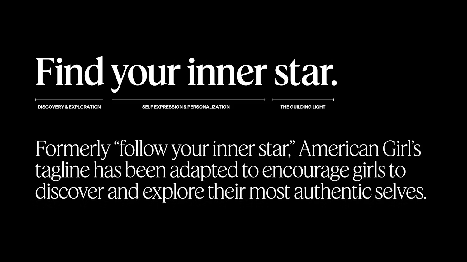
At the heart of the rebrand lies a powerful wordmark that exudes confidence and strength, with a reimagined star symbol symbolizing the brand’s new tagline, ‘Find your inner star’. The proprietary Pleasant Serif typeface, inspired by American Girl’s founder, incorporates the iconic 18-degree star angle, paying homage to the dolls’ stature. A bold color palette, including the signature Pleasant Berry hue and a vibrant ‘Berry Patch’ range, elevates the brand’s premium positioning.
Celebrating Individuality and Inclusivity
American Girl’s focus on individuality shines through in the refreshed identity, with authentic photography showcasing girls living their lives and contemporary illustrations by Joana Avillez that incorporate hidden stars as Easter eggs for fans. The brand’s signature silhouette of a girl reading has been expanded into a series that celebrates diversity, alongside icons of historical dolls and period ephemera, ensuring that every girl can see herself represented.
Bottomline
Through the power of design, American Girl has been able to reclaim its position as a beacon of empowerment for modern girls. The iconic rebrand by Pentagram seamlessly blends nostalgia with a fresh, inclusive perspective to honor the brand’s rich legacy. This new visual identity not only pays tribute to exceptional stories of girlhood from the past but also sets the stage for countless more to be told in the future. Either way, the design is fit to ignite the imagination of a new generation of girls, inspiring them to dream big and believe in themselves.