In the male-dominated world of motorsport racing, 15-year-old Alba Hurup Larsen is making waves as one of the most promising young female stars. Recognizing her extraordinary talent, New York’s Athletics Studio was enlisted to create a bold brand that showcases Alba’s personality and unique position in the sport. Let’s delve into the inspiring journey of Alba Hurup Larsen and the creation of her captivating visual identity, which aims to inspire the next generation of female athletes.

Breaking Barriers and Inspiring Change
Alba Hurup Larsen has been hailed as the fastest girl in her age group by esteemed names like Ferrari and FIA. Renowned Formula One stars Kevin Magnussen and Tom Christensen have also identified her as the young female talent most likely to enter the professional arena. While women have made their mark in motorsports since 1950, the lack of funding and support has often hindered their progress. Currently, no women are racing at the Grand Prix level. With her remarkable skills, Alba aims to change this narrative and pave the way for future generations of female racers.
Crafting a Narrative of Female Empowerment
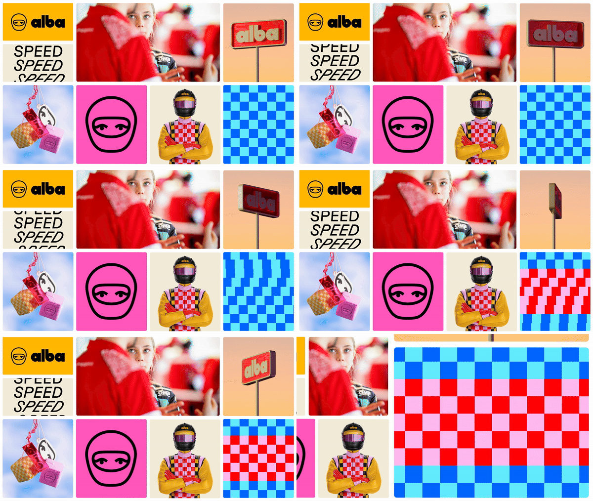
The visual identity and branding process, undertaken by Athletics Studio for Alba Hurup Larsen, was an exciting opportunity to narrate the story of a female protagonist in a visually striking way. The Athletics team set out to create a fresh and visually striking brand that compellingly tells the story of a female protagonist. “This project wasn’t just about creating a design; it was about telling a story and inspiring the next generation of female athletes,” says Malcolm Buick, creative director at Athletics. With Alba being hailed by Ferrari and FIA as the fastest girl in her age group, and recognized by Formula One stars as a future professional arena star, the studio had the opportunity to design for a trailblazer breaking barriers in a historically male-dominated field.
A Buoyant Wordmark with Vintage Flair
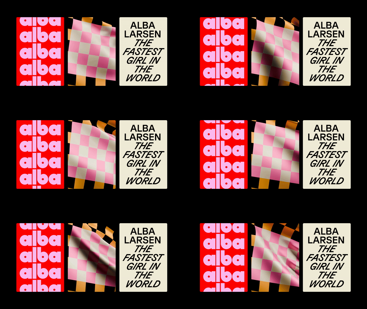
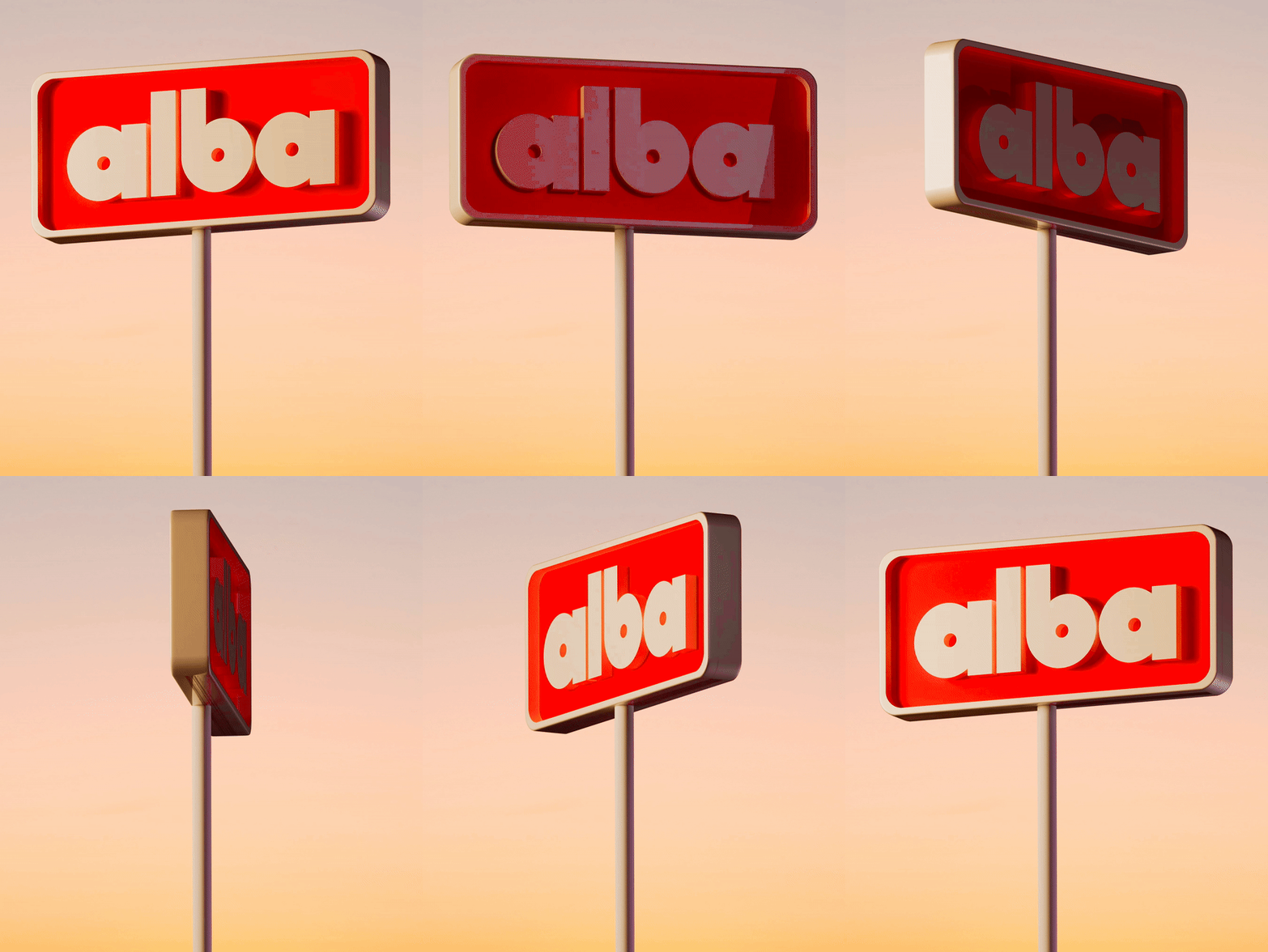
At the heart of the identity lies a rounded, buoyant wordmark inspired by the contrast of curved and straight lines on the racetrack. Uplifting Alba’s first name was a conscious choice, actively going against the tradition of referring to sports people by their surnames, thus “distinguishing her in a domain where last names are normative,” says senior executive Lars Hemming Jorgensen. The wordmark’s 60s energy and vintage feel pay homage to traditional motorsports logos, while a ‘hint of femininity’ sets her apart from other drivers.

Balancing Tradition and Youthful Vibrancy
To counterbalance the bold wordmark, the Athletics team imbued a sense of “youthful energy and femininity” into the rest of the system. Half of the color palette draws on motorsport tradition with red, yellow, and black, while complementary pinks and blues ‘breathe life into the palette’. Aspects of the identity also play with the iconic chequered racing flag, utilizing contrasting color combinations and animated elements to work alongside static ones.
Final Thoughts
The branding for Alba Larsen by Athletics aims to set her apart from other drivers while embracing motorsport traditions. The visual look is designed to be fresh, fun, and inspiring. As Malcolm Buick reflects, “Alba Larsen isn’t just a talented driver; she’s a trailblazer in a field that has historically been male-dominated.” With this bold and empowering brand identity, Athletics has not only increased Alba’s visibility but also positioned her as a pivotal figure in shaping the future of motorsports, inspiring generations of young female athletes to fearlessly pursue their dreams.


