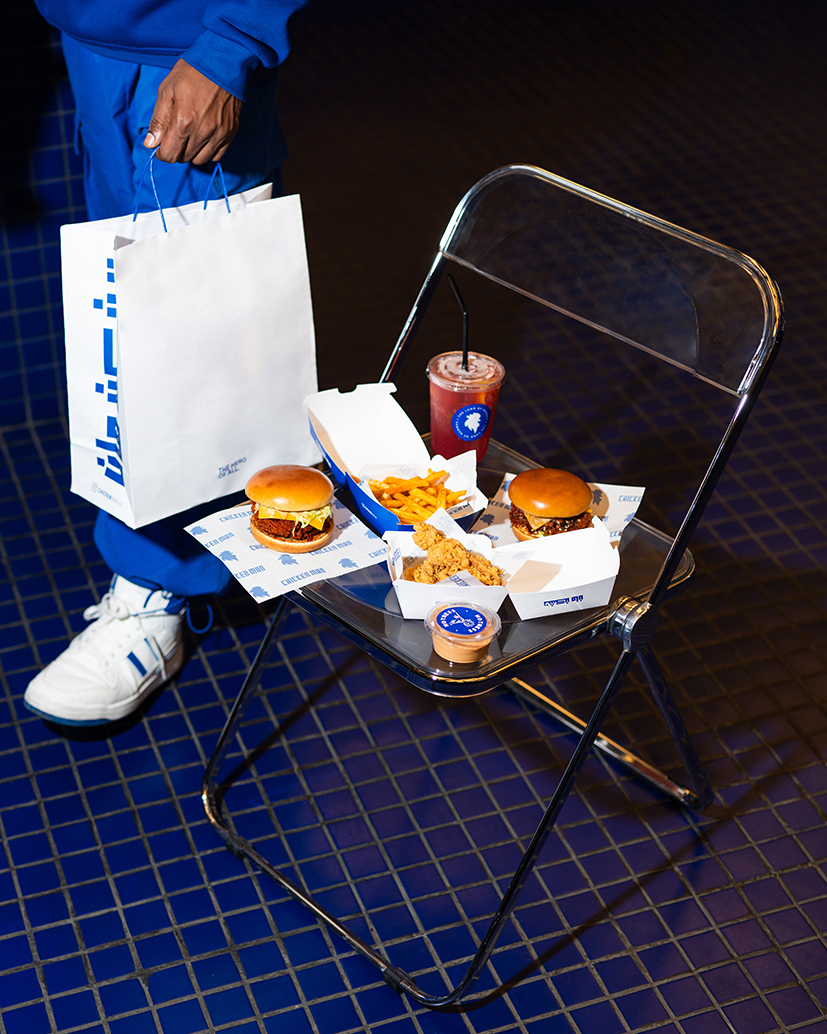
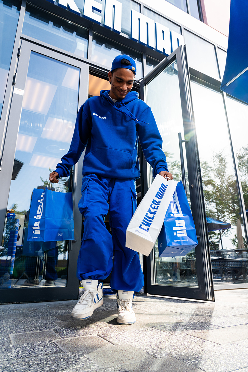
Chicken Man embarked on a bold journey, an inspiring transformation in culinary innovation, creativity, and the vibrant ‘blue’. The color is the focal point of its rebranding. For Chicken Man, blue symbolizes resilience, assurance, and integrity.
The UAE-based fast-food restaurant worked with Kyan Creative Studio for the rebranding and new logo embodying the essence of a fearless protector and as a beacon of strength and commitment. Chicken Man also adopted a new menu to show its dedication to culinary excellence and innovation. It incorporates bold flavors and creative dishes. The restaurant aims to provide an unforgettable dining experience.

Kyan Creative Studio said the decision to initiate the transformation with Chicken Man stemmed from a deep admiration for heroic qualities, to infuse the brand with vigor and dynamism. In regards to the color blue, the studio said the hue serves as a representation of Chicken Man’s core values – bold, resolute, and truly engaging.
Chicken Man’s rebranding was more than a new identity – it permeated every aspect and created an environment teeming with vitality and enthusiasm. The interior design reflects the renewed identity by artfully integrating elements of heroism and sophistication. Every detail pays homage to the indomitable spirit of everyday heroes.

The packaging redesign – each box, bag, and container features vibrant and bold inspirational quotes and heroic elements. It enhances the brand’s visual appeal and reinforces its core values of resilience and integrity. Furthermore, Chicken Man has redesigned employee uniforms to incorporate the new branding; this creates a cohesive look and instills a sense of pride and unity in the team.
Also Read: Bird Fluencers Wes And Sandy Shows How Blissful Train Journeys Are on SWR


