Twitch has always been a lively and engaging platform for gamers and streamers alike, setting itself apart in the fast-evolving landscape of online entertainment. With its recent rebrand, Twitch has introduced a refreshed identity system that truly captures the diverse personalities and passions of its community. This update goes beyond just a new look. It is a strategic move that improves user experience and boosts brand recognition in a crowded digital space.
A New Look for an Iconic Logo
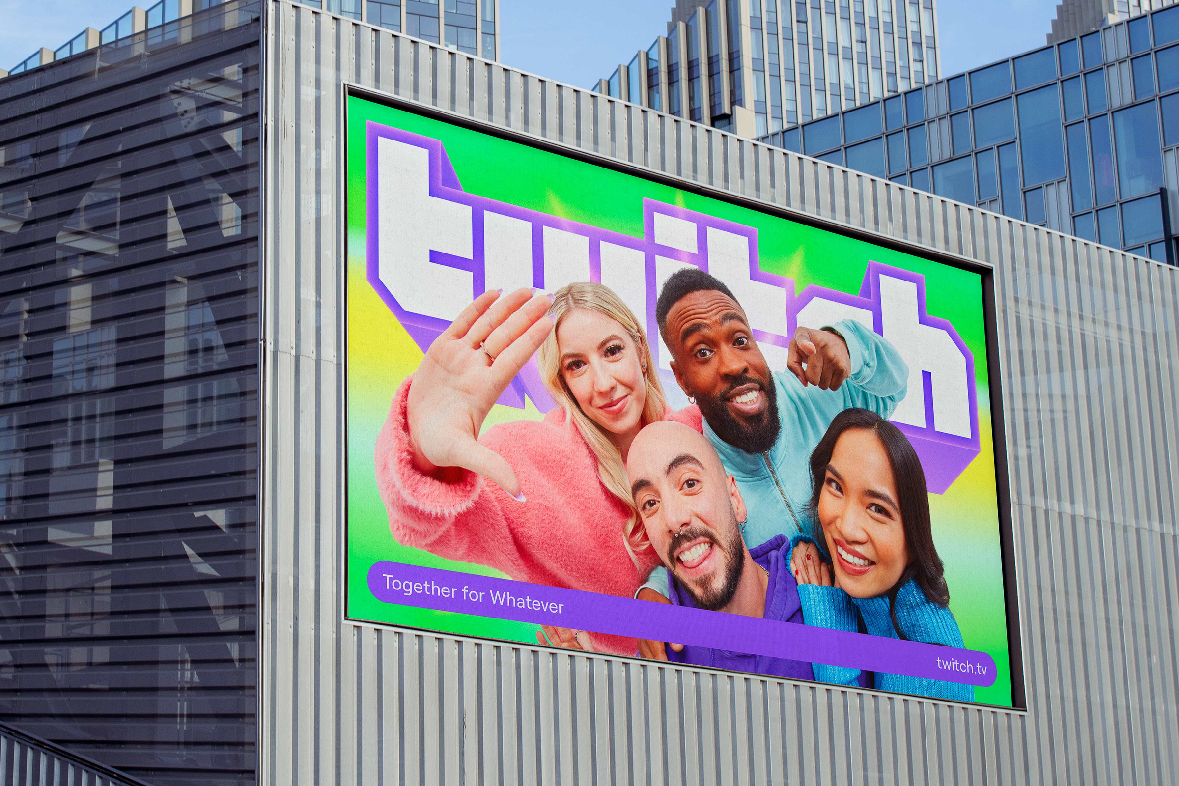
At the heart of this identity refresh, created in collaboration with the design studio Porta Rocha, is the beloved Glitch logo, which has undergone a stunning transformation from a flat design to a glossier 3D iteration. This shift marks a departure from the minimalistic trends of the 2010s, where brands stripped away metallic shadows in favor of simpler shapes. Twitch’s then Executive Creative Director Byron Phillipson noted the significance of the Glitch mark, emphasizing its deep connection to the community—it’s not uncommon to see fans flaunting tattoos of this iconic symbol.
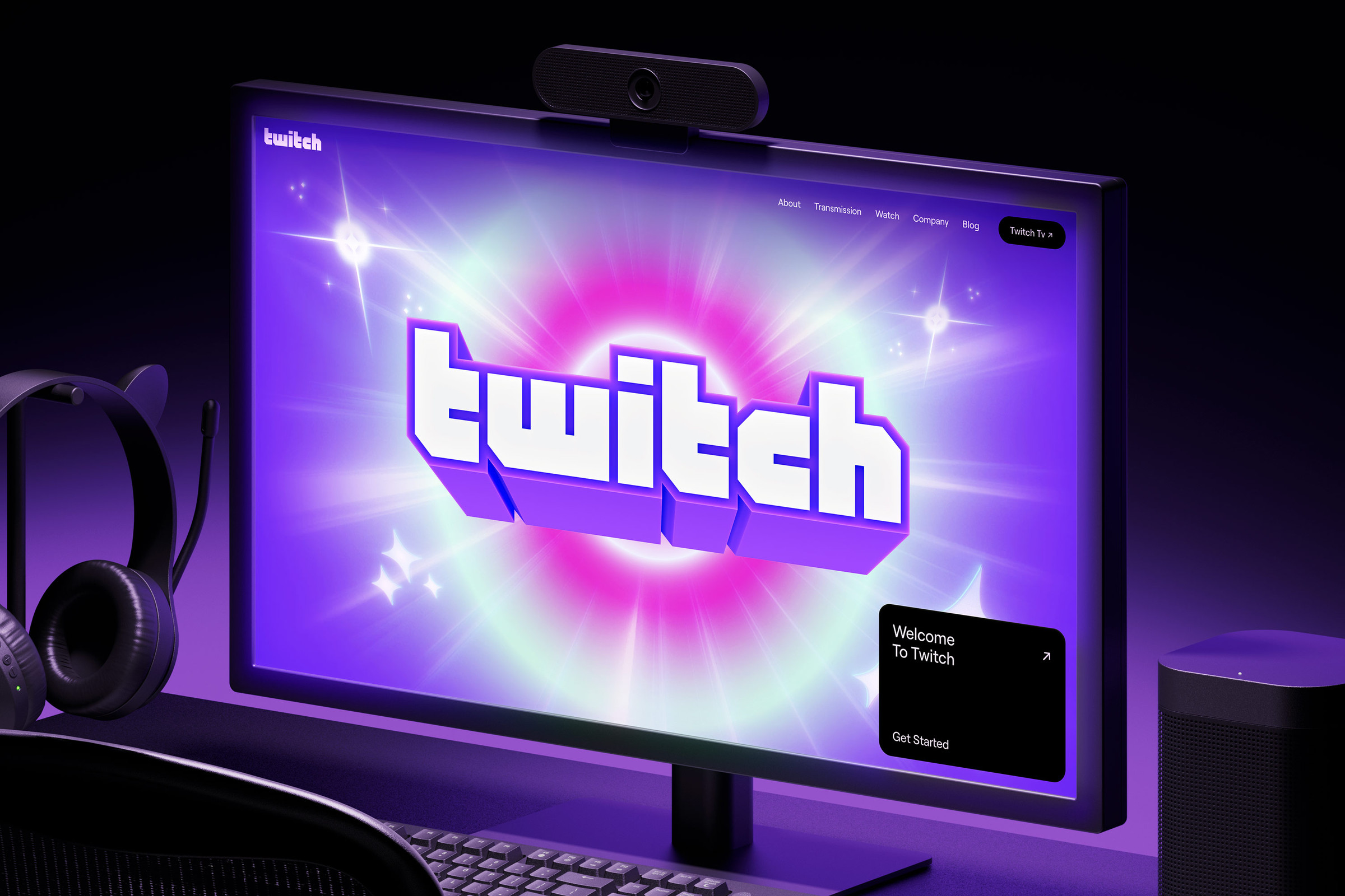
The new design breathes life into the Glitch logo, making it more dynamic and visually appealing. This revitalized identity is complemented by a suite of 3D illustrated motifs that add layers of personality and serve as contextual markers. As users navigate the platform, these elements help signpost the diverse content they’re engaging with, creating a more immersive experience.
Consistency Meets Creativity
Maintaining Twitch’s signature purple color palette was crucial in this identity update. While the core elements remain recognizable, Porto Rocha has introduced a vibrant complementary palette filled with sparkly flourishes that come to life in motion. This evolution enhances the overall aesthetic of the platform, making it more engaging and visually stimulating for users.
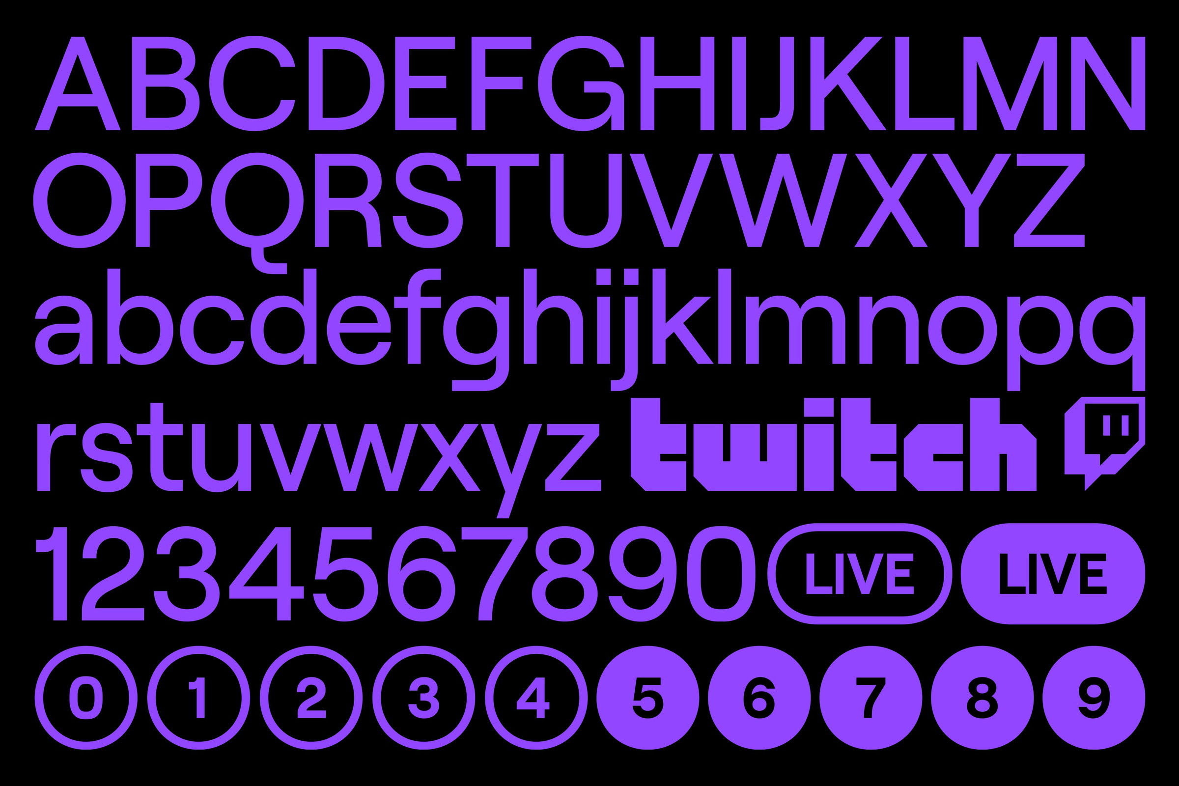
The customized typeface, an evolved version of Roobert named after synthesizer pioneer Robert Moog, has also received a facelift. Working with Displaay Type Foundry, Porto Rocha developed simplified typography systems that ensure readability and style. This thoughtful approach not only enhances the user experience but also empowers Twitch’s internal team to create fresh graphics with ease, fostering a more creative environment.
Streamlined User Interface
While the identity system embraces a maximalist and energetic theme, Twitch’s updated user interface (UI) has taken a different approach. The new UI strips away unnecessary clutter, allowing users to focus on the streams that matter most. Rounded framing devices for assets, backgrounds, and labels create a cohesive design that resonates throughout the platform, ensuring a seamless experience as users switch between different parts of their online lives.This thoughtful redesign reflects Twitch’s commitment to enhancing user engagement while maintaining the essence of its brand identity. As the platform continues to evolve, the influence of Porto Rocha’s creative vision will undoubtedly shape the future of livestreaming.
Final Thoughts
With Porto Rocha at the helm of this identity refresh, Twitch is poised to embrace a new era of online entertainment. This expanded identity system not only reflects the diverse interests of its community but also sets the stage for engaging and innovative livestreaming experiences. As Twitch continues to grow and adapt, fans can look forward to a platform that celebrates creativity, connection, and above all, the joy of streaming.
